Showing posts with label Singapore. Show all posts

09 March 2011

Windows To The World


A view from my office into the back courtyard of the Headquarters Library.

Like many people in my business, I've had my share of doing the musical chair scene, cycling myself through whatever creative studios, agencies, and publishing houses allowed me, while I gouged out my career like some giant, lumbering glacier that carved its way through the mountains until it reached its final resting place and disolved into the sea.

Along the way, my office accommodations have run the gamut: from working on a slab of thick glass I straddled between two filing cabinets to make a desk out of while freelancing in my spare bedroom-turned studio; to having my head poke up out of a cubicle amid a vast sea of other cubicles for a major corporation's in-house creative department; to working on a state-of-the-art networked computer system in a private office on the 44th floor of a skyscraper in New York CIty's Rockefeller Center.

Some of my more memorable workplace windows included views directly down into the heart of Times Square; a view into Central Park through a sliver of light between two condominium towers; even a most impressive, expansive, view of the Empire State Building and lower Manhattan from a high rise in midtown. And for offices that didn't have the greatest of views, I was only steps away from such memorable places as Thanksgiving Square in downtown Dallas, New York City's Union Square, Singapore's Chinatown, or Bangkok, Thailand's bustling Plonchit Road and associated side streets---all choked with both street food vendors and vehicle exhaust fumes. Ahhh, those were the days.

Nowadays, my office at the Headquarters Library for the Alachua County Library District looks out through six floor-to-ceiling colonial style windows into the back courtyard of the library. It is a peaceful, quiet, and calming view of flowering bushes, short palms, and creek-side trees with Spanish moss hanging from their branches. I fully open the blinds in my office to let the light flow in, and---because they face north---I can get good, ambient light and avoid the sweltering and harsh, direct light that the southern facing sides of the building get. My office view is the kind one would want to see from their sun room (or as they call their screened-in back porches down here, their "Florida Room"). And since I literally have no view from my own personal residence, my office windows do a lot of making up for that deficiency.

I occasionally wonder which of the many windows were the best I ever had. It's a tough call. But I'd have to say that on views alone, I'd take a serene view of nature like this one any day over the bustling, noisy streets of the big city. This way, I can literally say that I made it over to the other side where the grass is greener.

That being said, however, sometimes I just wished my windows could open.


30 November 2010

Signage: The Good, The Bad, The Ugly

Above: nine panels of a PowerPoint presentation, using images from the movie The Good, The Bad, & The Ugly to highlight examples of library signage. 

Thinking about clear, cohesive signage as part of my work in Singapore definitely reinforced my appreciation not only for its importance and impact on the public, but also about the kind of materials which were technically important for durability and to thwart vandalism as well. Developing a unified and consistent approach to how a corporation’s signage program is presented not only reinforces the effectiveness of the signage itself, but also projects a perception of a company’s level of attention and service to the public. Signage is just one aspect of the total package used to project the corporate image out into the public.

Where I work now for the Alachua County Library District in Gainesville, Florida, signage is everywhere at the 11 library branch locations. You could even honestly say that signage has run amuck for them. There is all kinds of signage, ranging from essential way-finding signs, all the way down to how much a copy machine costs to use. Much of the essential, legitimate signage is old and in need of being freshening up. Other signage is placed in locations and in such hap-hazard ways that they leave a person scratching their head, perplexed as if to say: what were they thinking? High on this list include signs produced by librarians on-the-run, responding to short-term problems with short-term solutions, often using whatever rudimentary computer text and decorating skills they have, then printing 8.5x11 inch signs out of the office printer—or worse yet—hand writing messages onto torn paper or Post-It notes. Occasionally, these solutions wind-up becoming semi-permanent fixtures in the public space. I cringe at the thought of all of these whenever I encounter them. Often, the word “tacky” rushes to my mind.

On the flip side of things, the library's display signage for collections, events and services is warm and welcoming in a home-made “crafty” sort of way (because that is essentially what it is—a lot of coloured butcher paper, print-outs, and Ellison cut stencil lettering like you might imagine being used on elementary/primary school bulletin boards. For better or worse, our library certainly won’t be mistaken for a high-end, slick retail space. 

I wouldn’t mind raising the aesthetics bar higher, however, so I have been compiling a selection of photos taken of signage throughout the our Headquarters Library branch to use in a PowerPoint presentation to highlight what I think examples of good, bad, and downright ugly use of signage has been in our library. I included bulleted discussion points of what makes signage effectively good, and what makes signage poor or ineffective. Over time, I plan to expand my appeal beyond my empathetic supervisor (with her assistance) for a more unified, cohesive branded approach to the use of signs throughout the library district.

Now, for most people, the design and development of informational signage is understandably boring. Either they don’t design or create signs, or they have little creative, technical, or material experience with the process of sign making. This is understandable, so in an attempt to liven up my presentation, I incorporated it into a tongue-in-cheek movie theater theme, featuring images of an indoor movie theater and screen, followed by images borrowed from the movie The Good, The Bad, & The Ugly. 

The title just worked so perfectly, I thought, and that is how I divided up my presentation, with bulleted points on each slide to reinforce the themed category I place them in. This presentation may never see the light of day; it might be revamped, toned down, or made more palatable to corporate viewing tastes. But for now it has been fun to work with and I think if nothing else, a way to open the eyes of the few who make decisions about the brand experience of the library either through signage directives or purchasing.


29 November 2010

My Singapore Library Connection

I recently noticed that one of my blog viewers was located in Singapore. What a coincidence! I thought, because my first experience designing for libraries actually occurred while I worked in Singapore as design director of a small creative design and branding studio called WordMaker Design, Pte Ltd.


WMD had been started by K.C. Chew about 25 years earlier as a typesetting shop that eventually took on more and more layout and design work. Over the years, WMD established itself as a bona fide and notable design firm that produced a wide range of award winning print design work for clients of all industries and levels. By the time I arrived at WMD’s historically quaint shop house on Ang Siang Road in Singapore’s Chinatown district in late 1999, K.C. still owned and operated the studio, but had given daily management duties to a very fine and capable young manager, Edi Fung. Under K.C. and Edi’s efforts, WMD built up a stable of clients ranging from small local enterprises to top 10 multinationals listed on the Singapore stock exchange.


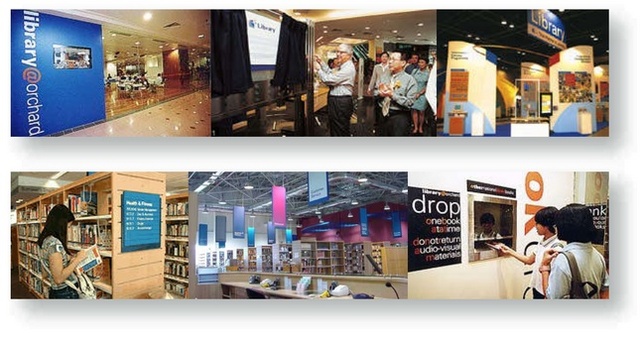
One of our largest clients was the National Library Board of Singapore. The national library system serves the entire nation of Singapore (with a population nearing three million) and was, at the time, comprised of over 24 libraries, including one national, three regional and 19 public libraries. Although a small company, WordMakerDesign contracted with NLB to produce a variety of communications for them in all matter of corporate and retail communications, ranging from corporate branding strategy through product delivery. Projects included brochures, fliers and program notices for library patrons, program and service identities, trade expo convention booths, interior wall murals, and environmental directional signage for lobbies, book shelves, drop boxes, check out areas, staff offices, doorways, and external building markers. The most extensive project was to develop the visual image of the library to the public through the development and implementation of a thoughtfully and comprehensively designed, unified signage system.