30 November 2010

Signage: The Good, The Bad, The Ugly

Above: nine panels of a PowerPoint presentation, using images from the movie The Good, The Bad, & The Ugly to highlight examples of library signage. 

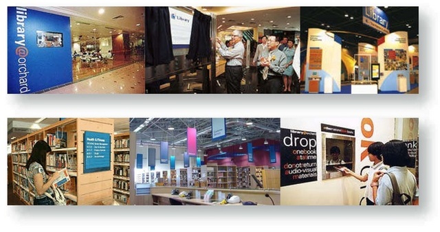
Thinking about clear, cohesive signage as part of my work in Singapore definitely reinforced my appreciation not only for its importance and impact on the public, but also about the kind of materials which were technically important for durability and to thwart vandalism as well. Developing a unified and consistent approach to how a corporation’s signage program is presented not only reinforces the effectiveness of the signage itself, but also projects a perception of a company’s level of attention and service to the public. Signage is just one aspect of the total package used to project the corporate image out into the public.

Where I work now for the Alachua County Library District in Gainesville, Florida, signage is everywhere at the 11 library branch locations. You could even honestly say that signage has run amuck for them. There is all kinds of signage, ranging from essential way-finding signs, all the way down to how much a copy machine costs to use. Much of the essential, legitimate signage is old and in need of being freshening up. Other signage is placed in locations and in such hap-hazard ways that they leave a person scratching their head, perplexed as if to say: what were they thinking? High on this list include signs produced by librarians on-the-run, responding to short-term problems with short-term solutions, often using whatever rudimentary computer text and decorating skills they have, then printing 8.5x11 inch signs out of the office printer—or worse yet—hand writing messages onto torn paper or Post-It notes. Occasionally, these solutions wind-up becoming semi-permanent fixtures in the public space. I cringe at the thought of all of these whenever I encounter them. Often, the word “tacky” rushes to my mind.

On the flip side of things, the library's display signage for collections, events and services is warm and welcoming in a home-made “crafty” sort of way (because that is essentially what it is—a lot of coloured butcher paper, print-outs, and Ellison cut stencil lettering like you might imagine being used on elementary/primary school bulletin boards. For better or worse, our library certainly won’t be mistaken for a high-end, slick retail space. 

I wouldn’t mind raising the aesthetics bar higher, however, so I have been compiling a selection of photos taken of signage throughout the our Headquarters Library branch to use in a PowerPoint presentation to highlight what I think examples of good, bad, and downright ugly use of signage has been in our library. I included bulleted discussion points of what makes signage effectively good, and what makes signage poor or ineffective. Over time, I plan to expand my appeal beyond my empathetic supervisor (with her assistance) for a more unified, cohesive branded approach to the use of signs throughout the library district.

Now, for most people, the design and development of informational signage is understandably boring. Either they don’t design or create signs, or they have little creative, technical, or material experience with the process of sign making. This is understandable, so in an attempt to liven up my presentation, I incorporated it into a tongue-in-cheek movie theater theme, featuring images of an indoor movie theater and screen, followed by images borrowed from the movie The Good, The Bad, & The Ugly. 

The title just worked so perfectly, I thought, and that is how I divided up my presentation, with bulleted points on each slide to reinforce the themed category I place them in. This presentation may never see the light of day; it might be revamped, toned down, or made more palatable to corporate viewing tastes. But for now it has been fun to work with and I think if nothing else, a way to open the eyes of the few who make decisions about the brand experience of the library either through signage directives or purchasing.


29 November 2010

My Singapore Library Connection

I recently noticed that one of my blog viewers was located in Singapore. What a coincidence! I thought, because my first experience designing for libraries actually occurred while I worked in Singapore as design director of a small creative design and branding studio called WordMaker Design, Pte Ltd.


WMD had been started by K.C. Chew about 25 years earlier as a typesetting shop that eventually took on more and more layout and design work. Over the years, WMD established itself as a bona fide and notable design firm that produced a wide range of award winning print design work for clients of all industries and levels. By the time I arrived at WMD’s historically quaint shop house on Ang Siang Road in Singapore’s Chinatown district in late 1999, K.C. still owned and operated the studio, but had given daily management duties to a very fine and capable young manager, Edi Fung. Under K.C. and Edi’s efforts, WMD built up a stable of clients ranging from small local enterprises to top 10 multinationals listed on the Singapore stock exchange.


One of our largest clients was the National Library Board of Singapore. The national library system serves the entire nation of Singapore (with a population nearing three million) and was, at the time, comprised of over 24 libraries, including one national, three regional and 19 public libraries. Although a small company, WordMakerDesign contracted with NLB to produce a variety of communications for them in all matter of corporate and retail communications, ranging from corporate branding strategy through product delivery. Projects included brochures, fliers and program notices for library patrons, program and service identities, trade expo convention booths, interior wall murals, and environmental directional signage for lobbies, book shelves, drop boxes, check out areas, staff offices, doorways, and external building markers. The most extensive project was to develop the visual image of the library to the public through the development and implementation of a thoughtfully and comprehensively designed, unified signage system. 

27 November 2010

6th Annual Teen Art Show

In October, youth services hosted the 6th Annual Teen Art Show. The library promoted the event by way of multiple posters distributed to area schools and the library branches. It uses the winning artwork from the previous year to promote the current year's event, and has a few age group categories to divide entrants into. I also used enlarged portions of last year's winning art as the border in each element.

Items used in promotions of the event included:

400 quarter page handbills
19 8.5x14in. legal-sized signs distributed to area schools
3 large format posters, enlarged from the 11x17in. sign 
1 library homepage web ad
1 newspaper ad
2 on-site 8.5x11in. "Vote For" signs
48 artwork labels (one for each entry)
48 Teen Artist entrant shirt labels
48 winner medallions for winning entries
3 contest judge ID lanyard badge labels
3 8.5x11in. pages for contest rules, instructions and applications

24 November 2010

Library Card Month Display, September 2010

Speaking of buildings, back in September we created a bulletin board display near the reference desk of the Headquarters branch library. This display was used to promote Library Card Month. 


On our district’s patron library card, we have a picture of the Headquarters library, but we have also have ten other branch buildings (which will become eleven in the near future). At one time, not too long ago, each branch library had a watercolour painting made of it. For the display I used printouts of these watercolours placed in polaroid-style frames to show all the different locations the library district has branches, and then used a giant scaled-up version of a library card with the Headquarters library on it (as see top image above).


I covered the bulletin board with two long sheets of light gray butcher paper, then pinned each branch polaroid watercolour in a row across the top. Large headline printouts were also pinned into place, and in the center two giant cards—each 32x20in.—were placed, one with the back view showing and one with the front view. 


Normally, with images needing to be printed larger than our office copier, I would print them out on our Hewlett Packard DesignJet 800, but it was in need of some repairs at that time, so I had to print out scans of the two giant cards onto four 11x17in. tabloid-sized pages for each card by tiling the images, then trimming each page and splicing the pages together. Once trimmed to size, I double-side taped them to quarter inch foam core board. You can see in the lower right image how big the card was compared to my hand as I worked on it.


I liked that the cards were thick, as if they were really enlarged cards. That added a little dimension to them, but I really wanted them to pop off the wall even more, so I hunted around for something I could use to raise one card off the wall even further. We didn’t have any styrofoam and I didnt want to stack multiple layers of cardboard together for fear it would make the card too heavy to hang, so finally I decided on double-side taping four empty scotch tape boxes to the back of the card I wanted to have lay overtop the other. This was really dimensionality on the cheap! The raised the upper card just enough to clear the lower card and gave it a little “levitation” off the display wall. I was really concerned that the tape would eventually fail and that I would walk by a couple hours or event a day later and find it on the floor. Amazingly, it never did and stayed where I placed it for the full month!

23 November 2010

Mundane Scanning for Tallahassee’s “Taj Mahal”

Some services provided by the design department are strictly mundane fare. Things like making employee name badges, bus passes, stationery items, generic certificates, scanning, burning CDs, laminating...you know, nothing to write home about. But occasionally, even a mundane project can find its way into something more colourful, such as a scanning project I was requested to provide by one of our librarians. 

Our librarian was contacted by someone asking if we could provide a 1200dpi high resolution digital image of two different historical photographs (see http://heritage.acld.lib.fl.us/1001-1050/1041.html and http://heritage.acld.lib.fl.us/1101-1150/1134.html from our Heritage Collection) which would be included in the décor of the new District Court of Appeals building in Tallahassee. The building, was nearing completion and would be using over 350 historical photographs from the First District which runs from Pensacola to Jacksonville and down to Cedar Key on the Gulf Coast. Photos would be enlarged and cleaned up, sepia toned, captioned, and framed with archival glass, etc.  Of the two photos we provided, the parade photo would go in a collection titled “People & Places of the First District.” The tractor image would go in a collection entitled “Florida Works”—appropriate because the FDCA covers workers compensation for whole state.

The development as a whole, however, wasn't without its share of political notoriety (as is the case with most public offices it seems). With that in mind, below is the extended discussion beyond my part of providing a couple of digital scans for a government project:

INFORMATION ABOUT THE COURTHOUSE THAT IS USING TWO OF OUR HERITAGE COLLECTION PHOTOGRAPHS:
A brand new $48 million home for the 1st District Court of Appeal in Tallahassee has become a target of criticism from judges in other cash-strapped courts and of political candidates who say it is an example of back room deals and a masked budget process.

Rendering of new $48 million District Court of Appeal building, Tallahassee
“This building is a perfect example of everything that is wrong and broken with Tallahassee,” Democratic Chief Financial Officer candidate Loranne Ausley said Tuesday standing outside the large new, suburban court building, still under construction, but finished enough to know that it dwarfs the old quarters for the court.

The building, scheduled for completion in November, was the subject of a lengthy article Monday in the St. Petersburg Times, which reported that each judge will get a 60-inch LCD flat screen television, a private bathroom with granite counter tops and a kitchen. The building will also have a gym. Meanwhile, judicial circuits around the state have been forced to lay off employees and cut costs at every corner.

Former Florida Supreme Court Justice Fred Lewis told the Times that when a last minute amendment was attached to a transportation bill authorizing the bond issue to pay for the building, he was taken completely by surprise because the negotiations had taken place behind his back.  He said he also asked Gov. Charlie Crist to veto the bill.

Crist told reporters Tuesday morning that he didn’t remember a specific veto request on the bond issue, but did answer a question regarding whether he would have done anything differently if he had known about the bond authorization.

“I wish the money had been spent more wisely,” Crist said of the DCA building.

The appropriation was buried in a last-minute and little-noticed amendment to a 142-page transportation bill approved on the last day of the legislative session in 2007, the Times reported. Sen. Victor Crist, R-Tampa, who sponsored the amendment, said then Senate President Ken Pruitt had wanted it, though Pruitt denied that. Crist said the project was also sold to him as a collaboration with Florida State University – which will get the old 1st District Court building in downtown Tallahassee. The old building was rent-free for the courts. The Times reported that the new one will cost the courts $1.7 million in rent that will be paid to the state Department of Management Services. One Hillsborough County judge quoted by the Times, called the new building a “Taj Mahal.”

Ausley held a press conference on the sidewalk across from the site and unveiled part of her campaign platform, promising to clean up “pay-to-play politics” and to push for the return of Community Budget Issue Requests, which allowed lawmakers to request specific projects for their districts. When the Legislature allowed CBIRs, they were detailed on publicly-available forms that included information on who actually asked for the spending project at the local level.

Senate President Jeff Atwater, who is Ausley’s Republican opponent for CFO, and former House Speaker Ray Sansom didn’t allow for community requests, citing the economic downturn.

However, projects pushed by certain lawmakers have continued to make it into the budget, just without any publicly available information about who is pushing the appropriation. Returning to the CBIR system would add transparency to the budget system, said Ausley, a former House member.

“There is no transparency in the budget process,” she said.

A spokesman for Atwater’s campaign did not return a phone call seeking comment.

By Kathleen Haughney
The News Service of
Florida


19 November 2010

Author Event: Naiad Press

Hey, while I’m on a roll about author events, I might as well catch up with a couple of my remaining yet-to-post events. Above are the event collaterals for Naiad Press. Founders Barbara Grier and Donna McBride came in October 2010 to discuss the history of their press line--now closed dow--and its 15,000 strong collection of gay and lesbian subject matter donated to the San Francisco Public Library.


Publicity items designed for this event included:


1 23x34in. large format poster (scaled up from the tabloid-size sign)
Multiple 11x17in. tabloid-size signs 
1 ACLD homepage web ad
1 newspaper print ad, black/white
20 pages of quarter-page handbills (4-up on one 8.5x11in. sheet...seen here in its untrimmed state)


The initial challenge for developing a strong visual image for this series began with the photo provided of the authors. If you could only see it. They were standing semi-outside in one of those “Florida rooms” with a screened in porch mesh behind them, looking out on an open wooded lot of some kind in the background. The lighting was dull on their faces in the foreground, then bright and harsh in the background. The low-rez image was poorly lit, blotchy in colour, and hey, poor Barbara had a neck-full of Donna’s intrusive elbow! If I had been Barbara, I would have jabbed Donna back into her side with a good, hard elbow of my own! Everything about the image was less than desirable. It’s unbelievable sometimes what people use to promote themselves. I mean really, is this the best they had to offer?


But I took a cue from the Naiad Press logo, noting its high-contrast styling. I decided to knock the ladies out from their photo to get rid of all the extraneous clutter and focus on them, then saturated the colour and posterized them to whatever extent I could to minimize the poor lighting and colour levels of the image. Using the momentum provided by the image itself, I just pushed it a little further down that path, “making lemonade out of lemons,” as they say. The posterization of them would make an effort to approach having an association between them and their high-contrast logo.


To liven it up more, I added a pink and cyan bar to either side of the purple/black logo. Pink would be an allusion to women, cyan to men, and the colours mixing together would constitute the purple background for the logo, thus, a subliminal suggestion of the coming together of women and men. The only colour lacking from the spectrum was missing was a green, but you know what? You can make a rainbow without literally showing a rainbow, if you know what I mean (rainbows being the chosen symbol of gay pride and community). I’m sure few people picked up on it, but it was there, nevertheless.


The end result was a more colourful, open, and airy presentation which I’m sure was more striking than what the authors would have ever envisioned, all things considered.

18 November 2010

Author Event: unspOILed


In September 2010, the library hosted an author event comprised of multiple speakers who had traveled the Florida region and subsequently wrote about the ecological effects of the British Petroleum oil platform disaster which leaked millions of gallons of oil into the Gulf of Mexico, as well as other ecological challenges the region faced.


To publicize the event, the library received the "unspoiled" program logotype and a high contrast image of a child squatting on the beach with a toy boat. I sourced for an image of water--not any water, but water with an oily sheen. Ideally, I wanted oily water so strikingly colourful that it reminded me of a "mood ring." I eventually found a couple of images and selected a tiny portion of a larger image to use in my designs.


I also incorporated a "wave" into the uppermost aspect of the black field that I reversed the body text out of. This wave became a line that I could write the names of the participating authors on.


The full program of design items included:


1 23x34in. large format display poster
Multiple 11x17in. tabloid-sized signs,
Multiple quarter-page handbills
1 black/white newspaper ad
1 ACLD homepage web ad
2 online newspaper ads of different sizes

Author Event: MD Abrams

My first Author's Event collateral exercise took place in August for local mystery writer, MD Abrams who placed her stories in and around the north Florida region. The only item we had available to us were covers of her books and her bio portrait. 


I wasn't keen to use any of those images as the main focal point of the publicity collaterals. Instead, I wanted to have one image that evoked some general sense of mystery that lurked in the nearby shadows—almost within reach of discovery, but not quite there yet. After searching for images of trees, prairie grass, and sunsets, but not finding anything I liked, I decided to render my own image in Adobe Illustrator.


The image became a backdrop for the reversed out text; yellow brought attention to the event location and Abrams' three books. One book had won an award and I wished I had a picture of whatever the award was, so I tracked down the organization that awarded her and got an image of the bronze medal that her book received. I thought this would be a great focal point and way to emphasize her book's success.


The exercise called for the following items as seen above:


1 23x34in. large format poster (same proportions used for 3 11x17 tabloid-size signs)
20 8.5x11in. pages of quarter-page colour handbills
1 newspaper print ad, black/white


Once the poster was placed on the bulletin board in the library, I felt like something more enticing needed to be said about who the author was and a more in-depth synopsis about her books. So I pulled together a small bio page with Abrams' photo on one page, and on another page I printed out a synopsis of each book that I culled from a variety of reviews and rewrote to reflect what I felt the most enticing backstories were to generate interest.


I learned from the library program director the week after the event that Abrams complimented the advertising and display graphics as being the best she had ever seen (I'm sure she meant regarding promoting her own work, not of all time). I was pleased that she thought so highly of the work and made a point to have the library program director offer the poster to her a few weeks later. Abrams declined the offer, so who knows...maybe the work wasn't so great after all!

17 November 2010

Author Event: Paul Reyes


Right, clockwise from largest: a tabloid-sized poster that can be reproduced at a larger scale for a large format poster, a ACLD website homepage ad (leaves room at top for a page ticker display), an 8.5x11in. page with four announcements on it that will be trimmed to become four handbills, and a black/white newspaper ad.


Often sponsored by the Friends of the Library, the library has an active schedule for author events which I produce event collaterals for. The usual items typically include the following:


1 34x43in. large format poster
2 to 15 11x17in. tabloid-size signs
200 8.5x11in. quarter page handbills
1 ACLD website homepage ad


Occasionally, I’ll produce additional items such as:


1 colour and/or black/white newspaper print ad
2 different sized newspaper website ads


Images are typically provided by the speakers, their agents, or by sourcing images via the internet. One of the challenges of getting images from people is that they don’t realize how poor the quality of a 72dpi image is. Good enough for reproduction on the web at smaller sizes, images of that dpi—unless it’s dimensions are very large—are usually too poor to translate well as a print image, resulting in a pixelated appearance. This was the case with this author’s profile image as well.

Library Monthly Event Signs, December 2010


Above is a selection of December 2010 event schedule signs for the ACLD library branches. Tabloid-size pages are to the far right and left, and two 8.5x11in. signs in the center (horizontal for Archer, vertical for Newberry).


I was interested to produce a general holiday visual that didn't single out or give preference to any particular religious group, nor did I want a weather visual that was too far removed from what one would normally expect from a Floridian winter. I also wanted something sophisticated and not cartoony, so I was thinking cool, soft colours, maybe a little out of focus, light, subtle, and elegant.


Snow as a visual was too extreme for a Floridian winter, but a frozen orange or frost would be a good, close alternative. I couldn't locate a frozen orange, unfortunately, but I did find this background image—a shot of frost on glass. It had a nice feathery effect which reminded me of birds in flight. This worked well with my desire to find a non-specific icon for the season—an image of a dove of peace. As a sign of hope and good will, the dove was a symbol I wanted to use that could apply to the multitude of celebrations—religious or otherwise—that occur during the traditional holiday season and beyond to the new year.

16 November 2010

Library Monthly Event Signs, November 2010

Every month I create a series of event listing bulletin signs for all the libraries. Some libraries have only a few events each month, while others have many. For the branches with few events, I can list their full program of events on a single 8.5x11in. page; for others, I might use a legal 8.5x14in. Most, however, require an 11x17in. tabloid-sized page, and certain branches will even fill up three tabloid pages with their full range of events. 


My aim is to develop a consistent and cohesive looking theme to this series of signs. I because the amount of event text will vary from page-to-page, I've decided to not apply a standard design template to each page. Instead, I work with the same design elements, but place them in different areas and orientations to work within the spaces that are naturally created by the content. I work images into white space gaps, or I wrap text around images. 


I prefer a certain airy-ness over clutter, but I also have to squeeze in a lot of content at times, so it is a balancing act, and some pages are more successful than others. By-and-large, however, the end result is a series of event signs that hold together well from branch to branch within the design theme used. I was particularly pleased with this series for November. A few of the many pages created are shown above. 

Building & Interior Design for DOK Library, Delft, Holland

I came across an interesting link today while googling for my very own blog. The other link was to Jenny Levine’s blog entry dated 19 March 2008, entitled “Visiting the Most Modern Library in the World” and part of  “The Shifted Librarian” blog. This entry mentioned certain aesthetic aspects of a library design in Delft, Holland.


http://theshiftedlibrarian.com/archives/2008/03/19/visiting-the-most-modern-library-in-the-world.html 


If you click on any of the very tiny photos on the blog, you will be transported to where you can view the images much larger at the linked Flickr page album here:


http://www.flickr.com/photos/dokdelft/sets/72157608201563435


http://www.flickr.com/photos/shifted/sets/72157604142377648/with/2341498809


Makes me want to take a trip to see it for myself!
Additional links and press about this concept library:


http://www.infotoday.com/mls/mar08/Boekesteijn.shtml

08 November 2010

Gala Design Items

The Gala design elements came together 
quite well, however, some table signs bowed, 
due to using too thin of a paper stock (note
circled area above).
The annual Authors' Gala event, held 7 November, 2010 went off very well. The design collaterals held together quite nicely as well and provided a clean, cohesive presentation wherever seen.


I saw for the first time the printed version of the banner which was hung on the front wall behind the stage where the band played and along side the speakers' lecturn. It looked very good. The printing company called me earlier in the week to see if I had a higher quality foundation logo. The one used was a low-rez, 96dpi image which, when enlarged, they feared would become too pixelated. I agreed; most print items should start with a 300dpi image, but the 96dpi image was all that I had and referred the printer to the Foundation to see if they had a more suitable one.


I later talked with one of the Foundation members and she said that the printer ended up recreating the logo for them, a charge of $55. That wasn't bad at all, considering that the printer was actually donating the work and materials to the Foundation for the Gala--a cost worth $50. So in the end, the Foundation only had to pay $5 for the cost of the two combined and will get a better logo they can use from here on out.


The only item I was not too happy about was the integrity of the table signs. I noticed that some had begun to bow and realized that those that did were probably the ones that I printed on the 110# card stock, the same stock used for the programs and Save The Date cards. 


I thought these would hold up better because they felt about the same thickness as the large tent cards that were purchased to be used for these signs originally. Once I had started printing on the Avery-style tent cards, I had a slight difficulty aligning the artwork up with the pre-scored bevel on the tent card paper. One can never quite know for certain how the office copier will grab the paper as it runs through the copier, so there is always a little variation in where the resulting image rests on the paper. Plus, printing on front/back also adds to the difficulty to get both sides in perfect alignment with each other AND the bevels on the paper as well. Because of that, I had switched to the 110# card stock to avoid the bevels. Unfortunately, once seen at the Gala, it appeared that table signs printed on the 110# card stock were the ones to bow, while the Avery-style signs did not. Lesson learned for the future. Perhaps next time use the Avery-style card stock, but look for one without the bevels.


And to top it off, a nice note came in via email the next morning from the Foundation development chair afterwards:


Hi Scot:

Just a personal note to let you know what a joy it was to work with you on the gala projects.  You handled everything in such a timely manner and took a special interest in the event.  I'm glad that you were able to attend and to bring your lovely wife as well. 

Hope to see you again soon.
Laura 


01 November 2010

Annual Author’s Gala Evening Events Program


The Foundation's Annual Gala Evening Events Program, front/back, printed on the Xerox Workcentre 7345 office copier, and hand-trimmed to remove copier unprintable border area to achieve bleed appearance.


Size: 8.5x11in., trifold
Paper: 110# card stock
Binding: trim and fold
Quantity: 250

Annual Author’s Gala Fundraising Event Collaterals


One of the largest fundraising events for the library is the annual Authors’ Gala Event organized by the Alachua County Library District Foundation. This year, the Gala will feature crime/detective novelist Michael Connelly.

Design items related to the Gala included:

Left top: Gala Ticket (front), printed on 110# card stock (note table number circle at top right corner leaves room for hand-marking in the table number assignment). Quantity: 500.
Left center: Gala Ticket (back), features the highest level of donors.
Left bottom: Evening Program Guide (cover shown), an 8.5x11in. trifold brochure printed on 110# card stock repeats the horizontal format of the ticket. Quantity: 250.
Center left: an 8.5x14in. poster. Quantity: 20.
Center right: Evening Gala Tabletop Sign (for guests to locate their tables). This was held by a metal wire stand in the center of the table. Printed front and back on 3.5x11in 110# large tent card stock and trimmed to size. Gold, Silver, Bronze, and Green circles with table numbers inside them indicate donor level of contribution. Quantity: 30.
Right: 4.94x10.5in. colour newspaper ad (black/white version also made). Quantity: 1.
Not shown: a web ad for the ACLD website home page, a Save The Date postcard (Quantity: 100) and a 120x36in. wall banner that essentially resembles the program cover without the subordinate text and moved the Foundation logo to the same level as the event display text. Quantity: 1.