Showing posts with label monthly event signs. Show all posts

15 October 2012

Library Marketing Templates... = Design “Magic”?

Above, the full range of monthly event sign template sets. Each branch library received
four coloured choices to select from for display of their monthly calendar of events.
For branches that required two sizes of signs, a template set for each size was created.
Unbelievably, I've been away from Library Graphic Design since the middle of August. Now, here it is the middle of October. Believe me, it hasn't been because of lack of work to show. No, quite the opposite in fact. In the 21 days of work immediately after my last post I'd completed 97+ projects and had more pouring in by the day. In the month of September, I tread the proverbial waters with over 80 projects in the works, and in October over 90 projects were in production (and only a count of projects, not including components of projects, for which one example is shown above).

This kind of project quantity has led to the discussion of how such a level can be sustained without burning out the single designer generating the creative for it. One of the more palatable options was to put the power into the hands of people wanting publicity materials when the designer could do no more. By this I mean create basic document templates that any staff member could use to expound upon to develop specific marketing materials when those items could get by without requiring the creative skills a designer. 

The template is a document that places important, standard elements into a format that becomes the base design that should be maintained for purposes of brand consistency and recognition from one project to the next. Having these standard elements already in place diminishes the chance that they will be inadvertently left off by the subsequent user of the document, while leaving room where users can place whatever additional elements they want in order to make each project unique.
One set of branded marketing materials for one of the 12 branch libraries
shows the uniformity of design that carries through from (left to right):
11x17 inch sign, 8.5x11 inch sign, quarter page handbills, and book cards.

To make these templates available to all staff, however, means the designer overseeing consistent brand development first has to create them. And in order to develop the entire complement of no less than eight branded documents specific to each of the 12-branch library system, 204 individual final documents had to be delivered to the branches. And in order to do that, the full process involved creation of 612 separate files. So initially, the effort to reduce work overload ironically actually significantly contributed to a work overload. Few people realize this is the process required as part of a holistic branding effort by the designer to provide the one or two materials that any single individual user might utilize on the rare occasion they need it.
This example demonstrates how one 8.5x11 inch page 
renders three book cards for one of the 12 branch libraries.

Once in place, however, one hopes these templates will be used by the non-design staff to help reduce work primarily done by the designer. It also gives people who perceive a template as meaning the work is virtually finished and "all you have to do is..." an opportunity to experience and appreciate first-hand for themselves what that "all" actually involves in the remaining development of project. The "magic" patina of a template will quickly wear off to reveal the reality of the remaining content development, information/presentation judgment, and production work left to be done before it reaches the hands of the public consumer.
This example shows how one 8.5x11 inch page renders four
quarter page handbills using the branded design template.

In my case, the process of developing branded marketing materials involves creating each design using the layout program InDesign, then saving the work as an image and importing it into a Microsoft Publisher layout. Creating the branded content as an image helps remove the possibility that it would be altered—or worse, left off the marketing piece entirely. The collective group of documents are then placed in folders on an intranet server for the appropriate branch staff to have access to. And if someone accidentally deletes or otherwise mucks up a document, I can redistribute a copy of the master document that I retain.

The drawback to releasing templates to non-design staff is that quality control is significantly diminished. Templates rely on others at every possible level of technical experience and visual savvy to exercise good judgement on the quality and quantity of visuals and information presented on the documents. Rarely would these documents be submitted to the design department for review and comment. Instead, the materials would simply appear wherever they are locally created and corporate brand managers would just have to hope for the best.

After the fact, perhaps there could be opportunity for review and give advice, but it is unlikely since these items would rarely be sent to the marketing department unless otherwise requested or required as part of the process. This would be a decision left to a marketing manager to decide on its importance for publicity and brand management. Additionally, with an ever-changing workforce, educating staff who might potentially create marketing materials would become a never-ending exercise in itself that still couldn't guarantee premium results. It would also replace the workload of one kind with the workload of another, which wouldn't necessarily provide the solution initially sought (to reduce the workload of the designer). At that point, the designer would effectively become a design manager—an additional role and scope of work not initially accounted for.

At least with the branded content consistently formatted from one piece to another, this treatment will aid in building brand recognition and provide actionable information (contact information and website address) for viewers to refer to whenever unique design and information is unclear.

01 February 2012

More Black History Month Library Event Design Collaterals

The Library website banner web ad as it appears online.

Newspaper print ad.
In an earlier post ( Library Events for Black History Month 2012 ) I unveiled my design concept for a Black History Month promotional marketing theme, "Celebrate Black History Month: Make The Dream Real." The headline is followed by a tagline that states: "A Dream Worth Having Is A Reality Worth Working On."
One of the 13 branch event listing pages.
The marketing concept follows Dr. Martin Luther King Jr.'s "I Have A Dream" speech and call to action. Likewise, the thrust of this campaign is to also say: "Don't just dream. Work towards it through action. Make the dream real as best you can."

I chose a simple, yet striking photo of the recently erected Martin Luther King Jr. memorial in Washington DC as the focal point of the design concept. A selection of other historical photos of people and events related to the American civil rights movement are also included in an orange stripe that encapsulates the aforementioned tagline above.

The design has been applied to a variety of print and online collaterals in an effort to promote the Alachua County Library District's celebration of Black History Month through specific programming events and general awareness displays.

The same image above was used for quarter page
handbills, and two different sign sizes. 
In addition to the collaterals shown in my earlier post ( Library Events for Black History Month 2012), post highlights a few more applications of the design to additional collaterals:

A youth services A-frame display shelf sign; an 8.5x11 inch print advert in the Black College Monthly magazine; an online blog icon; a 11x17 inch monthly event listing for most of the 12 branch libraries, each with their own specific listing of events for the month of February on the sign; a series of signs and handbills for a specific annual event called: Outside the Book; a simliar set of 11x17, 8.5x11 and handbills for another event: Music & Dance, and, a general awareness newspaper print advert.

Creating a single design theme and treatment helped to provide a uniform and consistent appearance and message to an entire range of programming events. It also helped to reduce the design department workload from attempting to create an entirely different creative concept for each separate but holiday-related program.

A-Frame bookshelf top sign.

02 November 2011

Library Monthly Event Signs, November 2011

November event posters utilized a variety of layouts based on the same theme.
It's autumn again, and also time for another set of monthly event listing signs for the ACLD branch libraries. I typically begin working about two to three weeks in advance of when I want to get these signs to the libraries. I pull event listing text from the library website calender and repurpose it for the printed signs. Along the way, text is edited and styled, clip art and/or public domain photography is used for visuals, then proofs are sent out to branch and program managers to review for correctness. A couple rounds of edits are allowed, then once approved, printed out and sent via our Library courier team to each branch that uses the event listing signs (three of the 11 currently do not due to lack of events or a preference to create their own). 


The entire production process is pretty smooth, albeit a little time consuming. The end result, however, produces a common styling throughout the library district when seen (with exception to one non-compliant branch that creates its own).

12 October 2011

Library Monthly Event Signs, October 2011

October event signs marked a transitional stage in the arrangement of event lists
 from "Recurring" and "Special" categories as seen in left and center columns--
to groupings based on ages--as seen in right column.
Monthly event signs created for October marked a transitional period in their arrangement of information. On previous monthly signs, events were divided into two categories--Recurring Events and Special Events--then arranged in order by listing events with multiple dates first (i.e.: "Mondays, 1pm", etc.), followed by events with only one listed date ("Sept. 2, 1pm") listed after. All events indicated what age group they were by displaying age group categories in a specific colour (for example: TEENS, and ADULTS). 


Patrons at at least one branch library indicated that instead of having to look through all the events collectively they would find it quicker and more convenient if events were grouped together in their own age group categories--for example, if all children's events were separated from other age group events.  Ideally, all events for each age group would hold to one page, made possible by cutting event descriptive text to make that possible. This required more editing work on my part, but the end result worked well. I grouped all the same-age group events together, then created a seal icon of a specific colour that contained the age group name. I also used the same seal colour for event titles related to those age divisions.


When needed and where possible, additional art elements could be added to compliment a standard nameplate design at the top of the page that identified what library branch the sign was for. As always, some branches required larger, 11x17 inch signs, while smaller branches with fewer monthly events could make do with 8.5x11 inch signs. Ten branches would receive two signs each for posting inside their libraries.


During this transition, the age grouping effort was only produced for one branch. The result would be evaluated by the branch librarians and later a discussion between branch managers and marketing would help to determine how to best streamline the content delivery during of the production cycle.

02 September 2011

Library Monthly Event Signs, September 2011

September event signs feature back packs and bags for toting school or work materials.
Ahh, here we are at last...the beginning of September. This is the time of back-to-school for children and the time of back-to-sanity for parents who can finally breathe a big sigh and carve out some time for themselves. With the burgeoning workload both students and parents alike have to keep themselves busy, they often find themselves toting portions of it around from place to place. Therefore, this month's theme features back packs and bags that we take to school or work. I'm sure the will be filled with plenty of books!


Nine of our 11 branches make use of these 11x17 or 8.5x11 signs, each sign lists the events specific to a respective branch. Because event and programs vary from branch-to-branch, some branches only require one 8.5x11 sign, while others might require anywhere from one to three 11x17 signs.


The process takes about 3 weeks, first sourcing for themed image ideas using free public domain photos or illustrations, culling the selection of possibilities down to a usable short list, and then working out the mechanics of arranging text over/within those images. By way of example, in these seven signs alone, there are 17 unique public domain photos in use. There is also four illustrated items as well. Modifications to both images and text are made during the edit cycle; afterwards two copies of each sign are printed and distributed to each branch. In all, I worked with six different bags and delivered about 20 unique pages to each branch.

04 August 2011

Library Monthly Event Signs, August 2011

11x17 inch signs are created for each of the 11 branch libraries.
It's time again for the next series of monthly event signs for the 11-branch strong library district. Being as the American Library Association's National Summer Reading Program was still in full swing, I utilized the associated artwork offered by the ALA on the monthly signs. It saved me a lot of time otherwise used for concepting and image sourcing. I developed variations based on the two main styles as shown above. Most branches received 11x17 inch signs; two branches that have fewer programs to promote received 8.5x11 inch signs. 

01 July 2011

Library Monthly Event Signs, July 2011

July's event signs featured images of people combining travel with technology.
Summer is upon us. School is out, families are on vacation, people are more on-the-go than ever during this time of the year. This doesn't mean that while you're away you'll be unable to visit your library, however, because we have been developing our ability to come with you wherever you may be or go. 


Our summer issue of THINK... newsletter / program guide reported on the library's use of apps for mobile devices that can provide convenient virtual services to patrons both in and out of the physical library. A couple of the images used in that issue were repurposed and used for this month's event signs, and supplemented with two additional ones. Each image features a person using their mobile device (i.e. a smart phone) to stay in touch with the library as they traveled. To help direct the viewer's eye to the technology aspect of the image, a "doughnut-shape" was made around the smart phone, allowing that area to be shown with complete clarity, and having the bulk of the ring thickness serve as a ghosted background to help text on the sign be read more legibly from the rest of the image. I really like the fact that these signs are posted about the same time that the THINK... newsletter is distributed, as well as the QR code signs. Each element compliments and reinforces the other, making the association between travel and technology at the library all the more powerful.


Due to the differing number of events each branch has, each received its own custom event sign or multiple combination of thereof. The images above show the full complement of images, and for four different branches of our 11-library strong district. In all, 22 event signs were distributed to the branches. Most branches receive 11x17 inch tabloid sized signs as shown above; two branches with fewer events receive 8.5x11 inch signs.

31 May 2011

Library Monthly Event Signs, June 2011

June event posters featured people participating in a variety of outdoor activities.
Now that the rains of April and flowers of May have passed, we move into Summer and encourage people--especially children--to enjoy being outdoors. I developed a series of 10 monthly event calendar signs by sourcing for public domain photos and then applying the June listing of events from each of our 11 branches to one or more of the images. Each branch received its own combination of signs. Eight branches require from one to three pages of these 11x17 inch signs; two branches receive a single 8.5x11 inch scaled down version, and one branch--which has no events due to its small size--doesn't receive a sign at all.


You might think that encouraging people to get outside and away from the library would go against our best interests as a business, but that's not entirely the case. Aside from wanting to encourage well-rounded personal growth that many activities and experiences provide, the library is slowly expanding its services to take place in both the virtual as well as the real world. You don't have to physically walk into the library like you once did to enjoy some of the services the library provides. More and more, library services are being offered via computer, smart phone, and other digital devices. Online websites offer all the essential information to patrons, plus provide accessto virtual databases and downloadable e-books. Our library is even on the cusp of beginning to use QR Codes for directing patrons to information and services. Just take a snapshot of a QR Code with your smart phone and information will be displayed in hand or downloaded to your service (iPhone or Android).


With innovations like these, the library can afford to say: "Hey go on and enjoy the great outdoors. And when you do, remember that the library is closer than ever before, no matter where you go."

16 May 2011

Library Monthly Event Signs, May 2011

As a follow-up to last month's "April Showers" monthly event signs, I completed the phrase visually with a series for "Brings May's Flowers." Each library branch received their own combination of signs that list May's recurring and special events. Above are a few of my favourites. Over 22 total signs were created and distributed.

01 April 2011

Library Monthly Event Signs, April 2011

April monthly event listing signs featured the theme of "rain."
You know the old saying: "April showers bring May flowers." That is the theme of that my April monthly event listing signs plays off of for the ACLD branch libraries. I sourced a variety of rain related public domain imagery and selected shots I felt would best lend themselves to being incorporated into layouts with varying amounts of text. Most shots had to have enough open space to allow for two full columns of text, other shots could be busier and allow for less. Once I knew what the text length would be required for each branch, I could try to balance those length requirements with a matching image. 


As it turned out, I was able to manage some consistency of images for each branch. For example, Hawthorne received the two white background shots seen above that used closed umbrellas (I particularly liked the pink duck umbrella); Millhopper received a series of three gray shots--one of a dark, cloudy sky, one of a black umbrella, and one of a dark water surface; Tower Road received two different red umbrella shots; Headquarters received three different coloured umbrella surface shots. These and other combinations of shots mix-and-matched their way around the complete 11-library district.


This month I also developed a new "container" shape to hold the two columns of text in, a shape that resembled an open book. I frequently use this element behind the columns of text and over the background image to help improve visibility of the text. I do this by making the shape lighter or darker so that the background photo doesn't interfere with the legibility of the words. I've used different container shapes before on other monthly event signs, but I think this one will have to become a standard feature because its book shape relates so perfectly to the notion of reading and libraries.


So now that you have seen what the April theme is, I bet you can guess what the May theme will be to complete the saying...yes?

02 March 2011

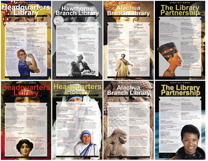
Library Monthly Event Signs, March 2011

A selection of the 21 designs used to promote library events in March.
March has been designated as--among many other things--National Women's History Month and International Women's History Month. So in order to combine both "national" and "international" designations, I created a set of 21 11x17 inch designs to promote library events in March under the theme tag line of: "Celebrating Inspirational Women In History."


I sourced images from a variety of sources, selected those that were of a high enough resolution quality to enlarge, and worked them into my design. Each branch received their own unique combination set of pages.


Who made the list? Here's the honourees, ranging from ancient times to the modern era:


Rosie the Riveter (used as a nod to "the every-day-woman" in general and more specifically to all those who pitched in during war-time era efforts and beyond), Susan B. Anthony, Catherine the Great, Nefertiti, Sappho, Mother Teresa, Cleopatra, Mae Jemison, Queen Victoria, Queen Elizabeth I, Margaret Thatcher, Madeline Albright, Joan of Arc, Florence Nightingale, Gloria Steinem, Oprah Winfrey, Marie (Madame) Curie.


There were plenty of other exceptional nominees worthy of the inclusion, but I had to stop somewhere. Sorry ladies!


Addendum: Have been receiving very nice feedback on the designs, including this from the Resource Manager of the Library Partnership: 
"WOW!!!!!! I love them….can we just keep you to ourselves over here at the LP…. J"


The Library Partnership's website is: http://redesignfostercare.org/library_partnership/index.htm

27 February 2011

For the Love of...February

With all that was going on with Black History Month and other promotions, you might have thought I forgot February was also the month of romance, right? Impossible! Why? Because this year, the city of Gainesville was ranked No. 9 in the United States by Amazon.com's "Romance Scale." How is this possible? Well, you'll just have to read it from them and an article in the local newspaper that reported on it. 


If you were as clueless as I was about this distinction, then you'll be happy to know that I was asked to create two posters to help bring attention to the notoriety and our own library statistics that helped to support the ranking. See below for yourself:

Two 20x30 signs were created to be displayed on easels in the library.
Not only that, but our youth services librarian hosted an event for teens to make Valentine's Day cupcakes. For this event, I created 8.5x11 signs and quarter-page handbills that looked like the image below:
Quarter-page handbills used a reduced image of the 8.5x11 inch sign. 
Of course, I also produce a series of calendar event signs every month, and for this month I developed signs that featured roses, candy hearts, chocolates, and cupid. Only one of our branches had a Chinese New Year event planned, so for that branch I even included a visual for that holiday--still within the "couple's theme"--by having a traditional Chinese New Year boy and girl. 
A selection of 11x17 inch monthly event signs--each library having its own custom variation on the theme.

04 January 2011

Library Monthly Event Signs, January 2011


Ahh, the new year is upon us. And with it, a new selection of monthly event schedules for the 11 ACLD branch libraries. I was looking for something that had a festive look, but one that was non-specific, so I went with a soft-focus shot of some holiday lighting. 


Some branches require multiple pages for their listings, so I took the single red image I selected and altered the hue to create additional green and purple versions. Then, when I needed a second or third image, I would use one of these and rotate or flip the image so that the lights appeared in different locations on the page. For pages that ended up with sufficient empty space--mostly where "Special Programs" were--I placed a star ornament that indicated "New Year 2011".


Most monthly event signs are tabloid-sized 11x17in, but there are a couple branches with very few programs. For these branches, I create 8.5x11in versions. Shown above is a selection of the tabloid-sized signs.


Print quantity: 30 total pages.


Happy new year!

27 November 2010

6th Annual Teen Art Show

In October, youth services hosted the 6th Annual Teen Art Show. The library promoted the event by way of multiple posters distributed to area schools and the library branches. It uses the winning artwork from the previous year to promote the current year's event, and has a few age group categories to divide entrants into. I also used enlarged portions of last year's winning art as the border in each element.

Items used in promotions of the event included:

400 quarter page handbills
19 8.5x14in. legal-sized signs distributed to area schools
3 large format posters, enlarged from the 11x17in. sign 
1 library homepage web ad
1 newspaper ad
2 on-site 8.5x11in. "Vote For" signs
48 artwork labels (one for each entry)
48 Teen Artist entrant shirt labels
48 winner medallions for winning entries
3 contest judge ID lanyard badge labels
3 8.5x11in. pages for contest rules, instructions and applications

17 November 2010

Library Monthly Event Signs, December 2010


Above is a selection of December 2010 event schedule signs for the ACLD library branches. Tabloid-size pages are to the far right and left, and two 8.5x11in. signs in the center (horizontal for Archer, vertical for Newberry).


I was interested to produce a general holiday visual that didn't single out or give preference to any particular religious group, nor did I want a weather visual that was too far removed from what one would normally expect from a Floridian winter. I also wanted something sophisticated and not cartoony, so I was thinking cool, soft colours, maybe a little out of focus, light, subtle, and elegant.


Snow as a visual was too extreme for a Floridian winter, but a frozen orange or frost would be a good, close alternative. I couldn't locate a frozen orange, unfortunately, but I did find this background image—a shot of frost on glass. It had a nice feathery effect which reminded me of birds in flight. This worked well with my desire to find a non-specific icon for the season—an image of a dove of peace. As a sign of hope and good will, the dove was a symbol I wanted to use that could apply to the multitude of celebrations—religious or otherwise—that occur during the traditional holiday season and beyond to the new year.

16 November 2010

Library Monthly Event Signs, November 2010

Every month I create a series of event listing bulletin signs for all the libraries. Some libraries have only a few events each month, while others have many. For the branches with few events, I can list their full program of events on a single 8.5x11in. page; for others, I might use a legal 8.5x14in. Most, however, require an 11x17in. tabloid-sized page, and certain branches will even fill up three tabloid pages with their full range of events. 


My aim is to develop a consistent and cohesive looking theme to this series of signs. I because the amount of event text will vary from page-to-page, I've decided to not apply a standard design template to each page. Instead, I work with the same design elements, but place them in different areas and orientations to work within the spaces that are naturally created by the content. I work images into white space gaps, or I wrap text around images. 


I prefer a certain airy-ness over clutter, but I also have to squeeze in a lot of content at times, so it is a balancing act, and some pages are more successful than others. By-and-large, however, the end result is a series of event signs that hold together well from branch to branch within the design theme used. I was particularly pleased with this series for November. A few of the many pages created are shown above. 

30 October 2010

The Interview Assignment That DID The Job


Above: the poster and web ad design concepts 
submitted during the application process.

One of the very first things I ever designed for the Alachua County Library District was an events poster and web ad before I was even hired. Part of the interview vetting process included asking potential candidates to design these two items. Images and text were provided to us to design with and certain instructions were included, for example: the poster headline (which we were to write ourselves) must include two colours of blue, and each designed piece must include at least two of the provided images. The images above were my entry for consideration.

Now, I must say that I really hate, hate, hate, doing assignments as part of an interview process. Doing a job interview assignment is akin to doing a creative concept presentation to a company to compete with others doing the very same thing in an effort to win a project contract. This practice is frowned upon by the design community because creative studios can spend a considerable amount of time and resources to generate a concept solution to the prospective client's brief non gratis when there are other paying client projects that need to be attended to as well. Then, after all that work has been completed for the presentation, all the prospective client has to do after seeing the complete selection of brilliant concepts is to not hire any of the firms presented and do it themselves or use a cheaper creative service. You may not believe it, but unscrupulous companies do this every day to designers all around the world. To combat this abuse partially, design firms often ask for a fee to pitch for a job in this manner. Unfortunately, individual job candidates don't usually have this as an option. After working hard to develop a professional portfolio, I believe the strength of my past work should speak for itself. But the way the library had their interview process set up, in order to get your portfolio shown you first had to leap through the flaming hoop of doing the assignment.

The ACLD design position was one I was really keen on having, however, so I swallowed my pride and did it. I had already been a volunteer in another capacity for the library for a year and four months by then, and I knew I could do much more for the library in a designer's capacity than with the services I provided as a volunteer. I liked the library and the people I worked with, so didn't want to jeopardize that relationship by throwing a hissy about their interview process.

In the end, it worked out. I did the “fantasy” interview assignment and was fortunate enough to be offered the job afterwards. But wait, there's more:  when the first month after I was hired came, I used my fantasy assignment solution for the real event calendar project and applied variations of it to all 11 branches of the library district. The bottom images were the result of my concept applied to the real project. In the end, I got paid for what I did, and they got what they paid for. I received a lot of compliments from branch librarians and managers for the look of the event calendars and everyone was happy. Interview/Job well done. =)


Below: the design concept later applied to the real project—a series of  tabloid, legal and letter-sized event calendar bulletins, each modified slightly for its respective library branch, based on content volume. Some branches had only a single page, while others had multiple pages, in which case the design allowed for a unique design for each page.