30 December 2010

Jammin’ In January II

Top: the poster. Bottom: the web ad.
A slow-down in work during the December holidays allowed me to work further ahead than usual on some upcoming event promotional materials. Thanks to the crack planning of the library staff in Hawthorne, I was able to begin work on Jammin’ in January II, a teen music festival that encourages teenage singers and musicians to come to perform at the library for a teen-only audience. 


The work request for publicity asked for: “White paper with some color in the background or letters. What I'm trying to convey here is that the program showcases teen musicians and vocalists and is primarily for other teens. I would like any characters in the sign to reflect the demographics of our community and high school, which is roughly 50/50 African American and white.”


I followed the brief, but had difficulty finding public domain photography that supported a teen 50/50 racial audience mix. I did find a few other images that I thought could work, however, and submitted four design choices. I lobbied for the concept shown here for a variety of reasons. Thankfully, the librarian organizing the event concurred, approving this one over the others as well. 


Because most of the work was already done during the concept stage, there were only minor things to tweak to complete the design. This design is a compilation of two separate photo images: the jumping singer and a generic swirling background that I changed the hue on to be slightly bluer than the grey it began as. I made the headlines slightly translucent and added an outer white glow. To help the headlines stand out a little more, I added a soft drop shadow as well. 


I kept the colours subdued and cool to reflect the season, and added some snowflakes to reinforce that sensibility. After a test printing, I discovered my light grey and blue colours printed darker than expected, so I went back to lighten them even more and add more contrast on the singer to brighten his skin tone. A last minute change was made from using the numeral “2” to become a roman numeral “II”. This helped reduce any confusion over when the event took place, as it was easy to initially interpret the event date as “January 2” instead of reading it as being the second annual event. Overall, I was very pleased with the result of this series of promotional materials.


Items requested to promote this event included:


1 Large format 20x30in. poster (an enlarged version of the 11x17in. sign)
2 Tabloid-sized 11x17in signs
30 pages of quarter-page handbills
1 ACLD website homepage web ad

27 December 2010

Author Event: Tonya Bolden

Above: the 8.5x11in. sign.
Another author event that I have been fortunate enough to work in advance on is one for Tonya Bolden, who will be coming to Florida all the way from New Jersey in February. I'm sure she wouldn't have minded to be in Florida right now, considering all the snow they've been getting in New England over the past couple of days. 

Anyway, Tonya Bolden is the award winning author of more than twenty books. They include Maritcha, a Coretta Scott King honor book and James Madison Book Award winner, MLK: Journey of a King which received the National Council of Teachers of English’s 2008 Orbis Pictus Award for Outstanding Nonfiction for Children and George Washington Carver which was awarded the Virginia Library Association’s 2009 Jefferson Cup and Cleveland Public Library’s 2010 Sugarman Award. 

Bolden’s latest book: Finding Family is historical coming of age story set in Charleston, West Virginia in 1905. Finding Family made it onto Kirkus’s list of Best Children’s Books of 2010.

This event will be part of a month-long collection of events celebrating Black History month in the library.

Materials created to publicize this event included:

20 8.5x11in. signs
500 quarter-page handbills
1 ACLD homepage web ad
1 Print ad for North Florida School Days

The background image was acquired as a public domain free background texture, and the author's photo was supplied via sourcing the internet (which was unfortunate, because the author profile images were small, of low-resolution, and from what I understand, woefully out-of-date. No better quality image was offered by the author).

22 December 2010

The holidays are closing in on us. Due to library closings on the holidays themselves and also due to organizers and hosts of library events being away during the last two weeks of the year and start of 2011, fewer new projects are being called for through the design department. 


Top: large format poster/tabloid sign. Bottom: web ad.
This is partly a good thing, because it allows me to work ahead on events coming in January and even February. It is a real blessing when event organizers include the design and marketing departments in early on event planning. In the creative and marketing worlds, far too often promotional development is delayed until far to late in the game and then a tremendous pressure is placed on creative, marketing, and printing departments to rush publicity out to the public. As a result, you see a lot of work that reflects poor-quality planning. And who gets the blame for that? Oh no, it's rarely the content producers, that's for sure. Designers and printers work their magic and save the day far more often than people realize but rarely get the kudos. Instead, what they get is the reputation that they can do this routinely. As a result, they often find themselves doing a lot of last minute rushes to save someone's back-end.


So it is with great pleasure that I have had the opportunity to work ahead on multiple projects, completing them even a month ahead of schedule. This is really advantageous for promotions because the in-library displays, signs and handbills are largely only seen by people who walk into the library, and if you're like me (as a patron) that's not an everyday event. Having those items out and visible a month in advance is much, much better than only a week or two before an event is to occur.


Such is the case with local author Nick West. He came to the library in November to ask if he could hold an event to promote his book, The Great Southern Circus. He's got a great story to tell and as a local author we would normally not want to pass up the opportunity and ease of promoting one of our own residents. No travel fees are required to secure him as a speaker, unlike out-of-state speakers.


Not only that, but through his publicist, Mr West had already done some marketing for his book. From a design standpoint, this could be either good or bad, depending on the quality of his promotional materials and available image files to use. Fortunately, he was fairly well prepared with a professional quality photograph of himself and a book that I could scan, followed by a lesser quality digital image of his book that I could use to recreate one of his online images with (a book shown on an angle). I could lay my higher quality scan of his book cover over the original book cover image to reproduce at a larger scale.


Because he already had his product (the book) and a nicely designed advert style in play, I didn't want to create a completely different looking set of publicity products. Instead, I chose to compliment what he already had by extending his existing style to the new marketing materials I was producing. This holistic thinking would serve his product better by maintaining the identity that had already been created.


New elements included using the same font from his book cover for his own name, then using complementary fonts for the details. An enlarged copy of the book cover was used to create a patterned frame around the poster and behind the author as well.


Marketing products used for this event:

11x17in Signs (18)
Quarter Page Handbills (200)
Large Format Poster (1)
ACLD Website Homepage Ad (1)
Print Ad (1)

20 December 2010

Library Fire Evacuation Floorplans


Addendum Note #1: I previously had an image of a emergency evacuation floor plan shown above, but I removed it in February 2011 after noting that it had become the second most popular website image return on Google Pakistan when the search keyword phrase "fire evacuation floorplan templete" (SIC) was used. I kept getting a lot of hits from Pakistan on this single entry, but rarely--if any--on my others. If it had been another country, or had just as many other views from other regions on the globe, or if I found that Google Pakistan was looking at other design entries as equally as this emergency evacuation floor plan, I may not have given it a second thought. But considering the present politico-terroristic climate, I felt it might perhaps be better to err on the side of caution and remove it than to continue offering this image for public consumption.
Addendum Note #2: While viewing my blog stats in late September 2011, the thought occurred to me: "I haven't seen any hits from Google Pakistan in a LONG while!" Strange, isn't it? Either removing the diagram made my blog less favourable, or the quality of my design work has plummeted in recent months!


Ok, enough about my dirty laundry (from my 15 December post). I know you really don't want to know what colour my boxers are anyway. But discussing the cold conditions in my room and thinking about the space heater that one of the facilities staff members was kind enough to bring me from his personal home reminds me of a project the same facilities guy brings me on occasion--fire evacuation floorplans.  


What does a graphic designer have to do with architectural floorplans you might ask. Of course, I'm no architect, however, this recurring project is to prepare new drawings of existing or modified branch library floorplans to show where all the fire exits, fire extinguishers, and fire pulls are. The floorplans are important for facilities to have for reference, and for documentation to show fire marshals that the libraries are in compliance with city ordinances and fire codes. After all, what would happen if I walked out of my office while my space heater was full on, trying to cope with my frigid room, and it overheated and caught fire from being on too long? I would sure want to know where the escape exit, fire pull and/or extinguisher was--wouldn't you?


So this is how it works: my facilities colleague would send a .pdf or bring me a physical copy and I'd scan it off, then work on the image in Photoshop and Illustrator to clean it up, remove unwanted visual items, then place images of fire extinguishers, pulls, and lines indicating routes to the exit points. Sometimes I have to piece multiple floorplan images together to create a single floorplan suitable for making a one page document. I've suggested that--for the sake of consistency--over time I redrawn all the floorplans for facilities' record books, using the same graphic icons and text. 


You might not think this kind of project would be included in my role as a graphic designer for the library, but there you have it. I'm not only about promotional marketing and publicity! I'm also about making sure each of the various departments have the visual tools they need to do their jobs and be able communicate among themselves, with other departments, and the public too.

15 December 2010

Dressing for Success

Graphic designers are fortunate in many ways. One of them is that we generally aren't pigeon-holed into an industry that requires us to dress in any particular standard fashion. Thankfully, we don't have to wear uniforms, nor are we expected to wear suits and ties. A designer's attire can run the gamut from elitist fashion all the way down to working in tank tops, cut-offs and flip-flops. For those who freelance at home, who knows what they wear (I won't reveal my trade secrets there). For me, no matter what I wear, I frequently pad around in my socks rather than in shoes (unless my feet are cold or I am getting ready to go somewhere out of the office).


How you define "dressing for success"--and "success" for that matter as well--is largely dependent on the person and marginally influenced by the environment worked in. I've worked in both casual and corporate environments, and for the most part have dressed according to the norm within those environments. Fortunately, at the ACLD, library staff dress is casual; you won't see a suit around here unless it is a really special occasion. That being said, I'm usually comfortable in a dress shirt and slacks or khakis and loafers, and because of this, I may be one of the more "corporately dressed" individuals among the team. 


But recent developments have led me to--at least temporarily--leave my office shirtsleeves and slacks in the closet in favour for casual attire. Why? Because as winter temperatures have descended down into Florida, my typically balmy room has become a cold trap. Floor-to-ceiling windows provide a beautiful view but are no defense against the cold that penetrates the glass. As a result, my office is infused with the chill of winter. 


This by itself wouldn't be so bad if you have adequate heating. But for some reason, our facilities has set up an ingenious air handling system that links the needs of my room's heating to the needs of other rooms somewhere else in the building. Whichever these rooms are must never need any heat, however, because I sure as heck don't seem to be getting any! Through the computer system they use, facilities can electronically alter which linked rooms--and how many of them--must first call for heat before the system kicks on. But for some reason, no matter what they do my room seems to stay perpetually around 70 degrees. 


Now, 70 degrees is certainly not a bad temperature, really--for the outdoors. But when you're sitting at an office desk all day, not generating any heat, the coolness of 70 degrees eventually sinks in to the bones. And for a body that operates at a 98.6F degree temperature, 70 degrees isn't cutting it--especially for hands. And lately, I find myself thinking as much about how cold my hands are as I do about how much work I can be getting done. That distraction isn't a good way to spend your day.


So--for me--the concept of dressing for success (in the comfort category) has been recently been renewed to include to dressing for warmth in my office. Now, I've lived and worked in colder climates, so I know about dressing for warmth. The key is dressing in layers, a tactic I have employed here in my ACLD office. But you'll be surprised to see how many layers it takes to keep me warm.


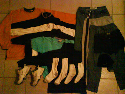
For example, above is what I wore all day long yesterday, just to stay warm in my office. Never mind that I also had a small space heater next to my feet that kicked on from time-to-time.

Yes, you're seeing that right. I wore all of these things all day long in my office! Six layers on top, three and a half on the bottom, two pair of socks, shoes, and a winter cap. That includes fleece, flannel and even sweats. I probably would have also worn gloves, if only I could type in them. Insane, I know, but there you are. Now that's dress for SUCKSess!

14 December 2010

Going Green at the Library

Looking back at the Autumn issue cover of the library newsletter, I'm reminded of a 20x30in. poster I created last month. The library wanted to promote its new Go Green! service option of sending account notices and statements out via email rather than by traditional mail. 


So I went sourcing for green, nature images and used one of a tree canopy as a background frame. I actually started out with a nice, overhead shot of grass, but then I got to thinking that showing trees rather than grass might make more sense (we might be more inclined to think about saving trees more than grass as part of our environmentally conscious efforts, although I'm sure there must be some applicable grass strategies too).


The photo frame image surrounded a clean, white interior background on which green text describing the service was inset. Where the service is located online, two small icons were used: a mail button and a check mark, so I had the web designer send me the originating files for those to use on my my poster design. To help break up the text for those of us who like to skim for key words, I set those in bold to help catch more eyes.


The resulting poster was printed out via our large format Hewlett Packard DesignJet 800 and was then placed into a free-standing wooden pedestal display that had a glass top and a hinged wooden frame to encase posters. It was then displayed near the check out counter at the lobby exit.

13 December 2010

THINK... Library Newsletter / Program Guide, Winter 2011

The library (read: the marketing & promotions / design department) produces a 12-page quarterly newsletter/program guide called "THINK..."The inner most four pages are printed in one colour--usually black--and the outer eight pages in full colour.


The guide reports on current and upcoming news, events, programs and information related largely to a common theme. The first issue I produced was for the Autumn 2010 which focused on environmental "green" issues. The following issue for Winter 2011 focused on job search and career building assistance.


Prior to my arrival as the district's graphic designer, this publication was a virtual bouquet of visual elements, apparently trying to squeeze the most out of the department's wealth of fonts and clip art--all in one issue. The menagerie of unrelated visuals reminded me of a grandmother's china cabinet collection of ceramic chotskies.


My goal was to refine the publication by reducing the large number of display fonts in favor of using a set standard of fonts as identified by the corporate identity standards, and by using more contemporary photography, illustration and clip art. The end result aimed to make the publication look more up-to-date, more in step with a sophisticated readership audience, and to polish up the public image of the library district.


In previous issues, the name of the publication itself had not even established a consistent styling, ranging from serif to san serif fonts in different sizes. My first goal was to establish this element as a strong visual. Because I wanted a strong impact, I went with a san serif bold font from the Arial family--a font that was already part of the corporate identity standard. 


Additionally, because the library incorporated the tag line: "...thinking outside the book" I wanted to refer back to that concept by setting the word "THINK" into a rectangular "book" shape, and allowing the ellipsis typographical mark "..." to remain outside of the book, as if to say "Think...outside of the book." The connection between the ellipsis and the box itself would be established by utilizing the same background/interior pattern or image. So for example, if the rectangular "book" had a green leaf in it, an extension of the same image would be captured within the confines of the ellipsis as well. It the box was a solid colour, the ellipsis would share that same box colour.


Serving as an additional accent that could vary from issue-to-issue, a symbol relating to the issue's theme could also be placed above the letter "i" as if it were the dot to that typographical character. I worked up about 20 variations of these nameplate designs to present to my supervisor to show its versatility and appeal. Some boxes used solid colours, some images. Each had it's own "i" dot icon related to a variety of seasonal or social references. Thankfully, it was immediately accepted and approved.


Thinking about what to do with the remaining space adjacent to the THINK...name plate, I chose to create a second "rectangle" composed of text that teased to the interior contents. To differentiate from one teased item to the next, I would vary the text colour, but keep each reference within the same colour family--all blues or all reds for example. This relative consistency would unify the text as a single visual item. And as it worked out, the natural reading flow would read: "THINK...(and then the items to be thought over). In time, I would offer each text reference in different colours that were derived from whatever cover image I used.


With the nameplate worked out, it allowed the largest square area of the cover to be designed as required by the issue's theme.

Not to Confuse Our Movies...

Today I received a staff-wide email from one of our ACLD librarians that indicated our library was mentioned in USA Today for offering programs that welcome the homeless to "community living rooms."


The trend of seeing what may be an increasing percentage of the homeless population in our library is, I suppose, not uncommon among libraries these days. In our particular downtown library branch, the indigent wait for our doors to open early in the morning and stay until other facilities open later in the day--facilities like "soup kitchens" and overnight shelters. 

I have come to easily recognize the faces of some patrons I see on a regular basis, and think of them just as much a part of our interior environment as the furniture. These "regulars" are woven right into the fabric of our daily environment, and to some extent become, more or less, part of our extended workplace family--same as a guy who might come into a diner in the morning to order his "usual" meal or coffee.

On 10 Dec. 2010 I reported on one of our branch library offerings: "Saturday Matinee." This movie watching event is offered to students who bring in a report card with grades of "C" or higher--an event not to be confused with our headquarters branch Monday Movie event which is offered the general public (even for those same students if they chose to come) for which the USA Today article referred to.

The Matinee Mondays design work shown above displays what we refer to as a "webslide." These are up to eight individual web ads displayed in a looping slide show format on the library district home page website. The image used was found while sourcing public domain photography websites.

An Earlier HelpNow! Sign & Handbill

A couple months prior to creating the requested development of a the HelpNow! bulletin board display (see 9 Dec. 2010 post), one of our branch libraries requested development of a 8.5x11in. sign and quarter page handbill (four bulletins printed on one 8.5x11in. page, trimmed out for patrons to pick up and take with them). 


The initial image I had in mind was to have an adult helping a student with their homework, so I went sourcing for pictures along those lines. Nothing I found within the public domain was really spot on, so I used a non-public domain photo as a visual resource to make a drawing from and added it to the design as seen above. After sending the concept proof to the branch, I received a nice email from the requesting librarian who said it was "exactly what I wanted!"


Yay for me. Spot on.

10 December 2010

Good Grades Get A Movie

For students who got a "C" or higher, they were invited to celebrate with popcorn and a drink at the library's Saturday Matinee Report Card Celebration


The library hosting the event asked for an 8.5x11in sign to promote it, so I went on the hunt for theatre experience motifs: film reels, movie projectors, stage curtains, popcorn and candies. I didn't find anything I liked through my public domain search, but I did like a particular image of a popcorn container that I used as reference to re-draw using Adobe Illustrator and Photoshop. 


Once satisfied with the artwork, I arranged all the essential text around it. I particularly liked adding the "A, B, C" on the side to reinforce the grades required to get said container of popcorn. I also liked the little "bow tie" strip at the bottom that contained the library logo. 


Because the art ended up being such a strong vertical, I needed a little more height to fit all the required text onto the sign, so I turned the 8.5x11in sign into an 8.5x14". 

09 December 2010

I Sure Could Use Some HelpNow!

Our reference desk area has a bulletin board dedicated to displaying research and skill building resources. HelpNow! is a database that can help grade school through college students with skill building and course work tutoring and test taking preparations. It can also help adults with similar educational help, as well as with other features such as resume writing, Microsoft Office software help, and even preparations for taking the US Citizenship exam.

The librarian in charge of this display asked if I could find an image looking down on a perplexed student sitting at his/her desk while taking an exam. I said we could add a little thought bubble over his/her head stating how they wish they could use/have used the HelpNow! service to prepare for the exam. 

I sourced for images that could fulfill the request but couldn't find a shot of a student taken at that angle. The closest I got were straight-on shots, the best being a student at a blackboard scratching his head, and another of a student at her desk, eyes angled skyward as if in thought. We went with the girl, added the thought balloon and headline, then added two additional tabloid-sized support signs that listed features of the HelpNow! service. 

I pinned a plain background of white butcher paper over the bulletin board, then placed the 23x34in girl/thought balloon poster overtop of it. I had already freehand cut the girl away from her background from the shoulders up to add a little "pop" to her image. From the shoulders down to either side of her section of the poster, I left the exposed brown cork board--a colour not too different from her surrounding background in the image itself. It was simple and straight-forward, indicating the name of the service and what it did. It also incorporated the HelpNow! logo into the emotive thought balloon statement to reinforce that association.

Now if I could only get a little HelpNow! from our facilities crew to make my office warmer than 71 degrees!

06 December 2010

Number of Library Graphic Designers in the US?

How many libraries are there in the US?
122,566.
The American Library Association (ALA) estimates there are 122,566 libraries in the US: 9,214 public, 3,827 academic, 99,180 school libraries, 8,906 special libraries, 289 Armed Force libraries and 1,150 government libraries. The largest library in America is the Library of Congress, with over 32 million volumes, followed by Harvard University and Boston Public Library, both having over 15 million volumes.
With this many libraries in the United States, I would think there must be a variety of recognition events at local and national levels. Like any good award ceremony, I would expect there to be a variety of categories to compete and gain recognition in too. 
So when I received a system-wide email today from one of my librarian colleagues indicating that she was on the Library Association’s 2011 Awards Committee, I wasn't surprised. She wanted to encourage everyone to check out the awards offered. I did, and noticed these were the award categories:

Member Group Awards


Of course, I noticed there were no awards given for publicity and marketing of libraries--particularly in the visual realm. The closest thing that came to it was "Library Web Site," which also included the component of "creativity and/or innovation in overall design and appearance of the web site."
Now, I'm not surprised that there are no design awards related to library marketing. Really. I hadn't expected there would be. But I couldn't help to wonder again--as I have done from time-to-time: how many graphic designers work for libraries? Maybe I can track down someone in the ALA that can find out for me. What do you think the number might be? 50%? 25%? 10%? 2%? My curiosity is growing, so I'm going on the hunt to find out. Stay tuned!

01 December 2010

Today’s Quickie Project: AIDS Awareness Month Poster

Yesterday, I had a meeting with one of the display librarians. We went over the line-up of what the next couple of displays would be for her section—among them, promoting the online Literature Resource Center and AIDS Awareness Month. I made some creative suggestions for each and sent her off to do some sourcing for information along those lines.


At 9:00am the following morning, I received an email from her, indicating that while looking for AIDS quilts I had suggested as a visual, she had discovered a website for an organization that promotes AIDS awareness through the creation of their quilt making workshops. She sent me the link and a suggestion for the poster headline "AIDS Awareness Week" and asked if I could incorporate the text and URL link with the one of the images of a block of quilts she particularly liked. She said she could return to visit me at 1:30pm to talk more about it. 


At 9:02am I took a look at the website, downloaded the online image offered by the organization, and sent my librarian friend the reply that I’d work up a concept or two and have it ready for her to see when she came by to talk. Then I started to fiddle. Import quilt image...flow in headline and website link...center and align top to bottom...hmmm...looks okay, but needs something more. Went back to the website to find a better URL, one that went directly to the organization’s "About" page—rather to the image itself—and along the way also collected their tagline: "remember.understand.sharethelessons.act" then dropped them into place.

Decided my all-black headline was too plain, so applied different colours taken from the quilt motif to each letter in "AIDS." Then I decided I wanted to include the written-out words associated with the lettering: "Acquired Immune Deficiency Syndrome." In some respects, I feel spelling out the full name of the medical condition removes part of the stigma associated with only using the initials. It gives fuller meaning to four letters we often come to have negative associations about without thinking much about the medical condition itself. 

I didn’t want the full name to be the headline, but I did want to incorporate it into the headline, so I gave it a different treatment, reversing the letters out of a solid colour box. Not wanting it to interfere with the headline, I chose to tone it back with white lettering inside a light grey box. This, and all the other elements were on a plain white background at the time. 

After considering it a while longer, I thought the plain white background was also too plain and went hunting for a soft background image...fabric perhaps. Or maybe something more ephemeral. A soft-focus sky image possibly? I settled on a soft, light gray/nearly white fabric or watercolour wash background. Added a light drop shadow to the headline and adjusted the full name box to be just a little darker so it wouldn’t completely disappear from a distance and wahlah! Poster ready to submit for review and consideration. 

I attached a .pdf of it to an email to the librarian:

"Heck, why wait until 1:30. It’s done. =) Attached for your review/comment.
Cheers,
Scot"

Time: 10:39am

Her reply at 11:26am: "As always, a wonderful job. This is why you’re the graphic designer!"

Hooray for me.