Showing posts with label newsletter. Show all posts

06 September 2016


Autumn issue cover.

The library's free, 12-page autumn edition of THINK... newsletter arrived in September. This issue cover featured "Peacock," a vibrant painting by Miranda Walters, one of the library's 2015 Fall Teen Art Show winners. The quarterly newsletter covers over 800 scheduled events from September through November. A printed edition of 2,750 copies is delivered not only to all twelve library branch locations but also to select non-library businesses to extend its reach further into the community. Online copies are also available on the library's website at, http://aclib.us/news.  

Development of the newsletter begins with library staff entering their planned quarterly events into the library's electronic calendar system during a 30-day period prior to beginning the editorial production process, which in turn takes an additional 30 days of feature writing, design, and printing production prior to delivery of the publication to the public. Printing services are outsourced to a local printer, taking five to seven days before receipt of the printed product back to the design department for separating and shipping different quantities to the 12 district libraries and local businesses.

Library website blog icon
Events published in the newsletter are the same as seen on the library's website calendar of events. Due to limited space in the newsletter, complete descriptive information about the events are not published, however. Those additional details remain available on the branch calendars online.

Project collaterals created in association with publication of THINK... include (+ quantities):

12-page print edition (2,750)
Library website digital edition (1)
Library website blog icon (1)
Television broadcast public service announcement advertisement (1) 

Broadcast television public service announcement (PSA)

14 April 2016

Re-Envisioning an Alternative Creative Marketing Solution for 2016 Summer Reading Library Programs

The Summer Reading Program is the Collaborative Summer Library Program’s (www.cslpreads.org) annual effort to encourage people of all ages to read. Their mission statement reads: "The Collaborative Summer Library Program (CSLP) is a consortium of states working together to provide a unified summer reading theme along with professional art and evidence-based materials so that member libraries can provide high-quality summer reading programs at the lowest possible cost and to play a significant role in literacy initiatives."

The Summer Reading Program breaks its effort down into different age groups that have their own themed presentations. For example, the 2016 Summer Reading theme for children was: “On your mark, get set...Read!” For teens it was: “Get in the game...Read.” And for adults it was: “Exercise your mind...Read.” Each of these themed presentations comes with its own commissioned art work and resources that is made available to its members.

Because CSLP has been around and successfully expanding its offerings since 1987, I naturally presume that it must be doing a reasonably decent job providing a desirable and much needed service to its members. Judging from the content offered on its website, I would think so. However, while I applaud the CSLP's efforts to promote the importance of reading, as a creative professional who helps to advise and lead development of my own library district's marketing efforts, I have to say that I—and every librarian I have ever spoken to about it—have issues with the quality of the themed presentations as well as the dilution of a unified message when multiple slogans are offered annually by the CSLP.

If you are in one of the many different kind of library staff positions tasked with developing and managing a marketing presentation strategy for your summer reading program, perhaps you might agree with me on what I am about to say concerning the creative decisions I have proposed and moved forward with for marketing my library's summer reading programs this year. 

In February, I received a thumb drive of digital assets provided by the CSLP. The files were all conveniently organized into appropriate folders and sub-folders based on the different age groups and content materials. To get an easy, single view of what all the images were for each of the themes, I created a single reference page where I placed the provided images onto for printing out and reviewing. From there, I could see that each age group had full colour illustrations, black and white/gray scale line art, PowerPoint backgrounds, slogans in versions both isolated and integrated into illustrations. Some images were editable vectors, while others were either non-editable vectors or in pixel-based formats. 

Seeing what all I had to work with was where my critical eye began to form a strategy for how I would approach design solutions. It was also the point at which I would begin asking a lot of questions and forming opinions, such as: 

1) There were different theme slogans to differentiate one targeted age group from another. However, any one of the slogans offered could have easily been considered appropriate and applicable to all of the age groups. So why not just use one annual slogan to simplify the message? One slogan for all ages could provide an umbrella of uniform continuity across the board for easy recognition of all the summer reading programs as a whole.

2) Each of the themes provided a couple of different art styles and treatments to use, ranging from black/white line art to full colour illustrations. The idea was to offer the marketer different choices in art styles, which can be good for appealing to different stylistic preferences. However, the end result was also that there were fewer images of each style rather than a lot of one style, the latter of which I believe offers more opportunities for using related combinations of elements together to form an integrated, multi-documented publicity campaign. Ultimately, presenting something with consistency aids in the ease and speed in which it can be recognized. The more a single promotion is diluted by using different styled visuals, the more difficult it is to recognize as being the same thing from one promotional piece to the next.  

3) Another issue I have had with the provided artwork was that the sophistication of the styles didn't correspond with what I considered to be intuitive, age appropriate groupings. For example, a majority of the children's artwork selection offered a very sophisticated watercolour and ink style of illustration, whereas the teen and adult artwork selections were composed primarily of what I would consider to be dated "clip art" styles. I would have preferred to see adults offered the more sophisticated art style, while I feel the animated or "cartoony" style of art would appeal more to the younger audiences.

4) To further complicate matters, if I wanted to combine an art element from one image with another image—for example, using slogan typography from one poster with an illustrative image from another—I couldn't do that unless both images were editable. This made it difficult to use the same typographical slogan treatment on multiple pieces of publicity beyond the one it was originally offered on. It also made it either complicated or impossible to enlarge small design elements that were pixel based. If the only option was to use two different typographical slogan treatments on many different sized documents of an integrated campaign, the different styles would further reduce ease of recognition for the summer reading theme.

My Solution
The combination of these four issues drove me to the conclusion that the artwork provided created more complications and problems in both production and program recognition than it did to help streamline the work flow and make for a well integrated visual marketing campaign that could be quickly and easily recognized across the board for all age groups.
 
So with that in mind, I offered an alternative approach: select a single slogan and a single, primary image to unify the three age divisions together as a well coordinated, unified marketing campaign that could be recognized more readily across all age groups and also provide for a less complicated creative exercise enroute to that goal.

The children and adult summer reading team leaders approved of exploring the idea, so I set to work sourcing for images that supported the slogan they chose of the three presented by the consortium: "Exercise your mind. Read!" Finding an image or images of what it looked like to "exercise your mind," proved elusive, however, so I expanded my search to include representations of the human brain, which in turn would lead me toward changing the slogan to "exercise your brain." And with that, I found what I considered to be a series of images respectable enough to be accepted by all age groups: a set of illustrated spot art brains exercising, one of which I could utilize as the primary logo, while retaining the rest as potential supportive images if needed for additional variety. I presented this option, along with four other potential solution image styles to the team for consideration and we all agreed that "exercise your brain" with the spot art brain could serve all age groups well enough by providing one easily recognizable and unifying icon across the board for all age groups.

Thus, instead of ending up with a disjointed menagerie of multiple art styles used for different age groups (as seen by using the links below to my earlier summer reading solutions when I used CSLP-supplied images), I hoped to pave the way for thinking differently about how to approach development of a more unified summer reading marketing solution for future years to come at my library organization. This approach should ensure that the series of programs would be more quickly and easily recognized across the board for everyone.

My summer reading marketing solutions from previous years included the following:
"Library Summer Reading 2012 Marketing Designs": www.librarymarketingdesign.blogspot.com/2012/06/summer-reading-at-library-2012.html

"Integrated Marketing Designs for Kids, Teens, & Adult Library Summer Reading Programs 2014": www.librarymarketingdesign.blogspot.com/2014/04/integrated-marketing-designs-for-kids.html

"Integrated Marketing Designs for Kids, Teens, & Adult Library Summer Reading Programs 2015": www.librarymarketingdesign.blogspot.com/2015/05/integrated-marketing-designs-for-kids.html 


Scope of projects delivered (+ quantities):
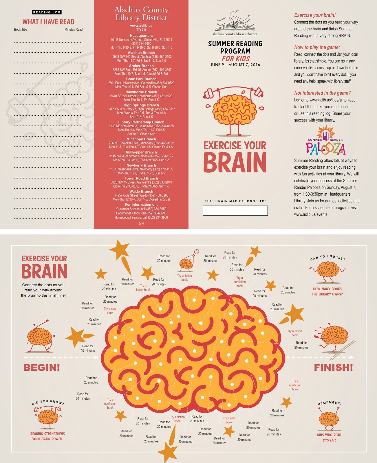
Kids 14x8.5 inch Brochure (4000)
Kids 2.75x8 inch Events Bookmark (6000)
Kids 150x300px Online Publication Ad (1)
Kids Poster Display 7-Brain 5 inch Image Set (1)
Kids Poster Display 7-Brain 6 inch Image Set (1)
Kids Poster Display 7-Brain 8 inch Image Set (1)
Kids Poster Display 24 inch Brain Image (1)
Kids Poster Display 24 inch Headline (1)
Kids Poster Display 3-1/2 inch Subhead (1)
Kids/Teens Public Service Announcement (PSA) #1 (1)
Kids/Teens Public Service Announcement (PSA) #2 (1)

Kids/Teens 3.625x4.875 inch Magazine Ad (1) 
Kids/Teens 30-Second Broadcast TV Commercial (1)
Teen 2.75x8 inch Bookmark (1500)
Adult Tote Bag Logo Imprint (1 image/500 bags)
Adult 14x8.5 inch Brochure (600)
Adult 45x45 inch Poster (1)
Any Age Template 8x11 inch Full Page Flyer (1)
Any Age Template Half Page Handbill (1)
Any Age Template Quarter Page Handbill (1)
Any Age 100x100px Blog Icon (1)
Any Age 625x234px Online Web Banner (1)
Any Age 25x40 inch Banner (1)
Any Age 36x13 inch Banner (2)

Library Newsletter Coverage (2750)

Finally, samples of my 2016 summer reading marketing campaign solutions are below: 

Adult tote bag.


Website blog icon.

Primary identity lock up.
Alternate identity lock up.
Website advertising banner.
Digital media advertisement.
Kids and Teens magazine advertisement.
Broadcast TV PSA (public service announcement).
Kids bookmark front and back.

Kids reading activity brochure front and back (above), 
adult reading program brochure front and back (below).


Newsletter cover.

04 March 2016

The Evolution of a Library Newsletter (or Program Guide) Redesign

A progression of redesigned covers and calendar pages demonstrates an exploration of solutions.

The Alachua County Library District’s quarterly newsletter, THINK..., has been in circulation since Spring 2010. In Autumn 2010, I redesigned it after I arrived as the library district’s marketing designer. Since then, THINK... has received many nods of appreciation from readers, staff, and has even been awarded two national PRxchange awards (2014 and 2015) from the American Library Association for excellence in marketing design. 

Despite its successes, THINK... didn’t include everything that some library patrons and staff wanted to see in their newsletter. With that in mind, the library formed a small committee of staff members in January 2014 to explore what those interests might be and then developed a wish list of things they would like to see included, or removed, in a potential redesign of the publication. Their list of interests became a working design brief that would provide me with a direction for exploring and developing information presentation solutions for the quarterly newsletter. 

The process would entail me designing a set of sample pages to demonstrate what the committee's essential interests might look like, which would in turn demonstrate what those solutions would require in terms of document format, potential page count, and projected materials and printing costs. After my delivery of those samples, I'd wait six months for the committee to find time to meet again to discuss those prototype pages before reverting back to me with their feedback. Then we'd repeat the process again...for what would become the next two years.

If this seems like a long time to develop a simple newsletter, well, of course it is. But don't be surprised; this timeline reflected the level of priority it had relative to a continuing march of other incoming projects with earlier deadlines that required more immediate attention and urgency. Also, by its own nature, design-by-committees are rarely a speedy process, nor ones that result in a fulfilling final outcome for everyone involved. To complete the often  paraphrased line: "when too many cooks are in the kitchen...," things get messy. For starters, just getting multiple people together for a meeting can be a scheduling challenge all by itself. Then, competing agendas among committee members often take time to be debated, re-debated, negotiated, and moderated. Hazily envisioned fantasies of "what could be" must also meet with real-world practical, technical, process, and financial realities. It just takes time to get everyone to come to terms with what is logistically possible using the resources that are available. "Thinking big" and pressing beyond initial expectations in hope of discovering greater opportunities and value is definitely encouraged, but after all the ideation takes place, every project has to eventually surrender to what is actually accomplishable.
 

So, to begin the redesign, lets first look at what the existing 12-page, 8.5x11 inch semi-gloss newsletter already provided for the 12-branch library system: 

> 6 pages of program event listings  
> 4-2/3 pages of program event and other topical library district news stories 
> 1/3 page of indicia 
> 1 cover page, usually focusing on one highlighted event

The new design brief wanted to develop solutions for the following interests:

1 > The emphasis for the publication should focus primarily on program listings and less on news coverage.


2 > Display all 12-branch program events in a visual calendar format for Children, Teen, and Adult age groups. 

For a quarterly publication, this meant using three monthly calendars that contained all branch libraries and age groups combined together with some way to differentiate between them, such as using colour coded text or icons. But with over 350-370 program events held each quarter, it was unlikely that the individual squares for each calendar day would be able to always accommodate the mention of every single event on only three calendars—unless the page size was incredibly big.
 
An alternative solution would be to use three different monthly calendars for each age group, meaning three for Children, three for Teens, and three for Adults. This solution would require between 9 to 18 pages alone. And if the information still couldn’t fit, another solution would have to be provided.


3 > Provide a list of all the same program events as listed on the calendars, but using a text format that also included complete descriptions of all the programs. In other words, include event name, date, time, location, targeted ages, and the program description for each and every one of the programs taking place during the three month time period. 

Again, considering the 12 branches collectively held around 350-370 events or more per quarter—with a push to continually increase the number
for programs that had widely inconsistent, variable description lengths, it would be difficult to accurately predict the number of pages required quarter-by-quarter. Nevertheless, using a text sample from one recent quarter of events to create a sample spread, I could guesstimate it might require approximately three to four pages per age group, not including any visuals. All told, we’d be looking at a total of approximately nine to twelve pages of plain text program listings with descriptions to fulfill this portion of the committee request.

4 > The cover should emphasize the words “library” (to make it clear that it was a library publication), and “program guide” (to make it clear that it was a programming guide and not something else—like, a "newsletter"). The library corporate identity (logo) should appear on the cover as well. Options for teasing to more than only one event should also be explored.

5 > Publication indicia should continue to be displayed in order to recognize the funding partner, key board and administrative members, and publication contact information.

6 > Library branch hours of operation, phone contact information, and social media icons should continue to be displayed. Physical branch library addresses should be added to this information in the redesign. 

7 > Production budget should remain the same or as close to the same as possible. This would require the page count to remain at or nearly the same, paper weights to be the same or thinner, and/or change from printing the newsletter as a four colour publication to one of only one or two colours.

8 > Printed quantities should remain the same, or, increase to include a wider audience distribution, or, decrease to reduce production budget—the direction depending on whom you talked to and when.

Well, that wasn't too much to ask for! Looking back on the requirements, I could see we were already talking about a document requiring 22-34 pages. And since sheets of paper are folded to become two-sided printed pages, that meant 24 or 36 pages would actually be needed in order to accommodate those requirements. Already, the production budget reality was going to be at odds with the wish list right out of the gate. Nevertheless, I’d still have to go through the effort of creating design solutions in order to provide evidence to support that conclusion, because sometimes telling people that things won’t work as they imagined simply isn’t good enough. You have to actually show them to prove it.

The first thing I wanted to tackle was to seek design solutions that incorporated as many of the most essential requests as possible. Since the focus was first and foremost on displaying programs in text list and calendar formats, that’s where I began my quest, using a three-month supply of raw text from our most recently printed issue.


Prototype one explored calendar and listing spreads, plus two cover variations.

PROTOTYPE 1:
I could already tell there was no possibility of successfully displaying the programs of all 12 branch libraries and three age groups combined together
on only three 8.5x11 inch page calendars, so I went directly to developing a two-page calendar spread to see how many event listings could fit into a single weekday square. After sorting through the raw text list, pasting events into their respective days of the month and styling the text, the most I could fit into a single day square at eight-point text size was 11 lines. The remaining overset text I relocated into empty calendar squares in order to not leave out any information. But having to look for that information away from the date it was scheduled was awkward and still didn't guarantee that all future text lengths could be accommodated. In an effort to see if I could get all text to fit into another arrangement, I rotated the orientation of the publication to become a vertical format and recreated the calendar to be tall and narrow. But you know what? No matter if day squares were short and fat or tall and narrow, they would still only offer the same total space for the same text to fit into them, so the end result was essentially the same.

What's more, eight-point
calendar text size would be too small for many readers. At least one senior patron had already complained in the past that our usual 10-point newsletter text was too difficult to read. To enlarge text so it could be more easily read would mean either fewer events could be listed in each daily square, or, a larger format and/or more pages would have to be added to accommodate a larger point size of the same text. This would immediately fail the primary objective of listing ALL events and/or not significantly increasing the budget. 

During this initial stage of exploring calendar page design solutions, I also designed a sample spread to show how program text listings with complete descriptions could look with additional boxed text/image options for highlighting individual programs. Knowing full well that it would be an unpopular solution, I also designed a single-page sample showing a text treatment solution displaying program listings that did not include their
descriptive text. I also provided two design solutions for new cover treatments that changed the publication name from “THINK...” to “Library” and included the wording “program guide” of sufficient size to be emphasized but not overpower the actual publication name itself.
 

Prototype 2: Poster.
PROTOTYPE 2: 
Still wrangling with the issue of how to display three months worth of program descriptive language without adding additional paper and costs, I explored another option: placing all the program text—including descriptions—onto a poster format. Each of the three age groups would have their three-month's worth of program text listings displayed on one side, along with one of three monthly calendars. On the back side, the second and third calendars would be displayed. Using this method, I could display the entire text listings for each of the age groups, but only three calendars for one of the age groups—and not even all four weeks of the calendars could be squeezed in due to the event lengths. I could conceivably use a second sheet of paper to display the other two age group calendars and some news on its reverse side, but I already knew that the poster option wasn’t going to be an approved solution. For one reason, pieces of paper folded together would become too bulky and even confusing about how to unfold/refold the document. Who among us hasn't wadded up a map in utter frustration after a few attempts at getting it right? That surely wasn't the kind of user experience I wanted. The other reason why I knew the solution wouldn't work was because when I asked my printer what the largest size of paper was they could print on, I was told it was 22x24 inches. My poster size required 36x36 inches. The nearest printing facilities that could print on that size of paper would be out-of-state in bigger printing markets such as Chicago, New York or other distant locations like Hong Kong and Singapore. Again, the logistics of materials, printing, and even shipping costs became a negative factor in this solution.

Prototype 3: Fold-out version.
PROTOTYPE 3:
I went back to my original 8.5x11 inch format newsletter. I worked up a new solution based on my first design, but I expanded the depth of the two-page calendar spreads to become 20 inches. This extra length beyond the 11 inch publication height would fold up into the publication when it was closed. Maintaining an 8.5x11 inch standard format would also ensure it could conveniently be shelved, filed, or stored. The unique feature of this solution allowed calendars to be removed from the publication for posting elsewhere (walls, refrigerator doors, etc.). The back side of the closed flap could be used to contain promotional
advertisements, news articles, more of the program listings that begun on their preceding pages, or even have it contained to that available space. At least with this solution I could ensure that all the programs were displayed on the calendar—up to a certain line count, of course. Exceeding that, we’d be back to the same issue about where to place overset text. 
 

The drawbacks for this solution included that it would require using nine calendars (three two-page spreads for each age group, for a total of 18 pages). It would also create an issue about how the calendars would not be able to open out without first tearing through or removing the staples that kept the entire document together—not entirely the most user friendly solution. And, again, there would be the additional costs for paper sizes, quantities, printing, and bindery services.
 

Prototype variations 4 & 5: 16 and 20 page versions, both using the same program list and calendar solutions.

PROTOTYPE 4 & 5: 
Back to the drawing board once again, I took another crack at my original 8.5x11 inch format, this time using a newly considered content strategy for displaying programs. The program text list would now be used only for displaying regularly scheduled, recurring monthly events, but this time without the burden of including program descriptions. The calendars would be used for only displaying non-recurring monthly events, also referred to as “special events.” This is the way our library system previously separated and identified program events from each other on monthly calendars a few years earlier, so I was fairly assured that there would be buy-in from the programming staff. The gamble was in not including complete program descriptions, but I was fairly confident that my previous prototypes had already demonstrated the materials logistics and budget-busting results including full descriptions would create, thereby paving the way for buy-in on that decision as well.

Separating recurring events from the monthly calendars allowed the calendar formats to be held to one per page each, rather than two or more pages. Removing complete program descriptions from the text lists allowed repetitive listings to be whittled down to two thirds of a single page. Remarkably, the combination of solutions held each of the age group listings plus their respective calendars to four pages each for a total of 12 pages
combined. This equaled the same number of pages as our existing newsletter.

With four more pages, we could add a front and back cover (kind of essential) to highlight the biggest events (with space for images even!). And, on the front/back inside covers we could provide space dedicated to essential indicia, library branch contact information (both requested in the design brief), and even a branch locator map. The remaining page could be used for either one news article or a few very short news briefs. With this minimal allocation of non-calendar and event listing pages, nobody could argue that it was a “newsletter” (with actual news!) when the bulk of it was undeniably a “program guide.” I would consider this 16-page solution a “bare bones” approach to the newsletter—err, now program guide.


But call me crazy. From a marketing standpoint, I consider this publication
however you want to refer to itthe single-most viable and economically produced printed opportunity to market the entire library district beyond simply listing program after program after program. There is so much more—dare I say, newsthat could be provided and promoted to the public about what takes place among 12 libraries during any three-month stretch than only program names and associated dates, times, locations, age groups, and descriptions.

So, daring to push my assertion even minimally forward, I added an option for an additional four pages with the intention of having them be dedicated to non-program information, which brought the previous 16-page prototype concept up to a total of 20 pages. In this version, I proposed taking advantage of the library's rarely leveraged library mission statement: “to participate, connect and discover.” I used one of these words as the heading on three separate news brief pages to promote library awareness, library services, and library partnerships or collaborations with outside organizations that share the library’s endeavours to benefit the community it serves.

One of these mission statement pages took the place of the “News” named briefs page from the 16-page prototype, while the fourth remaining page provided informational coverage for the library’s digital “eSources” information and reference services, allocating twice the amount of text space than what the existing newsletter provided on the same topic.

The intent of these four additional pages was to allow the library to inform patrons about relevant news, issues, opportunities, services, and other information that was not directly part of program events. This information might otherwise go completely unreported or unnoticed unless the library sufficiently provided it elsewhere in other documents or website blog posts. The opportunity for these disparate bits and bytes information would become elevated, however, when bundled together with other information that patrons might be first drawn to—the same of which could be said about the benefit of discovering event calendars and listings, if reading news was the initial incentive to pick up the promotional publication.


Unfortunately, my inspired 20-page vision was rejected due to the committee's lack of interest in providing news and a preference for spending as little money as possible. And, despite a back cover design that took advantage of prime visual space to colourfully promote nine programs separated equally by age groups, it was surprisingly negotiated out to make room for a full page filled with more text about....wait for it...program news! With margin-to-margin verbosity anticipated due to the lack of adequate space elsewhere, I was assured that the visual people among us would be left to only dream of seeing a sliver of space left for one or two less-than-postage stamp size images to draw a hint of colour and attention to an otherwise sea of gray-matter that would inevitably be shoehorned onto the page.

As I mentioned in the beginning of this article, however, nobody walks away from design-by-committee projects with everything they want. This solution would result in an increased budget requirement, complete program descriptions being left out, library district news to be reduced to a single article and/or few briefs, the tiniest granules of non-programming highlights to be eliminated in their entirety, all opportunities for photography and artwork except the cover to be reduced to a few colour bands and postage-stamp size images, and an opportunity for the library's rarely seen mission statement left to remain publicly whispered elsewhere, if at all. On the plus side, what it did do was to provide adequate solutions to roughly five of the seven items on the committee's initial wish list (the eighth was contradictory to itself, so excluded as a design directive), andmost importantlymake visible nine monthly program calendars separated by age groups, which was really what was wanted above all else.

Despite whatever successes it may have or receive in the future, this program guide (now definitely not a newsletter) still won’t have everything that everyone wanted either...and rest assured, in time it too will be redesigned once interests sufficiently evolve enough to demand its next array of design solutions.