Showing posts with label identity. Show all posts

01 July 2016

Rebranding Design for Library Battle of the Books Program Series

Rebranded program event identity design.
In February of 2016, my library's youth services teen librarian let me know that they would be needing a new round of publicity materials for the teen Battle of the Books events. In March, promotional material would need to be in place to promote the events so that potential participants could cast votes for books they would like to read prior to the competition events held during the summer. 


Previous marketing material designs: identity, web banner, print ad,
 flyer and handbill (same design), and quarter page handbill sheet.


Even before February, I had already discussed with the librarian that if we had time enough, I would like to redevelop the visual identity and promotional materials for this event. The existing marketing materials, which had been used for at least four years, utilized a photograph of open book in between two opposing hands holding with what appeared to be something akin to game show joy sticks, as well as a typographical treatment for the event name that was legible but somewhat awkward. It was less of a logo and more of a photo with a typographical treatment over the image.

8.5x11 inch flyers/sign redesign concepts would also be 
scaled to size for handbill and poster collaterals.

I wanted to create a logotype that could remain legible at different scales—especially small if neededalong with silhouetted images of people in some kind of action or fighting stances. The two images I had in mind were either youths in front of a standing microphone such as you would see at a spelling bee contest, or—and this was what I most wanted to pursue—images and typography styles that evoked vintage boxing posters.

I first worked up about 50 logo designs and presented them to our teen librarian. We narrowed the selection down to two that I could refine further based on her feedback. I also showed design treatments and reference images that included boxing posters, spelling bee photographs, and silhouettes of youths jumping for joy. It was decided that the silhouettes would be the most flexible design elements to work with, so I took the design in that direction and presented a series of print ads featuring silhouetted youths leaping in exuberant celebration along with the refined logotype and type treatments for what the essential promotional text would include

Additional development included a decidedly more feminine looking 
participant, and a vote instruction display sign.

Box wrapping paper design for vote entries.
Once that was approved, I created one additional ad that depicted a more clearly defined silhouette as a girl, as well as a display sign that could be set alongside of a box that participants could submit their voting ballots indicating which books they preferred to read for the summer contest series. In order to have the vote ballot box be recognized as part of the campaign, I used the advertisement design treatment to create a wrapping paper that could be taped around the ballot boxes.

The final promotional pieces to be created were online banner ads that would appear on the library's web site. I provided two options to be used.

Two web site banner ad choices.


Projects and quantities delivered:


8x11 Flyer/sign (21)
Quarter page handbill (200)
36x36 inch Vote box wrapping paper (12)
Web banner option #1 (1)
Web banner option #2 (1)


Library web banner in use.


18 May 2016

Refreshing an Old Library Bookmark with a New Make-Over

BEFORE: The existing bookmark (front/back sides shown above) provided information but lacked inspiration.

Project Brief: Update an existing branded library bookmark. The existing bookmark, which used a single colour and was then printed on flimsy paper stock for cost-savings purposes, was both lackluster in appearance and weak on promoting what the library should want to present to the public as a vibrant library experience.

Solution: If the library was willing to pay for only two more inks and use the same paper stock they printed other library event bookmarks on, this bookmark could embrace the library's visual identity standards more fully while simultaneously standing out more prominently among other counter materials. The biggest draw-back to the proposed design was that insufficient room was left to include the library logo, however, all the language included should sufficiently cover for that short-coming.

The redesigned bookmark would present well as a nice companion piece to the library's recently redesigned welcome brochure, its presentation pocket folder, recruitment display posters, and its branded event flyer and handbill templates shown in earlier posts on the Library Marketing Design blog.

AFTER: The eye-catching redesign integrated with the library's visual identity system more fully and vibrantly.

14 April 2016

Re-Envisioning an Alternative Creative Marketing Solution for 2016 Summer Reading Library Programs

The Summer Reading Program is the Collaborative Summer Library Program’s (www.cslpreads.org) annual effort to encourage people of all ages to read. Their mission statement reads: "The Collaborative Summer Library Program (CSLP) is a consortium of states working together to provide a unified summer reading theme along with professional art and evidence-based materials so that member libraries can provide high-quality summer reading programs at the lowest possible cost and to play a significant role in literacy initiatives."

The Summer Reading Program breaks its effort down into different age groups that have their own themed presentations. For example, the 2016 Summer Reading theme for children was: “On your mark, get set...Read!” For teens it was: “Get in the game...Read.” And for adults it was: “Exercise your mind...Read.” Each of these themed presentations comes with its own commissioned art work and resources that is made available to its members.

Because CSLP has been around and successfully expanding its offerings since 1987, I naturally presume that it must be doing a reasonably decent job providing a desirable and much needed service to its members. Judging from the content offered on its website, I would think so. However, while I applaud the CSLP's efforts to promote the importance of reading, as a creative professional who helps to advise and lead development of my own library district's marketing efforts, I have to say that I—and every librarian I have ever spoken to about it—have issues with the quality of the themed presentations as well as the dilution of a unified message when multiple slogans are offered annually by the CSLP.

If you are in one of the many different kind of library staff positions tasked with developing and managing a marketing presentation strategy for your summer reading program, perhaps you might agree with me on what I am about to say concerning the creative decisions I have proposed and moved forward with for marketing my library's summer reading programs this year. 

In February, I received a thumb drive of digital assets provided by the CSLP. The files were all conveniently organized into appropriate folders and sub-folders based on the different age groups and content materials. To get an easy, single view of what all the images were for each of the themes, I created a single reference page where I placed the provided images onto for printing out and reviewing. From there, I could see that each age group had full colour illustrations, black and white/gray scale line art, PowerPoint backgrounds, slogans in versions both isolated and integrated into illustrations. Some images were editable vectors, while others were either non-editable vectors or in pixel-based formats. 

Seeing what all I had to work with was where my critical eye began to form a strategy for how I would approach design solutions. It was also the point at which I would begin asking a lot of questions and forming opinions, such as: 

1) There were different theme slogans to differentiate one targeted age group from another. However, any one of the slogans offered could have easily been considered appropriate and applicable to all of the age groups. So why not just use one annual slogan to simplify the message? One slogan for all ages could provide an umbrella of uniform continuity across the board for easy recognition of all the summer reading programs as a whole.

2) Each of the themes provided a couple of different art styles and treatments to use, ranging from black/white line art to full colour illustrations. The idea was to offer the marketer different choices in art styles, which can be good for appealing to different stylistic preferences. However, the end result was also that there were fewer images of each style rather than a lot of one style, the latter of which I believe offers more opportunities for using related combinations of elements together to form an integrated, multi-documented publicity campaign. Ultimately, presenting something with consistency aids in the ease and speed in which it can be recognized. The more a single promotion is diluted by using different styled visuals, the more difficult it is to recognize as being the same thing from one promotional piece to the next.  

3) Another issue I have had with the provided artwork was that the sophistication of the styles didn't correspond with what I considered to be intuitive, age appropriate groupings. For example, a majority of the children's artwork selection offered a very sophisticated watercolour and ink style of illustration, whereas the teen and adult artwork selections were composed primarily of what I would consider to be dated "clip art" styles. I would have preferred to see adults offered the more sophisticated art style, while I feel the animated or "cartoony" style of art would appeal more to the younger audiences.

4) To further complicate matters, if I wanted to combine an art element from one image with another image—for example, using slogan typography from one poster with an illustrative image from another—I couldn't do that unless both images were editable. This made it difficult to use the same typographical slogan treatment on multiple pieces of publicity beyond the one it was originally offered on. It also made it either complicated or impossible to enlarge small design elements that were pixel based. If the only option was to use two different typographical slogan treatments on many different sized documents of an integrated campaign, the different styles would further reduce ease of recognition for the summer reading theme.

My Solution
The combination of these four issues drove me to the conclusion that the artwork provided created more complications and problems in both production and program recognition than it did to help streamline the work flow and make for a well integrated visual marketing campaign that could be quickly and easily recognized across the board for all age groups.
 
So with that in mind, I offered an alternative approach: select a single slogan and a single, primary image to unify the three age divisions together as a well coordinated, unified marketing campaign that could be recognized more readily across all age groups and also provide for a less complicated creative exercise enroute to that goal.

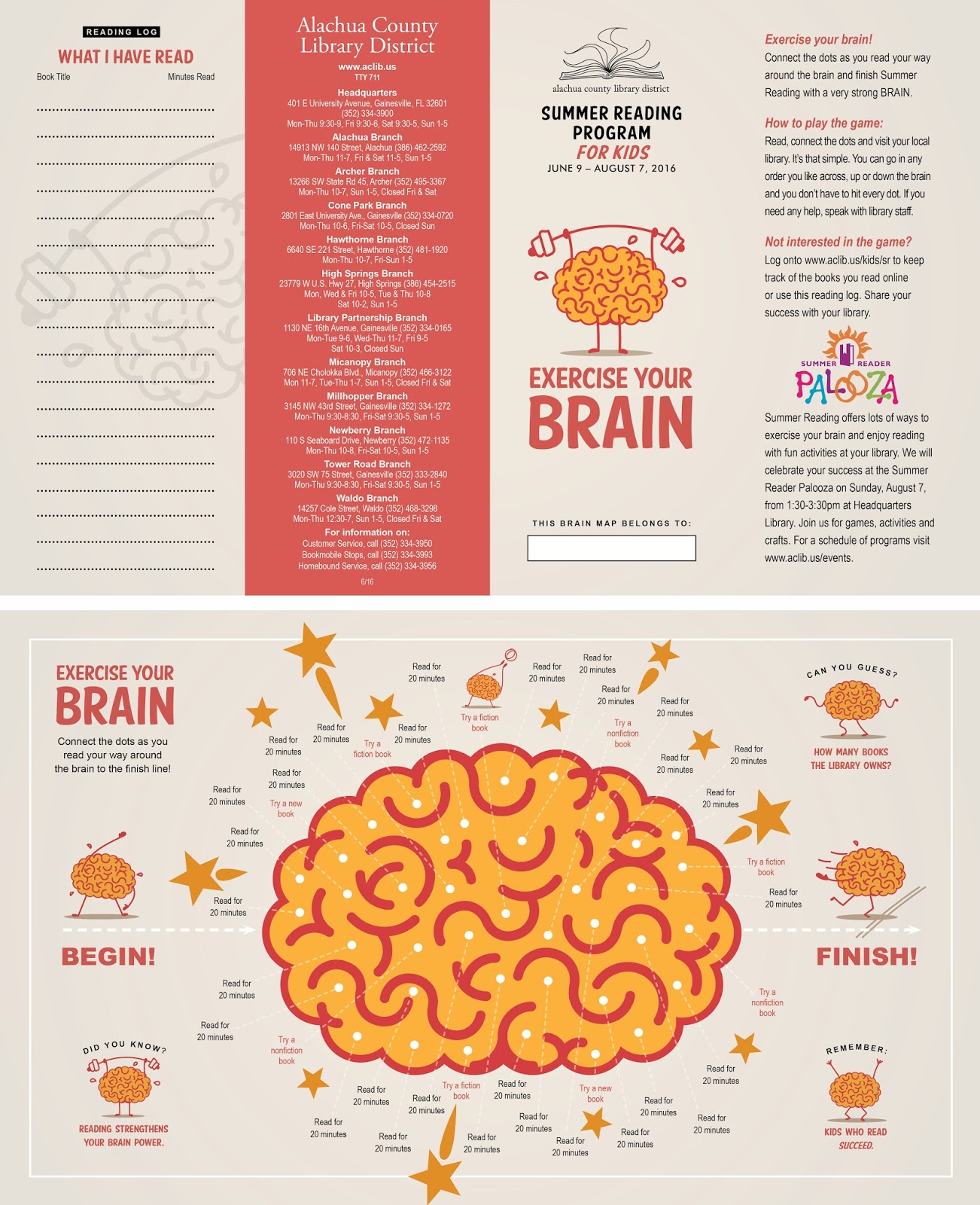
The children and adult summer reading team leaders approved of exploring the idea, so I set to work sourcing for images that supported the slogan they chose of the three presented by the consortium: "Exercise your mind. Read!" Finding an image or images of what it looked like to "exercise your mind," proved elusive, however, so I expanded my search to include representations of the human brain, which in turn would lead me toward changing the slogan to "exercise your brain." And with that, I found what I considered to be a series of images respectable enough to be accepted by all age groups: a set of illustrated spot art brains exercising, one of which I could utilize as the primary logo, while retaining the rest as potential supportive images if needed for additional variety. I presented this option, along with four other potential solution image styles to the team for consideration and we all agreed that "exercise your brain" with the spot art brain could serve all age groups well enough by providing one easily recognizable and unifying icon across the board for all age groups.

Thus, instead of ending up with a disjointed menagerie of multiple art styles used for different age groups (as seen by using the links below to my earlier summer reading solutions when I used CSLP-supplied images), I hoped to pave the way for thinking differently about how to approach development of a more unified summer reading marketing solution for future years to come at my library organization. This approach should ensure that the series of programs would be more quickly and easily recognized across the board for everyone.

My summer reading marketing solutions from previous years included the following:
"Library Summer Reading 2012 Marketing Designs": www.librarymarketingdesign.blogspot.com/2012/06/summer-reading-at-library-2012.html

"Integrated Marketing Designs for Kids, Teens, & Adult Library Summer Reading Programs 2014": www.librarymarketingdesign.blogspot.com/2014/04/integrated-marketing-designs-for-kids.html

"Integrated Marketing Designs for Kids, Teens, & Adult Library Summer Reading Programs 2015": www.librarymarketingdesign.blogspot.com/2015/05/integrated-marketing-designs-for-kids.html 


Scope of projects delivered (+ quantities):
Kids 14x8.5 inch Brochure (4000)
Kids 2.75x8 inch Events Bookmark (6000)
Kids 150x300px Online Publication Ad (1)
Kids Poster Display 7-Brain 5 inch Image Set (1)
Kids Poster Display 7-Brain 6 inch Image Set (1)
Kids Poster Display 7-Brain 8 inch Image Set (1)
Kids Poster Display 24 inch Brain Image (1)
Kids Poster Display 24 inch Headline (1)
Kids Poster Display 3-1/2 inch Subhead (1)
Kids/Teens Public Service Announcement (PSA) #1 (1)
Kids/Teens Public Service Announcement (PSA) #2 (1)

Kids/Teens 3.625x4.875 inch Magazine Ad (1) 
Kids/Teens 30-Second Broadcast TV Commercial (1)
Teen 2.75x8 inch Bookmark (1500)
Adult Tote Bag Logo Imprint (1 image/500 bags)
Adult 14x8.5 inch Brochure (600)
Adult 45x45 inch Poster (1)
Any Age Template 8x11 inch Full Page Flyer (1)
Any Age Template Half Page Handbill (1)
Any Age Template Quarter Page Handbill (1)
Any Age 100x100px Blog Icon (1)
Any Age 625x234px Online Web Banner (1)
Any Age 25x40 inch Banner (1)
Any Age 36x13 inch Banner (2)

Library Newsletter Coverage (2750)

Finally, samples of my 2016 summer reading marketing campaign solutions are below: 

Adult tote bag.


Website blog icon.

Primary identity lock up.
Alternate identity lock up.
Website advertising banner.
Digital media advertisement.
Kids and Teens magazine advertisement.
Broadcast TV PSA (public service announcement).
Kids bookmark front and back.

Kids reading activity brochure front and back (above), 
adult reading program brochure front and back (below).


Newsletter cover.

23 February 2016

Integrated Marketing Designs Promote Library's 25th Anniversary Celebration

Broadcast TV public service announcement (PSA) advertisement promoted the upcoming celebration event.

In 1991 the Alachua County Library District's Headquarters Library branch celebrated its move across the street into a new building. Twenty five years later, it would celebrate again its history of service to the community at the same location. I was asked to provide integrated design solutions and printing for a range of marketing collaterals that would be used to promote the celebration.

Headquarters Library's fifty-foot high cupola ceiling.

The library district is comprised of 12 branch libraries of which Headquarters Library is one. The 25th anniversary is unique to this building alone, and as such, rather than focusing on any similarities of mission and services provided between it and other branches, I wanted to capitalize on aspects unique to this library, namely the building's architecture. The building is the library district's largest. It features an octagonal front lobby with walls that soar upward to form the walls of a grand fourth floor meeting room above the lobby that is in turn crowned by a fifty-foot cupola and ringed by 32 stained glass windows. Both the octagonal meeting room and other areas of the main fourth floor feature high, sloping, pine wood covered ceilings and enormously large, suspended wooden beams that span the spaces. I had used an image of this library's wood beams for a grand re-opening celebration back in 2012 
( see http://librarymarketingdesign.blogspot.com/2012/11/library-grand-re-opening-invitation.html ), so I didn't want design solutions for this event to feature the same elements. Instead, I wanted to revisit with fresh eyes and a new view of an image previously used on the cover of the 1991 Grand Opening booklet: one of the cupola meeting room stain glass windows.

The 1991 Grand Opening event provided guests with a 34-page commemorative booklet that featured a timeline of the entire library district's history. It also included historical photos of related library buildings and activities, interior and exterior photos of the new Headquarters Library building, as well as artist renderings of the building's elevation and site plans. The booklet cover featured a large image of one of the 32 stain glass windows created by artist Narcissus Quagliata, one of many similar windows that encircled the crown of the library building's fifty-foot high octagonal cupola. 

Proposed gate fold design for commemorative booklet.

Final printed booklet spreads.
Internal library clients for the 25th Anniversary event also wanted a commemorative booklet, so I based the styling and 7x8.5 inch proportions of my booklet design solution as a complimentary follow-up to the 1991 version. Working in advance of knowing how much content might be generated for this new booklet, I generated a unique design that I intended to be more memorable than an ordinary saddle-stitched publication. My design featured a long cover gate fold that would open outward and then contain any number of additional page spreads saddle-stitched into the interior of the gate fold. Unfortunately, as it turned out, the amount of content generated was so scant that only one single page spread would have been stapled into the gate fold, rendering the design essentially meaningless. So I re-paginated the pages to become what I was hoping to avoid in the first place: a typical, 12-page saddle stitched document. Less uniquely memorable, and more of a committee wish list box to check off.

Nevertheless, I made the most out of it that I could, utilizing a few existing photographs of the building spaces—none of which were inspiring enough to carry the booklet presentation on their own. For that, I would have to rely on taking more photos specific to the building interior elements I wanted to feature. I asked if I could use a hydraulic lift to be elevated up into the cupola space high enough to take photographs of the stained glass windows. Fortunately, our library had such a lift that the facilities department used to change electric bulbs in the few large dome lights that hang from the high wooden ceilings. With a range of 40-feet, I could rise high enough to take eye level photos of the lowest stained glass windows and be just below the upper tier of windows. Later, after downloading the images to my computer, I corrected camera lens and foreshortened window perspectives distortions by using features within Adobe Photoshop. The resulting stained glass window shots would be used for decorative purposes within the booklet and become the primary elements used on most of 68 uniquely designed advertising and promotional items requested for the event (not including 540 photographs taken and a 300 page layout of the time capsule contents).

Logo, print and PSA adverts, invitation and program.
After the logo was created and the booklet design was underway, I designed print and digital advertisements as well as the event invitation once that information was assimilated and confirmed. Advertising appeared in the local newspaper, online, and as a broadcast televised public service announcement. The invitation appeared as an email e-blast image and was also printed as a single fold card. A program card was also printed front and back on card stock utilizing the two primary stained glass window images.

Display materials ran the gamut, ranging from a small 5x3 inch artifact display case card template to 21x28 inch posters and all the way up to include 165x24 inch large format banners. The only items not printed in-house by me in the design office was the commemorative booklet and street-side yard signs. All materials utilized the stain glass window motif selected from a variety of the windows I photographed in the cupola.

Posters, print ad, timeline and yard sign, and certificate.
165x24 and 60x10 inch banners.

116x68 and 75x24 inch posters.
One of the large format prints was a 116x68 inch enlargement of one of the stained glass windows. This would be used by a librarians as a background to pin a "then and now" timeline onto it to feature photos taken over the 25 year span that the current library building had been in service. Another set of 75x24 inch posters reproduced three different stained glass windows at or near full scale for viewers to appreciate. I thought this would have a nice impact on viewers since the normal viewing distance of 30 to 40 feet away made all the windows appear to be very small when in fact, their 5.5x2 and 2x5.5 inch scale was actually quite large. This way, viewers could appreciate some of the finer details in the stained glass windows that were easily overlooked from such a distance and under varying lighting conditions.

A range of 2x28 inch posters were requested to highlight a variety of things: a general lobby poster for the event, a series of library environment upgrades, a series of statements by the people involved in the planning and construction of the building, a series of staff and board members during the 25 years, and a series used for public tours of the library staff offices.

Photos of the event can be viewed online at both the library's website or at its Flickr.com account
www.aclib.us/about/blog/headquarters-library-celebrated-its-25th-anniversary
www.flickr.com/photos/acld/albums/72157663623009060

Promotional collaterals designed to promote this event include (+ quantities):
25th Anniversary logo (1)
Variety of 21x28 inch posters.
Commemorative gift pen logo imprint (1)
Email e-blast invitation image
(1)
Library website banner ad (1)
Library website blog icon (1)

TV broadcast public service announcement (PSA) (1)
Take photos of interior and exterior building features
Take 540 photos of over 300 time capsule artifacts for website publicity and 300 page archival preservation document use
5x3 inch time capsule artifact label template (2)
5.5x8.5 inch program card (200)
7x8.5 inch (when closed) 12-page commemorative booklet (250)
8x8 inch cake decoration Image (1) 
8.5x11 inch tour sign to highlight Peep Box facts (1)
8.5x11 inch tour sign to highlight Snuggle Up Center facts (1)
8.5x11 inch tour sign to highlight Story Woods Room facts (1)
10.5x4 inch open; 5.25x4 inch closed invitation card (300)10x10 inch time capsule artifact table sign (4) 
10x10.5 inch newspaper advert (1)
11x8.5 inch certificates of merit (3 unique) 
11x8.5 inch PowerPoint presentation backgrounds (13 unique)
11x17 inch timeline sign (1)
21x28 inch poster for lobby (1) 
21x28 inch poster for photography head shot frame / red (1)
21x28 inch poster for photography head shot frame / yellow (1) 
21x28 inch poster highlighting library directors and 25-year veteran staff (1)
21x28 inch poster highlighting list of past / present board of trustee members (1)
21x28 inch poster highlighting list of past / present governing board members (1)
21x28 inch poster highlighting library environments (1)
21x28 inch tour highlight posters.
21x28 inch poster highlighting library events / things (1)
21x28 inch poster highlighting stained glass windows (1)
21x28 inch poster highlighting stained glass window artist's statement (1)
21x28 inch poster highlighting library director's statement (1)
21x28 inch poster highlighting architect's statement (1)
21x28 inch poster highlighting builder's statement (1) 
21x28 inch poster highlighting Administration (1)
21x28 inch poster
highlighting Adult Services (1)
21x28 inch poster
highlighting Automated Services (1)
21x28 inch poster
highlighting Bookmobile Services (1)
21x28 inch poster
highlighting Circulation Services (1)
21x28 inch poster
highlighting eBranch Services (1)
21x28 inch poster
highlighting Facilities Services (1)
21x28 inch poster
highlighting Literacy & Volunteer Services (1)
21x28 inch poster
highlighting Marketing Services (1)
21x28 inch poster highlighting Most Popular Checkouts (1)
21x28 inch poster highlighting Outreach Services (1)
21x28 inch poster
highlighting Technical Services (1)
21x28 inch poster highlighting Youth Services (1)
24x18 inch yard sign (2)
45x45 inch large format poster (1) 
60x10 inch Youth Services congratulations banner (2)
75x24 inch full scale stained glass window reproduction (3 unique)
116x68 inch large format alcove poster (1)
165x24 inch large format banner blue (1)
165x24 inch large format banner red (2)