Showing posts with label blog icon. Show all posts

20 September 2016

Integrated Promotional Advertising Campaign for Freegal Online Music Service

13x2 foot banners.

Project: Freegal Music Service

Creative brief: Create an integrated advertising campaign comprised of print and digital materials to promote Freegal online music service which provides five free music song downloads per week to subscribers. The campaign seeks to increase public awareness and generate greater subscriber traffic results by being visible in more locations and with greater frequency and duration. The design should provide a new look that captures people's attention and communicates the key points of the service.

Content messagingMultiple language options were provided, each lacking engaging or inspiring direction. Additional content marketing that advertising was to support was not yet in process, created nor in place, and/or had details still in flux with no reliable completion date in sight.

Number of integrated items requested at outset: Between 16 and 38 unique items.

Number of integrated items requested as opportunities were reassessed and re-imagined: 29 unique items.

Requested turn around time: 15 days. (+ additional deadlines created as adjustments to initial and additional project opportunities were realized and requested). Good luck!

Production challenge note: 27 other unrelated projects with a varying range of their own completion deadlines were also being worked on simultaneously during this same initial time frame. 27 + 16/38 projects = 43/65 projects in 88 hours. No problem!

Sets of PSAs 34x22 inch posters and 11x8.5 inch signs
Website banner advertisement which links to blog.


Children's publication print advertisement.
Projects produced  (+quantities delivered)
Marketing Campaign Concepts 
(33 Integrated Page Designs)
Web blog icon #1 Cool (1)
Web blog icon #2 Soul (1)
Web blog icon #3 Workout (1)
Web banner #1 Cool (1)
Web banner #2 Soul (1)
Web banner #3 Workout (1)
Broadcast TV PSA #1 Cool (1)
Broadcast TV
PSA #2 Soul (1)
Broadcast TV
PSA #3 Workout (1)
Quarter page Handbill of album covers (400)

Quarter page handbill front (top) and back (bottom).
5.5x3.5 inch Shelf Promo Sign Template (1)
5.5x3.5 inch Shelf Promo Sign #1 Cool (1)
5.5x3.5 inch Shelf Promo Sign #2 Soul (1)
5.5x3.5 inch Shelf Promo Sign #3 Workout (1)

5.75x4.5 inch Print Publication Ad (1)
8.5x11 inch Sign for Airport Users (4)
11x8 inch Sign #1 Cool (45)
11x8 inch Sign #2 Soul (45)
11x8 inch Sign #3 Workout (45)
21x28 inch Poster
#1 Cool (6)
21x28 inch Poster
#2 Soul (6)
21x28 inch Poster #3 Workout (1) 
34.75x22.125 inch Banner #1 Cool (3) 
34.75x22.125 inch Banner #2 Soul (2) 
34.75x22.125 inch Banner #3 Workout (1)
45x45 inch Poster (1)
13ftx2ft Banner
#1 Cool (2)
13ftx2ft Banner
#2 Soul (2)
13ftx2ft Banner Workout (1)
1.5 inch Circular Ear Bud Case Adhesive Labels (100)


8.5x11 inch airport user sign

5.5x3.25 inch "shelf talker" cards mount to front of book shelves.

Compare to 2015 collaterals: poster & flyer (left), PSA (center), web ads (top, middle right) and wallet card (bottom right).

Compare to 2013 collaterals: poster & flyer (left), wallet card (center top), print ad (top right) and PSA (bottom right).

06 September 2016


Autumn issue cover.

The library's free, 12-page autumn edition of THINK... newsletter arrived in September. This issue cover featured "Peacock," a vibrant painting by Miranda Walters, one of the library's 2015 Fall Teen Art Show winners. The quarterly newsletter covers over 800 scheduled events from September through November. A printed edition of 2,750 copies is delivered not only to all twelve library branch locations but also to select non-library businesses to extend its reach further into the community. Online copies are also available on the library's website at, http://aclib.us/news.  

Development of the newsletter begins with library staff entering their planned quarterly events into the library's electronic calendar system during a 30-day period prior to beginning the editorial production process, which in turn takes an additional 30 days of feature writing, design, and printing production prior to delivery of the publication to the public. Printing services are outsourced to a local printer, taking five to seven days before receipt of the printed product back to the design department for separating and shipping different quantities to the 12 district libraries and local businesses.

Library website blog icon
Events published in the newsletter are the same as seen on the library's website calendar of events. Due to limited space in the newsletter, complete descriptive information about the events are not published, however. Those additional details remain available on the branch calendars online.

Project collaterals created in association with publication of THINK... include (+ quantities):

12-page print edition (2,750)
Library website digital edition (1)
Library website blog icon (1)
Television broadcast public service announcement advertisement (1) 

Broadcast television public service announcement (PSA)

14 April 2016

Re-Envisioning an Alternative Creative Marketing Solution for 2016 Summer Reading Library Programs

The Summer Reading Program is the Collaborative Summer Library Program’s (www.cslpreads.org) annual effort to encourage people of all ages to read. Their mission statement reads: "The Collaborative Summer Library Program (CSLP) is a consortium of states working together to provide a unified summer reading theme along with professional art and evidence-based materials so that member libraries can provide high-quality summer reading programs at the lowest possible cost and to play a significant role in literacy initiatives."

The Summer Reading Program breaks its effort down into different age groups that have their own themed presentations. For example, the 2016 Summer Reading theme for children was: “On your mark, get set...Read!” For teens it was: “Get in the game...Read.” And for adults it was: “Exercise your mind...Read.” Each of these themed presentations comes with its own commissioned art work and resources that is made available to its members.

Because CSLP has been around and successfully expanding its offerings since 1987, I naturally presume that it must be doing a reasonably decent job providing a desirable and much needed service to its members. Judging from the content offered on its website, I would think so. However, while I applaud the CSLP's efforts to promote the importance of reading, as a creative professional who helps to advise and lead development of my own library district's marketing efforts, I have to say that I—and every librarian I have ever spoken to about it—have issues with the quality of the themed presentations as well as the dilution of a unified message when multiple slogans are offered annually by the CSLP.

If you are in one of the many different kind of library staff positions tasked with developing and managing a marketing presentation strategy for your summer reading program, perhaps you might agree with me on what I am about to say concerning the creative decisions I have proposed and moved forward with for marketing my library's summer reading programs this year. 

In February, I received a thumb drive of digital assets provided by the CSLP. The files were all conveniently organized into appropriate folders and sub-folders based on the different age groups and content materials. To get an easy, single view of what all the images were for each of the themes, I created a single reference page where I placed the provided images onto for printing out and reviewing. From there, I could see that each age group had full colour illustrations, black and white/gray scale line art, PowerPoint backgrounds, slogans in versions both isolated and integrated into illustrations. Some images were editable vectors, while others were either non-editable vectors or in pixel-based formats. 

Seeing what all I had to work with was where my critical eye began to form a strategy for how I would approach design solutions. It was also the point at which I would begin asking a lot of questions and forming opinions, such as: 

1) There were different theme slogans to differentiate one targeted age group from another. However, any one of the slogans offered could have easily been considered appropriate and applicable to all of the age groups. So why not just use one annual slogan to simplify the message? One slogan for all ages could provide an umbrella of uniform continuity across the board for easy recognition of all the summer reading programs as a whole.

2) Each of the themes provided a couple of different art styles and treatments to use, ranging from black/white line art to full colour illustrations. The idea was to offer the marketer different choices in art styles, which can be good for appealing to different stylistic preferences. However, the end result was also that there were fewer images of each style rather than a lot of one style, the latter of which I believe offers more opportunities for using related combinations of elements together to form an integrated, multi-documented publicity campaign. Ultimately, presenting something with consistency aids in the ease and speed in which it can be recognized. The more a single promotion is diluted by using different styled visuals, the more difficult it is to recognize as being the same thing from one promotional piece to the next.  

3) Another issue I have had with the provided artwork was that the sophistication of the styles didn't correspond with what I considered to be intuitive, age appropriate groupings. For example, a majority of the children's artwork selection offered a very sophisticated watercolour and ink style of illustration, whereas the teen and adult artwork selections were composed primarily of what I would consider to be dated "clip art" styles. I would have preferred to see adults offered the more sophisticated art style, while I feel the animated or "cartoony" style of art would appeal more to the younger audiences.

4) To further complicate matters, if I wanted to combine an art element from one image with another image—for example, using slogan typography from one poster with an illustrative image from another—I couldn't do that unless both images were editable. This made it difficult to use the same typographical slogan treatment on multiple pieces of publicity beyond the one it was originally offered on. It also made it either complicated or impossible to enlarge small design elements that were pixel based. If the only option was to use two different typographical slogan treatments on many different sized documents of an integrated campaign, the different styles would further reduce ease of recognition for the summer reading theme.

My Solution
The combination of these four issues drove me to the conclusion that the artwork provided created more complications and problems in both production and program recognition than it did to help streamline the work flow and make for a well integrated visual marketing campaign that could be quickly and easily recognized across the board for all age groups.
 
So with that in mind, I offered an alternative approach: select a single slogan and a single, primary image to unify the three age divisions together as a well coordinated, unified marketing campaign that could be recognized more readily across all age groups and also provide for a less complicated creative exercise enroute to that goal.

The children and adult summer reading team leaders approved of exploring the idea, so I set to work sourcing for images that supported the slogan they chose of the three presented by the consortium: "Exercise your mind. Read!" Finding an image or images of what it looked like to "exercise your mind," proved elusive, however, so I expanded my search to include representations of the human brain, which in turn would lead me toward changing the slogan to "exercise your brain." And with that, I found what I considered to be a series of images respectable enough to be accepted by all age groups: a set of illustrated spot art brains exercising, one of which I could utilize as the primary logo, while retaining the rest as potential supportive images if needed for additional variety. I presented this option, along with four other potential solution image styles to the team for consideration and we all agreed that "exercise your brain" with the spot art brain could serve all age groups well enough by providing one easily recognizable and unifying icon across the board for all age groups.

Thus, instead of ending up with a disjointed menagerie of multiple art styles used for different age groups (as seen by using the links below to my earlier summer reading solutions when I used CSLP-supplied images), I hoped to pave the way for thinking differently about how to approach development of a more unified summer reading marketing solution for future years to come at my library organization. This approach should ensure that the series of programs would be more quickly and easily recognized across the board for everyone.

My summer reading marketing solutions from previous years included the following:
"Library Summer Reading 2012 Marketing Designs": www.librarymarketingdesign.blogspot.com/2012/06/summer-reading-at-library-2012.html

"Integrated Marketing Designs for Kids, Teens, & Adult Library Summer Reading Programs 2014": www.librarymarketingdesign.blogspot.com/2014/04/integrated-marketing-designs-for-kids.html

"Integrated Marketing Designs for Kids, Teens, & Adult Library Summer Reading Programs 2015": www.librarymarketingdesign.blogspot.com/2015/05/integrated-marketing-designs-for-kids.html 


Scope of projects delivered (+ quantities):
Kids 14x8.5 inch Brochure (4000)
Kids 2.75x8 inch Events Bookmark (6000)
Kids 150x300px Online Publication Ad (1)
Kids Poster Display 7-Brain 5 inch Image Set (1)
Kids Poster Display 7-Brain 6 inch Image Set (1)
Kids Poster Display 7-Brain 8 inch Image Set (1)
Kids Poster Display 24 inch Brain Image (1)
Kids Poster Display 24 inch Headline (1)
Kids Poster Display 3-1/2 inch Subhead (1)
Kids/Teens Public Service Announcement (PSA) #1 (1)
Kids/Teens Public Service Announcement (PSA) #2 (1)

Kids/Teens 3.625x4.875 inch Magazine Ad (1) 
Kids/Teens 30-Second Broadcast TV Commercial (1)
Teen 2.75x8 inch Bookmark (1500)
Adult Tote Bag Logo Imprint (1 image/500 bags)
Adult 14x8.5 inch Brochure (600)
Adult 45x45 inch Poster (1)
Any Age Template 8x11 inch Full Page Flyer (1)
Any Age Template Half Page Handbill (1)
Any Age Template Quarter Page Handbill (1)
Any Age 100x100px Blog Icon (1)
Any Age 625x234px Online Web Banner (1)
Any Age 25x40 inch Banner (1)
Any Age 36x13 inch Banner (2)

Library Newsletter Coverage (2750)

Finally, samples of my 2016 summer reading marketing campaign solutions are below: 

Adult tote bag.


Website blog icon.

Primary identity lock up.
Alternate identity lock up.
Website advertising banner.
Digital media advertisement.
Kids and Teens magazine advertisement.
Broadcast TV PSA (public service announcement).
Kids bookmark front and back.

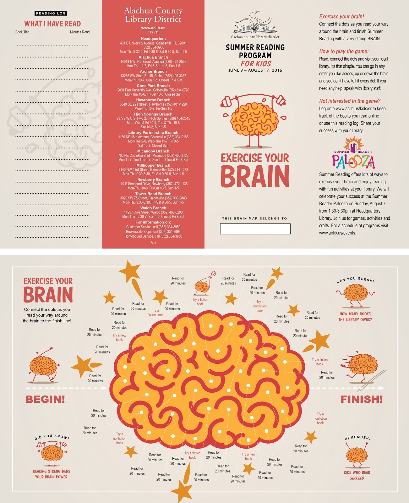
Kids reading activity brochure front and back (above), 
adult reading program brochure front and back (below).


Newsletter cover.