Showing posts with label graphic. Show all posts

01 July 2016

Rebranding Design for Library Battle of the Books Program Series

Rebranded program event identity design.
In February of 2016, my library's youth services teen librarian let me know that they would be needing a new round of publicity materials for the teen Battle of the Books events. In March, promotional material would need to be in place to promote the events so that potential participants could cast votes for books they would like to read prior to the competition events held during the summer. 


Previous marketing material designs: identity, web banner, print ad,
 flyer and handbill (same design), and quarter page handbill sheet.


Even before February, I had already discussed with the librarian that if we had time enough, I would like to redevelop the visual identity and promotional materials for this event. The existing marketing materials, which had been used for at least four years, utilized a photograph of open book in between two opposing hands holding with what appeared to be something akin to game show joy sticks, as well as a typographical treatment for the event name that was legible but somewhat awkward. It was less of a logo and more of a photo with a typographical treatment over the image.

8.5x11 inch flyers/sign redesign concepts would also be 
scaled to size for handbill and poster collaterals.

I wanted to create a logotype that could remain legible at different scales—especially small if needed—along with silhouetted images of people in some kind of action or fighting stances. The two images I had in mind were either youths in front of a standing microphone such as you would see at a spelling bee contest, or—and this was what I most wanted to pursue—images and typography styles that evoked vintage boxing posters.

I first worked up about 50 logo designs and presented them to our teen librarian. We narrowed the selection down to two that I could refine further based on her feedback. I also showed design treatments and reference images that included boxing posters, spelling bee photographs, and silhouettes of youths jumping for joy. It was decided that the silhouettes would be the most flexible design elements to work with, so I took the design in that direction and presented a series of print ads featuring silhouetted youths leaping in exuberant celebration along with the refined logotype and type treatments for what the essential promotional text would include. 

Additional development included a decidedly more feminine looking 
participant, and a vote instruction display sign.

Box wrapping paper design for vote entries.
Once that was approved, I created one additional ad that depicted a more clearly defined silhouette as a girl, as well as a display sign that could be set alongside of a box that participants could submit their voting ballots indicating which books they preferred to read for the summer contest series. In order to have the vote ballot box be recognized as part of the campaign, I used the advertisement design treatment to create a wrapping paper that could be taped around the ballot boxes.

The final promotional pieces to be created were online banner ads that would appear on the library's web site. I provided two options to be used.

Two web site banner ad choices.


Projects and quantities delivered:


8x11 Flyer/sign (21)
Quarter page handbill (200)
36x36 inch Vote box wrapping paper (12)
Web banner option #1 (1)
Web banner option #2 (1)


Library web banner in use.


06 March 2015

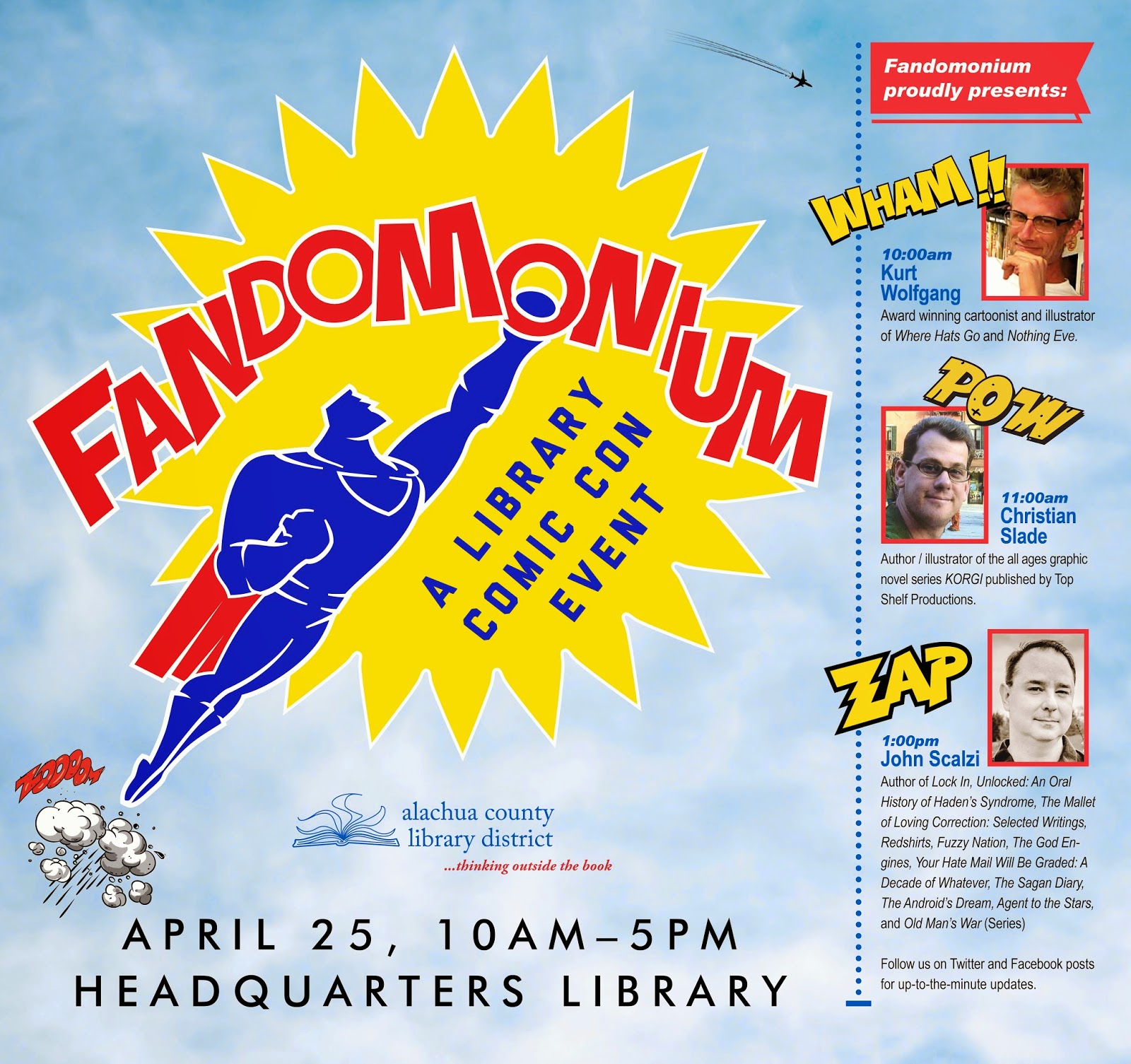
Marketing Design for Fandomonium, A Library Comic Con Event

Above: event identity utilizes a bold comic-styled iconography to catch viewer attention.

Above: identity variation without 
descriptive language for 
use in smaller applications.
Project: Alachua County Library District Fandomonium event visual identity and promotional collaterals.

Design brief: Establish a visual identity mark and develop integrated print and digital media marketing collaterals to promote the library's newly created annual event. 

Required collaterals (and printed quantities):
Series logo, with element variations and formats in both 
    colour and black/white (1+)
Newspaper Save the Date print ad (1) 
Public Service Announcement broadcast media ad (1)
67x63 inch library poster (1) 
Handbills four per 8.5x11 page.
45x45 inch library poster (1)
21x28 inch library poster (7)
21x28 inch library book sale announcement poster (1)
21x28 inch library event floor plan poster (3)
14x8.5 inch (open) / 7x8.5 inch (closed) 
    8-page program guide booklet (300+)
8.5x11 inch flyer (45)
8.5x11 inch newsletter (2,500) cover 
    and interior page layout design (1+1) 
8.5x5.5 inch Contributor Thank You Card (50)
8x2.5 inch bookmark (1,000)
Quarter page Save the Date handbill (2,000)   
Quarter page handbill (1,000)
Library website blog icon (1)
Library website banner ad (1)
Library website newsletter cover 140x188px image (1)
Library website newsletter cover 100x100px 
   blog icon (1) 


Spring newsletter cover and inside page provided event coverage.

Top: Library website blog icon; Middle: bookmark front, back. Bottom: library website banner ad.
TV broadcast PSA.
Black/white newspaper ad.
67x63 Youth Services display poster.
78x66 Teen Services display poster.
Design for both 8.5x11 inch sign and 21x28 inch poster.

8-page program guide booklet.

25 May 2014

Marketing Designs for a New Library Grand Opening Event


Roadside sign announces opening of new library after opening day.
Invitation (folded) was printed on card stock, two invites per 8.5x11 inch page.
Event program (lower right) was also printed in the same manner, but not folded.

Grand opening public service 
announcement ad.
In 2011 the Alachua County Library District received permission from the city of Gainesville, Florida to build a new branch library. After that agreement and until they could build a permanent building, a mobile trailer was used as a functioning library. Finally, in 2013, work on the permanent structure began and leading up to its opening, the library wanted to get word out that a grand opening celebration would take place.

I looked back at previously designed marketing collaterals for the mobile unit's grand opening as a basis for continuing the theme of "building the future." That series of collaterals made use of a blue print background, a rainbow, and a few architectural tools such as a t-square. An announcement for ground breaking on the new permanent location site used a shovel silhouette along with the rainbow as part of the handle. You can see samples of those materials in my earlier blog posts here http://librarygraphicdesign.blogspot.com/2011/12/cone-park-library-branch-grand-opening.html and here http://librarygraphicdesign.blogspot.com/2013/04/library-groundbreaking-ceremony.html .


Post grand opening public service
 announcement ad.
Now that the permanent building had architectural renderings, I decided to use the architect's elevation drawing as line art for the basis of the new permanent building's grand opening design collaterals. I combined the elevation drawing with a sepia-toned wood grain image to add colour to it and to become the central art element on all collaterals. For purposes of continuity from piece-to-piece of the new collaterals, I made use of the same wood grain texture as a border treatment and within outlined text of the words "Grand Opening."


Website home page banner ad.
The first marketing piece to be distributed was an invitation, printed two up on a full page, then trimmed and folded down to be a quarter-paged sized card that could be opened. The 300 physical copies would be conventionally mailed out to recipients. A second invitation version saved as a .jpg would be embedded as an image into emails invitations sent out to additional recipients.


8.5 x 11 inch sign to post
in existing branch before
transfer of materials into
 the new library branch.
Two television broadcast public service announcement ads were created. One for announcing the grand opening event, and a second one for long term use after the grand opening. A 23x34 inch poster was also created for use in a free-standing frame to be displayed in the Headquarters Library lobby.

Closer to the grand opening day, a website banner ad and a secondary blog icon image would also appear on the library website to announce the grand opening and link to a blog post for details.

Because the mobile library unit would still be in operation during construction of the new permanent building, a time would come when materials from the mobile unit would need to move to the permanent site. A sign was created to provide advance notice for that disruption of service on the days that transfer of materials would happen. 


Library lobby poster.
Roadside yard signs were also created to be used along the stretch of road that passed in front of the new library location. One designed set appeared to announce the grand opening event, a second designed set appeared the day of the grand opening, and a final set appeared after the grand opening day to announce that the permanent library building was now open for business. The 24x29 inch signs were printed on large format paper and laminated for protection from inclement weather.

For the day of the grand opening, an event program was created, printed front and back on card stock, two programs to an 8.5x11 inch page. A diagram of the building's floorplan was also created to help visitors navigate the new space. And lastly, a pair of certificates were designed to present to the Library Foundation and Friends of the Library organizations for their generous support in helping to make the new library possible look and function to the highest of expectations.
Email invitation image.


Photos of the grand opening event can be viewed here:

https://www.flickr.com/photos/acld/sets/72157638731665456/


Event poster showed floorplan 
sections of new library.
Items created for publicizing the new library: 

300 copies: Grand Opening Event Invitation

1 copy: Grand Opening Event Email Invitation

1 copy: Grand Opening PSA #1

1 copy: New Library Open PSA #2

1 copy: Grand Opening Event Website Banner

Donor certificate.
1 copy: New Library Open Blog Icon


4 copies: Library Closed (during collection shift) 8x11 inch Signs

1 copy: 20x30 inch Grand Opening Announcement Lobby Poster


3 versions / 6 prints each: 24x19 inch Yard Signs for Pre-Grand Opening, Day-Of Grand Opening; and Now Open Post Grand Opening
Donor certificate.

100 copies: Grand Opening Event Program
Floorplan


1 copy: Grand Opening Event Colour Coded 
24x19 inch Poster

1 copy: Cake Decoration Image


1 copy: Grand Opening Event 11x8.5 inch Appreciation Certificate for Friends of the LIbrary donor

1 copy: Grand Opening Event 11x8.5 inch Appreciation Certificate for Foundation donor

Event program front and back.

18 April 2014

New Signage Design for Children's Library Collection

A newly designed signage system created for the children's collection provided solutions to serve multiple interests.


New room furnishings provided the
inspiration for a more colourful
signage system that could compliment it.
During the summer of 2013, the children's level of the Alachua County Library District's Headquarters Library was renovated. The renovation included new furniture, carpeting, lighting and ceiling panels, book shelving, and decorative wooden sculptural elements based on popular children's book characters placed on a wall and surrounding floor columns. The renovation also brought with it a brighter, more vibrant palette of colours that was applied to walls, columns, floors, and seating. 

With all the major refurbishing complete, a new set of signage was desired to update the appearance of the collections as well. An audit determined that signs would be needed for tops of bookshelves, bookshelf end panels, walls, and suspended from the ceiling. 

In the past, this library's bookshelf end panel signs were simply pieces of 8.5x11 inch copier paper printed with a range of appropriate call numbers--sometimes coupled with a symbolic illustration included on the sign, sometimes not--then taped into their location. The initial directive for me was to do something along similar lines. As I began sourcing for images to be used with bookshelf signs, I found plenty of examples I thought looked good either stylistically or thematically, but 1) the library didn't have image rights to reuse them, and 2) when viewing them all together, I came to the conclusion that I would need to re-illustrate them in order to achieve a consistent, uniform style. So for the images I liked best, I drew over them to simplify them as line drawings.
Signs are itemized in a signage intent document so that all individuals
involved in the process have an opportunity to review the 
design
intent and schedule of deliverables prior to RFP and eventual fabrication.

Because most surfaces in the library are angular in shape, I wanted to explore ways to counteract that with signs that featured more organic shapes. I was also eager to explore ways to integrate the new, vibrant room colours into the sign designs as well. So taking my cue from the new colour palette, I arranged the collection numbers into circles, then placed the circles partially into a larger, central circle that featured the theme image of each bookshelf aisle series. I offset the placement of the two smaller text circles so that they followed the convention of reading left-to-right and top-to-bottom. This also helped to avoid a symmetrical and linear arrangement of the three circles. The overall arrangement resulted in what I ended up referring to as a "triple circle" sign. 

The solution appeared to work well, so I applied it to the rest of the bookshelf end panel signs. After seeing the colour selections for the numbered circles, I decided I should also maintain a consistency in the way colour would be used there too. So, for example, the 800-900s circle portion of a sign should remain the same when seen on any another sign. 

In addition to the triple-circle signs, three different single-circle signs were also created: large 10-3/4 inch signs--one for magazines/audio tapes, and one for early readers; a set of six inch circles that displayed alphabetical letters for the picture book collection; and a single six inch circle sign for the ending numerical range of the triple-circle series.

Placement of bookshelf top paper 
sign for on-site testing and review.
For shelf top and large area ceiling signs, a full circle would take up too much room, so I flattened circles into ovals and placed collection section names into those shapes. The tops of the ceiling signs and bottoms of shelf top signs would have to be flat so they could run parallel to the surface they would be attached to, so I designed a cut to begin at a reasonable distance from the sides of the sign lettering. 

Because ceiling signs would need to be seen from two directions, two different 1/8 inch acrylic signs would need to be made, then glued back-to-back. Together as one unit, the new ceiling signs would make use of the same hardware of hooks and chains used to suspend the old signs. 
Back of bookshelf top sign shows 
construction of "L" brace.

For shelf-top signs, they would need to lean back slightly so they wouldn't tip over. I wasn't certain if the acrylic could bend into an "L" shape or not, so I first designed it that way, but  deferred to my external sign vendor for his advice. He suggested that it would be easier to create an "L" shaped brace made of another material, then glue it to the back of the sign for support.

Before final signs were ordered and fabricated, I printed out all but the ceiling-mounted signs to use for a few months on location as a field test. This way, I could see if the proposed designs were adequate in size, work well for public navigation, and be aesthetically pleasing. Feedback from both youth services staff and patrons were overwhelmingly positive, so the concept was approved and I moved forward to work with the sign vendor on securing price quotes, working out technical aspects of the fabrication process, and creation of final digital files.

Cutting out full-scale paper prints for on-site testing.

On-site testing of paper signs temporarily placed to check for 
aesthetic value, proper sizing, and sufficient public navigation issues. 
You can see one of the older signs still in use hanging above the bookshelves.


On-site field testing of paper signs 
served their purpose but were by no
means intended to be permanent.
The design for the entire new signage system called for using 1/8 inch acrylic with a printed colour vinyl backing. Using a clear acrylic would allow light to enter the face of the sign and illuminate the brightly coloured vinyl print affixed to the back, making the colour even more vibrant. Wall and bookshelf mounted signs would use 3M double sided tape to adhere the sign to its location; the ceiling signs made use of the existing hook and chain hardware used to support the previous signs. 

The complete signage project included the following items:

Three double-sided 48 inch ceiling signs suspended by existing hook and chain hardware
Nineteen 6 inch circle alphabet bookshelf end signs 
One 6 inch circle numerical wall sign 
Two 10 inch circle bookshelf end signs
Nine 14.5x10.75 "triple circle" bookshelf end signs
One 23.5x3.25 inch bookshelf top easel backed sign
One 11.5x3.25 inch bookshelf top easel backed sign
Two 12.5x3.25 inch bookshelf top easel backed signs


A shot of the fabricated signs before installation. Only sign not included in shot was the large ceiling sign for Picture Books.
Views of completed acrylic signs installed.
Detail of one of the "triple circle" bookshelf end panel signs.
Completed signs installed on bookshelf end panels and ceiling.
A view of bookshelf and ceiling mounted sign in the picture book area.