05 May 2014

Integrated Marketing Designs for Kids, Teens, & Adult Library Summer Reading Programs 2014

News of the summer reading programs was showcased on the cover of the quarterly newsletter, THINK....

The Summer Reading Program is the Collaborative Summer Library Program’s (www.cslpreads.org) annual effort to encourage people of all ages to read. They break the effort down into different age groups that have their own themed application. For example, this year’s Summer Reading for kids was: “Fizz, Boom, Read!” For teens, it was “Spark a Reaction.” And for adults, it was “Literary Elements.” 

To help publicize this, the organization provides a CD-ROM of custom-made art and a few pre-formatted marketing items for each age group, such as a bookmark, an 8.5x11 inch sign, and a PowerPoint background image. Space is left on each designed collateral item for local libraries to add their own language. Unfortunately, it might not be enough space for the needs of each library. 

Our library happens to be one of those that needs more space. We prefer to advertise and promote the Summer Reading program across multiple channels of publicity, such as for print, broadcast and online applications. The wide variety of unique collaterals we use—30 at the time of this writing—each have their own dimensional requirements, which means that few, if any of the pre-formatted layouts provided by the CSLP will match the full range of formats we need. Because of this, I end up creating everything we need from scratch, incorporating artwork I select from what was provided, and supplementing with my own additional images if needed to unsure a consistent style is used for each age set. 

Typically, our library youth department manager will coordinate the gathering and dissemination of planned event information to the marketing department for creation of materials requested. Our adult services department will use one of its own staff members to coordinate adult summer reading publicity separately. I’ll work with both of these internal clients as well as our marketing / public relations director to round out development of the full compliment of marketing design collaterals requested throughout the summer.

Because there are so many separate pieces I've created to support the entire Summer Reading program, instead of discussing the process for each. Instead, I'll just provide some sample images with a brief description.

Three 100x100px library website blog icons depict the essential theme identities for children (left), teens (middle) and adults (right).


Three library website banners 
show an expanded view 
of the essential theme identities.


Three online advertisements 
list children and teen events 
for June, for July, and for 
June–August.


Bookmark fronts / backs 
for children and teens.


Two television broadcast PSAs.
Top one for children / teen 
combination, and bottom one
for adults.


The top portion of 
MS Publisher templates for
children and teen half-page
flyers (top), full page signs
(middle), and quarter-page
handbills (bottom).


Children's quarter-page 
handbills.


Top left: online publication banner advert.
Top right: magazine print advert.
Bottom: publication print advert.


Exterior (top) and interior (bottom) 
views of a 14x8.5 children's 
tri-fold brochure. Used to log books
read, as well as to act as a 
game board to guide readers
through the summer.

The game board was also printed 
as 55.5x36 inch large format posters
for each of the 12 district libraries to
use with youth readers as they
charted their reading progress 
during the summer.


A version of the game board
I presented as an alternative
to a single linear game, this
version allowed users to read
at-will, and check off the 
"molecules" represented as
they progressed. Surprisingly,
it confused some of the 
librarians, so we went with the 
more structured, linear design.

An 14x8.5 inch tri-fold brochure
for the adult reading program.
Images used within the theme
display lettering and background
were images I sourced for to 
supplement the provided 
iconography with. Book covers
provided by the librarian.


Single-colour image 
(white ink) would imprint
onto a purple tote bag 
for adult summer readers.


COMPLETE SUMMER READING PROJECTS DESIGNED (+ QUANTITY):

Kids 3.625x4.875 inch Giggle Magazine Print Advert (1)
Kids/Teens 3.625x4.875 inch Giggle Magazine Advert (1)
Kids/Teens North Florida School Days Print Advert (1)
Kids/Teens Black College Monthly Newspaper Print Advert (1)
Kids Bookmark (5000) Vendor Printed
Teens Bookmark (1000) Vendor Printed
Adult 45x45 inch Publicity Board Poster (1)
Kids 8.5x11 inch Template (1) 
Teens 8.5x11 inch Template (1) 
Kids Half Page Template (1) 
Teens Half Page Template (1) 
Kids Quarter Page Template (1) 
Teens Quarter Page Template (1) 
Kids/Teens Half Page Handbill (240)
Kids Fun4GatorKids 150x300 px Online Advert (1)
Kids Fun4GatorKids 8x11 inch Online Advert Jun-Aug (1)
Kids Fun4GatorKids 8x11 inch Online Advert June Only (1)
Kids Fun4GatorKids 8x11 inch Online Advert July Only (1)
Kids 3ft Vert. x Prop Width Large Format Game Posters (18)
Kids 14x8.5 inch Tri-fold Game Brochure (4000) Vendor Printed
Adults 14x8.5 inch Tri-fold Brochure (700) Vendor Printed
Kids/Teens Broadcast Television PSA (1)
Adult Broadcast Television PSA (1)
Kids Website Blog Icon (1)
Teens Website Blog Icon (1)
Adults Website Blog Icon (1)
Kids Website Banner (1)
Teens Website Banner (1)
Adults Website Banner (1)
Adult Mini Tote Logo (1)
THINK... Quarterly Newsletter cover and interior pages (2750)

18 April 2014

New Signage Design for Children's Library Collection

A newly designed signage system created for the children's collection provided solutions to serve multiple interests.


New room furnishings provided the
inspiration for a more colourful
signage system that could compliment it.
During the summer of 2013, the children's level of the Alachua County Library District's Headquarters Library was renovated. The renovation included new furniture, carpeting, lighting and ceiling panels, book shelving, and decorative wooden sculptural elements based on popular children's book characters placed on a wall and surrounding floor columns. The renovation also brought with it a brighter, more vibrant palette of colours that was applied to walls, columns, floors, and seating. 

With all the major refurbishing complete, a new set of signage was desired to update the appearance of the collections as well. An audit determined that signs would be needed for tops of bookshelves, bookshelf end panels, walls, and suspended from the ceiling. 

In the past, this library's bookshelf end panel signs were simply pieces of 8.5x11 inch copier paper printed with a range of appropriate call numbers--sometimes coupled with a symbolic illustration included on the sign, sometimes not--then taped into their location. The initial directive for me was to do something along similar lines. As I began sourcing for images to be used with bookshelf signs, I found plenty of examples I thought looked good either stylistically or thematically, but 1) the library didn't have image rights to reuse them, and 2) when viewing them all together, I came to the conclusion that I would need to re-illustrate them in order to achieve a consistent, uniform style. So for the images I liked best, I drew over them to simplify them as line drawings.
Signs are itemized in a signage intent document so that all individuals
involved in the process have an opportunity to review the 
design
intent and schedule of deliverables prior to RFP and eventual fabrication.

Because most surfaces in the library are angular in shape, I wanted to explore ways to counteract that with signs that featured more organic shapes. I was also eager to explore ways to integrate the new, vibrant room colours into the sign designs as well. So taking my cue from the new colour palette, I arranged the collection numbers into circles, then placed the circles partially into a larger, central circle that featured the theme image of each bookshelf aisle series. I offset the placement of the two smaller text circles so that they followed the convention of reading left-to-right and top-to-bottom. This also helped to avoid a symmetrical and linear arrangement of the three circles. The overall arrangement resulted in what I ended up referring to as a "triple circle" sign. 

The solution appeared to work well, so I applied it to the rest of the bookshelf end panel signs. After seeing the colour selections for the numbered circles, I decided I should also maintain a consistency in the way colour would be used there too. So, for example, the 800-900s circle portion of a sign should remain the same when seen on any another sign. 

In addition to the triple-circle signs, three different single-circle signs were also created: large 10-3/4 inch signs--one for magazines/audio tapes, and one for early readers; a set of six inch circles that displayed alphabetical letters for the picture book collection; and a single six inch circle sign for the ending numerical range of the triple-circle series.

Placement of bookshelf top paper 
sign for on-site testing and review.
For shelf top and large area ceiling signs, a full circle would take up too much room, so I flattened circles into ovals and placed collection section names into those shapes. The tops of the ceiling signs and bottoms of shelf top signs would have to be flat so they could run parallel to the surface they would be attached to, so I designed a cut to begin at a reasonable distance from the sides of the sign lettering. 

Because ceiling signs would need to be seen from two directions, two different 1/8 inch acrylic signs would need to be made, then glued back-to-back. Together as one unit, the new ceiling signs would make use of the same hardware of hooks and chains used to suspend the old signs. 
Back of bookshelf top sign shows 
construction of "L" brace.

For shelf-top signs, they would need to lean back slightly so they wouldn't tip over. I wasn't certain if the acrylic could bend into an "L" shape or not, so I first designed it that way, but  deferred to my external sign vendor for his advice. He suggested that it would be easier to create an "L" shaped brace made of another material, then glue it to the back of the sign for support.

Before final signs were ordered and fabricated, I printed out all but the ceiling-mounted signs to use for a few months on location as a field test. This way, I could see if the proposed designs were adequate in size, work well for public navigation, and be aesthetically pleasing. Feedback from both youth services staff and patrons were overwhelmingly positive, so the concept was approved and I moved forward to work with the sign vendor on securing price quotes, working out technical aspects of the fabrication process, and creation of final digital files.

Cutting out full-scale paper prints for on-site testing.

On-site testing of paper signs temporarily placed to check for 
aesthetic value, proper sizing, and sufficient public navigation issues. 
You can see one of the older signs still in use hanging above the bookshelves.


On-site field testing of paper signs 
served their purpose but were by no
means intended to be permanent.
The design for the entire new signage system called for using 1/8 inch acrylic with a printed colour vinyl backing. Using a clear acrylic would allow light to enter the face of the sign and illuminate the brightly coloured vinyl print affixed to the back, making the colour even more vibrant. Wall and bookshelf mounted signs would use 3M double sided tape to adhere the sign to its location; the ceiling signs made use of the existing hook and chain hardware used to support the previous signs. 

The complete signage project included the following items:

Three double-sided 48 inch ceiling signs suspended by existing hook and chain hardware
Nineteen 6 inch circle alphabet bookshelf end signs 
One 6 inch circle numerical wall sign 
Two 10 inch circle bookshelf end signs
Nine 14.5x10.75 "triple circle" bookshelf end signs
One 23.5x3.25 inch bookshelf top easel backed sign
One 11.5x3.25 inch bookshelf top easel backed sign
Two 12.5x3.25 inch bookshelf top easel backed signs


A shot of the fabricated signs before installation. Only sign not included in shot was the large ceiling sign for Picture Books.
Views of completed acrylic signs installed.
Detail of one of the "triple circle" bookshelf end panel signs.
Completed signs installed on bookshelf end panels and ceiling.
A view of bookshelf and ceiling mounted sign in the picture book area.

08 April 2014

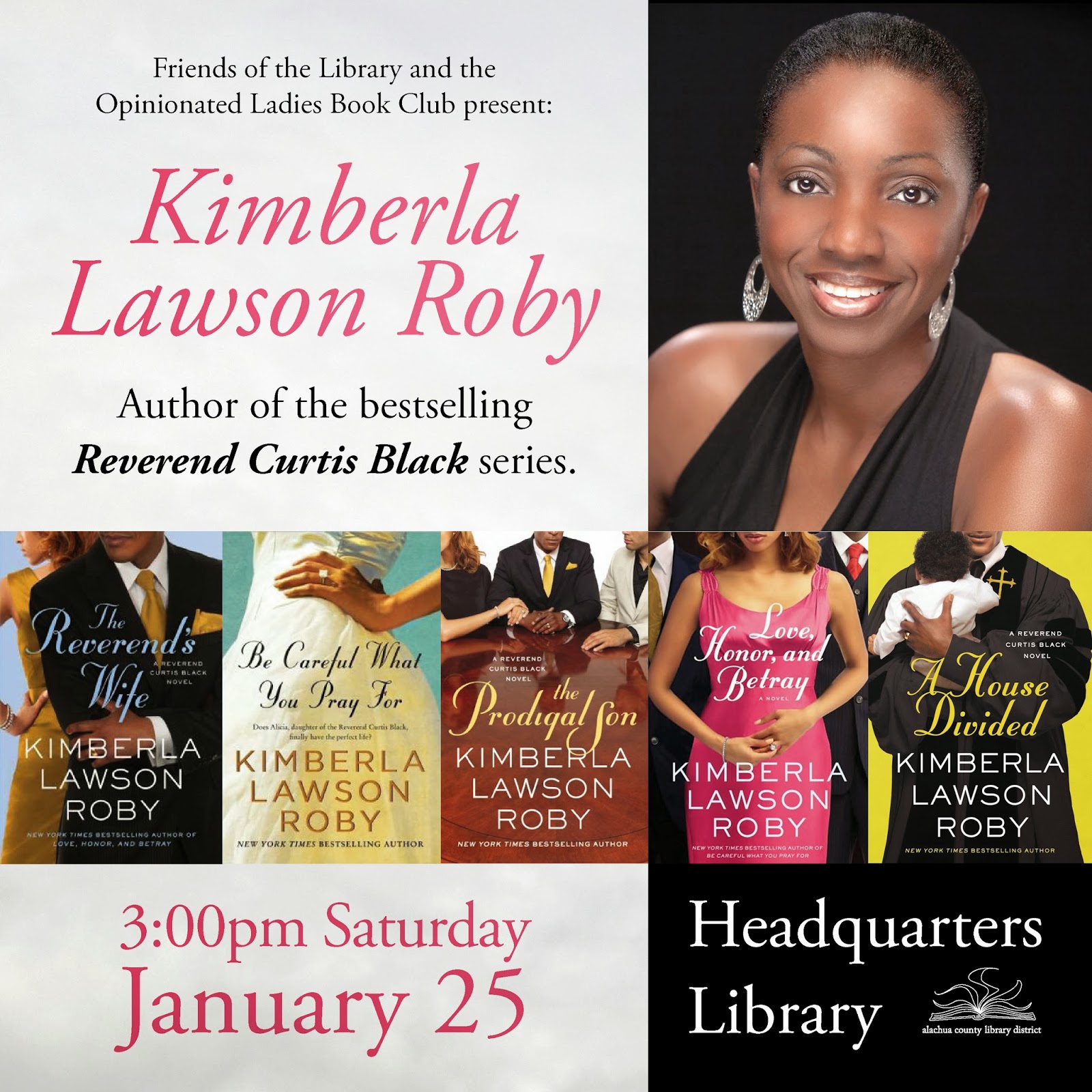
Promotional Design for Library Speaker Event: Kimberla Lawson Roby

45x45 inch large format display poster.
A standard 8.5x11 inch page 
accommodated space for four handbills.
Author Kimberla Lawson Roby spoke at the Alachua County Library District in January 2013. A variety of marketing collaterals were used to promote the event, ranging from print, online and television broadcast advertisements, posters and signs, leave-behind handbills, and an invitation image to be used in email blasts.

The publicity materials utilized a consistent design style of the author's photo along with covers of books from her Reverend Curtis Black series.


A public service announcement advert also served 
as an image embedded into an email invitation.
Promotional collaterals created to promote this event:

250 quarter page handbills
30 8.5x11 signs
1 newspaper print advertisement
1 website banner advertisement
1 public service announcement (PSA) advertisement
1 email invitation image
1 45x45 inch large format display poster


A website banner ad followed in the style of the print collaterals.

05 April 2014

Promotional Marketing Design for Library Speaker Event: Author Bill DeYoung

45x45 inch large format display poster.
One of two print advertisements.
Author Bill DeYoung provided two good quality images of himself and his book cover for use in promoting his author event at the Alachua County Library District in January. 

By "good quality" I mean sufficient for a decent print reproduction quality at the size the images are would be seen. Image quality is determined by two factors: the resolution of the image (for example, 72 pixels per inch or "72ppi" is sufficient for digital media reproduction but not printed documents, whereas printed documents reproduce better at higher levels such as 300 dots per inch or "dpi"; a suitable number is dependent on the scale you might adjust the original sized image to).

In DeYoung's case, both his book and headshot images were low resolution 72ppi images, but the dimensions were 11x16.6 inches and 6.6x10 inches, which allowed them to be scaled up larger without significant noticeable image degradation for the size I wanted to increase them to. A third image of the bridge I used in the web banner was also a higher quality image at 7x3 inches, 96ppi. The higher quality of image sizes ensured a higher quality visual image for each promotional piece created.
An 8.5x11 inch page provided 
space enough for four handbills.

Promotional materials created for this author event included:

One 45x45 inch large format display poster
One website banner ad
Two newspaper print advertisements
100 quarter page handbills for Headquarters Library
100 quarter page handbills for two libraries

Library website page banner ad.


29 March 2014

Marketing Design for Black History Month 2014 Library Events


Base theme design that would be applied whole or in part to other corresponding event collaterals.


Web page blog icon.
Every year, the Alachua County Library District puts on an array of programs and events to celebrate Black History Month. Marketing and design helps to support that effort through the creation of a variety of publicity materials. My first order of business in developing a visual theme for the celebration is to refer to The Association for the Study of African American Life and History (ASALH), headquartered in Washington, D.C. which sets the annual national theme for Black History Month. The association's mission is to promote, research, preserve, interpret and disseminate information about Black life, history and culture to the global community. You can read more about the ASALH here: www.asalh.net, and for an annual listing themes, here: http://asalh.org/blackhistorythemes.html.

Website home page banner ad would be 
used to promote all associated events.
The 2014 theme was "Civil Rights in America" so I focused on collecting images of three symbolic things relating to two key moments in a 100-year span of history related to the government's recognition of these rights: the Supreme Court building, Abraham Lincoln (in reference to the Emancipation Proclaimation of 1863), and finally Martin Luther King, Jr. shaking hands with then-president Lyndon Baines Johnson at the 1964 signing of the Civil Rights Act bill.

I was able to assemble these photographic images overlaying each other, then add a background of radiating light rays, stars and stripes and typography to create a few different arrangements for the various collaterals needed.

Television Public Television Announcement.
Projects included:

General quarter page handbills

350 General 8.5x11 inch event list flyer
1 General television PSA
1 General celebration webslide
1 General celebration blog icon
1 General newspaper print ad
250 Dance event quarter page handbills
1 Dance event 11x17 inch poster


45x45 inch large format display poster.
Final 45x45 inch display poster installed on site.


15 December 2013

Promotional Design for Library Fundraising

Our Library Foundation and Friends of the Library organizations are incredibly generous groups of people who provide considerable financial assistance to the library district. So whenever I hear that they are in need help developing marketing materials that in turn benefit the library, I always encourage them to first ask if I can provide them with creative services before they entertain the thought of looking elsewhere. Having them work with me not only saves the Foundation and library district money, but it also allows me the opportunity to monitor and maintain a certain level of quality control while seeking to provide continuity in their communication collaterals.


Updated brochure design exterior (top)
and interior (above).
In the past I've had the pleasure to design fundraising brochures and flyers for the Foundation which you can see here http://librarygraphicdesign.blogspot.com /2012/07/library-foundation-brochure.html. Later, when they wanted to create additional fundraising collaterals to promote its donor program which features a large etched glass pane called the "Katherine's Tree" at our Headquarters Library, I suggested for  purposes of reinforcing their brand recognition that they continue using the design sensibility already established in the other recent fundraising materials I created.


Views of an older brochure exterior
(above) and interior (below) that
predated my redesign.
For this project, the Foundation wanted to create an 8.5x11 inch page and a 20x30 inch poster to illustrate the Katherine's Tree glass etching. An initial idea by the client was to have a photo shoot of the 20 foot high etching which would involve an elaborate set-up to hang large fabric behind the etching, shoot without any additional lighting, and hope that there would be no flash hot spots or glare to contend with. The fall back would be that extensive Photoshop work could save the day. All this and before I forget to mention they were mildly in a hurry for it too.

I could see that such a photo shoot plan would require such a considerable amount of logistics, manpower and production time that I suggested instead to use the photo I had already shot and used in the existing brochure, remove the etching portion of the photograph and replace it with a vector redraw of it using Adobe Illustrator. To demonstrate how much easier and less time consuming it would be, I spent about 15 minutes of time to do exactly that and showed my Foundation contact that I'd already finished about 10% of the etching with very little effort and without all the complicated and non-guaranteed photo shoot results. Not only that, but by creating the graphic portion of the tree using Adobe Illustrator, it ensured that the line work in the image would be pristinely sharp and clear—even modifiable at a later date if needed—at any size big or small that they would want to use it in the future, unlike the pixel format of a photographic image. 

Sales job done, it was agreed upon and I went to work. I had a proof for the Foundation to review in less than three days to check for counting the tree leaves which needed to be numbered and approved for the order in which they would be viewed. The initial request was to number all the leaves from top to bottom, right to left, but due to the uneven, non-uniform arrangement of the leaves, I chose to utilize a sweeping path that attempted to keep every leaf butting up against the numbered one preceding it—or as close to it as possible. This way, leaves in groups of 10s might appear in clumps together, rather than in unevenly spaced, bumpy lines that attempted to force readers to try to read it like a book.

With the number grouping strategy approved, I cleaned up the design and saved the image in three different ways for using: 1) a straight black and white etching image framed by the colour photo, good for reproducing at a small scale as a graphic that individual leaves could be identified later by hand with highlighter markers; 2) colour-coding leaves in groups of 10s to assist in locating numbered groups faster and more conveniently; and 3) the straight black/ white graphic tree laid overtop of a ghosted back image of the original background. This would help communicate that the Katherine's Tree is a see-through glass etching and it would also give the illustration a little more sophistication. It could be used at a larger presentation scale and look better than the straight black/white or colour-coded graphic versions that were intended to be more utilitarian for reference and marking on.

Delivery of the project only took a couple of weeks. A single 20x30 inch poster was printed using my large format printer and them mounted to foam core board. They would display the poster at events where they would have multiple person audiences. For their 8.5x11 inch pages they would use as handouts and mailable inserts, all they needed were the three digital images; they would place those images onto Microsoft Word or Publisher pages they would create language content for and maintain themselves.