Showing posts with label font. Show all posts

06 March 2015

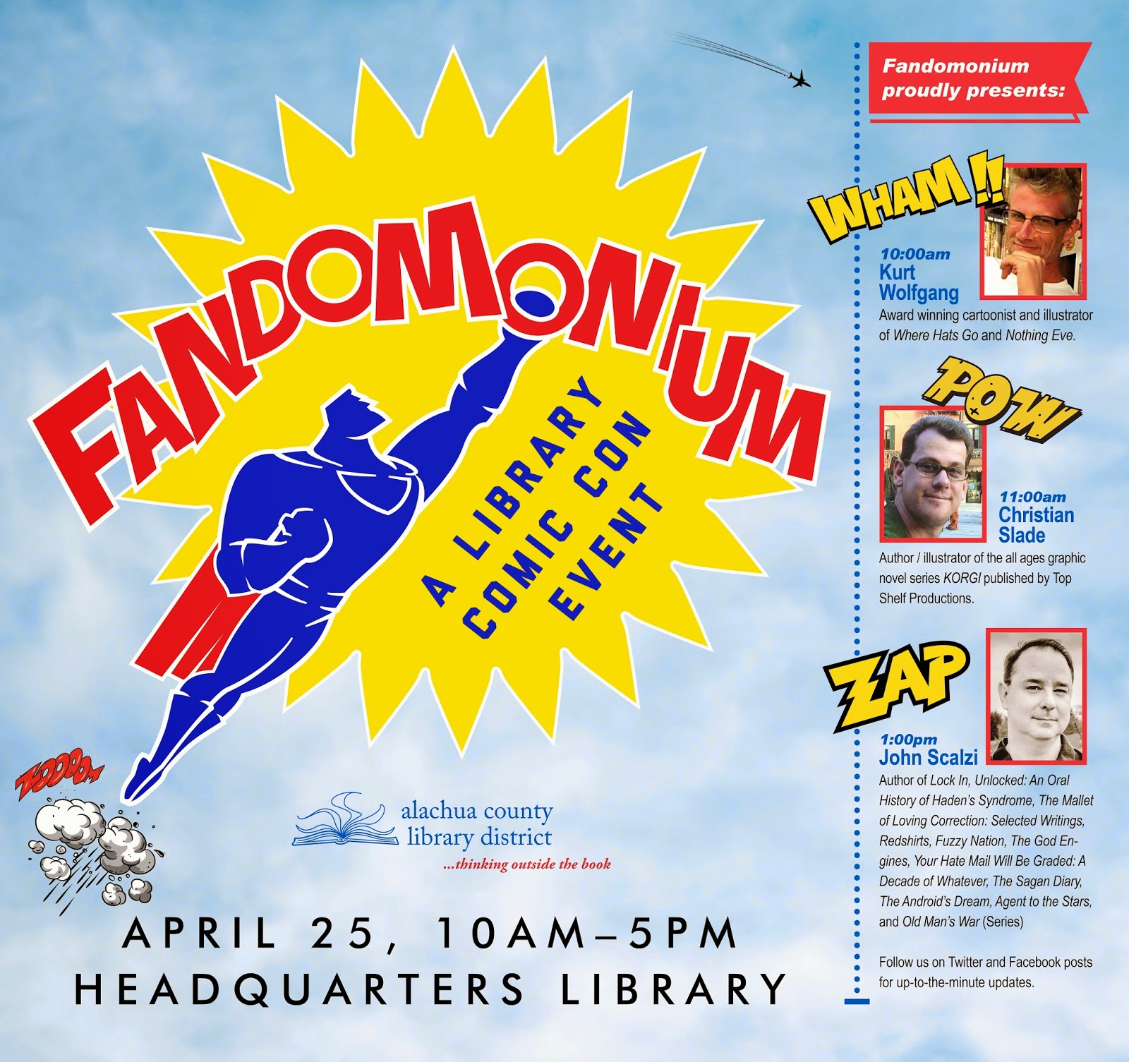
Marketing Design for Fandomonium, A Library Comic Con Event

Above: event identity utilizes a bold comic-styled iconography to catch viewer attention.

Above: identity variation without 
descriptive language for 
use in smaller applications.
Project: Alachua County Library District Fandomonium event visual identity and promotional collaterals.

Design brief: Establish a visual identity mark and develop integrated print and digital media marketing collaterals to promote the library's newly created annual event. 

Required collaterals (and printed quantities):
Series logo, with element variations and formats in both 
    colour and black/white (1+)
Newspaper Save the Date print ad (1) 
Public Service Announcement broadcast media ad (1)
67x63 inch library poster (1) 
Handbills four per 8.5x11 page.
45x45 inch library poster (1)
21x28 inch library poster (7)
21x28 inch library book sale announcement poster (1)
21x28 inch library event floor plan poster (3)
14x8.5 inch (open) / 7x8.5 inch (closed) 
    8-page program guide booklet (300+)
8.5x11 inch flyer (45)
8.5x11 inch newsletter (2,500) cover 
    and interior page layout design (1+1) 
8.5x5.5 inch Contributor Thank You Card (50)
8x2.5 inch bookmark (1,000)
Quarter page Save the Date handbill (2,000)   
Quarter page handbill (1,000)
Library website blog icon (1)
Library website banner ad (1)
Library website newsletter cover 140x188px image (1)
Library website newsletter cover 100x100px 
   blog icon (1) 


Spring newsletter cover and inside page provided event coverage.

Top: Library website blog icon; Middle: bookmark front, back. Bottom: library website banner ad.
TV broadcast PSA.
Black/white newspaper ad.
67x63 Youth Services display poster.
78x66 Teen Services display poster.
Design for both 8.5x11 inch sign and 21x28 inch poster.

8-page program guide booklet.

26 August 2014

Logo Design for Library Summer Palooza Event


After 25 years of hosting a Literary Festival event in October, the Alachua County Library District decided the time had come to integrate it into the Summer Reading Program and rebrand the newly appointed August event as the "Summer Reader Palooza," that celebrated the end of the Summer Reading program and kicked off the back-to-school season.

To initiate branding of this new event, the library required a new event identity. I wanted the mark to appeal to the age-appropriate audience of children, so I selected a playful yet easy to read display font and cheerful colour scheme. I also created the icon of a book and inset it into a modified clip art sun icon to provide an easily recognizable association to books and summer. 

I developed a few logo variations until I came up with four that worked well, then selected the one that looked like it would have the highest technical reproduction integrity, as well as what I hoped would have strongest potential for remaining fresh and have staying power — perhaps one that could last for another 25 years! The final mark is shown here in its two options, full colour and black/white. 

Final logo files were passed to the client for using on documents and publicity that they created. The only application of the new identity I used it on was a web banner posted on the library website, seen below.

Web banner ad used for library website.

08 May 2014

Marketing Design Collaterals for 2014 Library Volunteer Appreciation Luncheon

To strengthen recognition of any single event, its marketing collaterals
should be created to maintain a cohesive look from one piece to another.

Top row: starting images.
Bottom: modified images.
For the 2014 Volunteer Appreciation Luncheon, the library chose John Cech, who—among a variety of notable accolades—was Director of the University of Florida’s Center for Children’s Literature and Culture. He planned to speak about local Florida “treasures” that literary work had written about.

In conversations with my internal client, we agreed on exploring a visual solution that imparted the idea of a long-held keepsake from childhood that over the course of time might have become a little worn but nevertheless remained a personal treasure for the memories it evoked. 

Since the event was for a library, it was only natural to settle on a book concept—if for no other reason than to help present the essential invitation and program information. A book or personal journal could be the quintessential keepsake. 
Two sides of printed
program cover.

Next was to create something that looked like an “old book.” I already had a selection of domain free images of textures I could tap into from previous projects, and easily selected a brown leather grained material to be the cover of the book. A second book cover image had a wonderfully aged texture and decorative flower motif that would serve well as an accent to the primary cover material image. As it turns out, I also use the same image used in black/white as a pattern inside large “brackets” in the quarterly library newsletter, THINK...., so there is already a subliminal connection to the library for those who really look hard. 

Both original images needed to be modified for use in the luncheon event, however. I brightened both up and also changed the dark brown leather to be purple. The purple/gold combination looked more festive—perhaps a little more regal or “award ceremony-ish”—it was certainly a more youthful than the darker and duller original images. My client remarked that the purple/gold comination reminded her of the book The Little Prince; I was leaning toward Harold and the Purple Crayon myself. Neither was spot on, but hey, if the colour choices emparted any specific childhood book then I was already on target.
250 single-sided printed invitations on
 110lb stock before folding into card.

I planned to use the purple leather as the exterior cover of the book, then use the gold patterned image as an interior cover end paper surface. Once I placed text on the cover, however, I decided I wanted the cover to be more immediately recognizable as a book, so I included the gold accent image along the spine. I also used the accent pattern inside of a gold star that rested atop the display text, providing readers with an eye-catching place to start reading from.

I also wanted a playful, hand-generated looking display font with a thick line weight so it could still look bold even if used at a small point size. For this, I chose a font named “One Starry Night.” For the bulk of remaining text, I kept with the library’s corporate standards of Arial and Adobe Garamond.
The completed print invitation.

The first item of business was to create a print invitation in order to get it mailed out to recipients with enough advance notice. The library had typically used front/back printed quarter page card stock inserted into invitation envelopes for mailing. But because this theme involved a book design, I wanted this year’s invitation to be a “mini book” of sorts, with a cover and at least one internal page spread to open to. Having that would mean there would be four individual pages to provide information on in addition to the external and internal cover surfaces (not that I would advocate filling every open surface with text). It worked out well to have the event name on the cover; an invitation message on the first inside page; speaker credentials information on the left interior spread; event theme and essential date/time/location information on the right inside spread; and RSVP information requirements on the back inside page. The back cover and inside cover end pages could remain decorative and uncluttered. 
The e-vite version of the event invitation.

A separate RSVP card was created to be tucked into the invitation, but was later cancelled in favour of having attending guests either phone or email in their RSVPs. I was hopeful that the interior 24lb text pages could be bound to the exterior 110lb card stock cover by using a thin gold stretchy band, but due to a limited budget we used a thin, tan rubber band which--although cheap--didn't look terribly bad.
Checking program trim and alignment.

With the invitation setting the tone for the visuals, an e-invitation image was created to mimic the print invitation. This image would accompany electronically delivered invitations to invited guests. It would be followed up a few weeks later with a save-the-date email that included an instantly recognizable theme design image as an reminder.

Taking its cue from the invitation design, the event program would follow suit. It would utilize the same invitation book style and be more substancial in content with 12 interior pages: an opening dedication page; speaker bio; event schedule; six pages of branch volunteer highlights; a spread highlighting the speaker’s key points with a map to refer to their location; and a list of contributors to thank. Two slits into the back cover would hold in place a discount entrance ticket to one of the locations from the speaker’s list.
Above, below:
program interior pages.

The interior pages looked too stark and cheap against the detailed texture of the inside cover end pages, so I wanted to find something that had a little texture to it but not so much that it competed with the inside cover textures. I used an image of a handmade paper that had thin fibers and some golden accent leaves in it. After toning the original image back to 30% brightness, it provided a nice compliment to the cover textures. For continuity from page-to-page, I also made use of the gold patterned star as an accent above disaply text ascenders, as text bullets, and site locations on the map. Like my hope for the invitation, I hoped the program would make use of a nice, decorative gold stretch band. But finding materials within budget was a challenge. In the end, although a single staple held interior pages to each exterior cover, a length of gold yarn was used to hide the staple. It wasn't anyone's first choice, but it worked for those concerned with budget issues and the appearance of appearing too extravagant with public funding; a reasonable concern, of course.

While program language was being developed by others, I worked on designs for a raffle winner star and a discount ticket to one of the speaker’s destinations of choice. The raffle winner star was quick and easy: I picked up the accent star icon from the invitation and program, added a border around it using the purple cover texture, added the words “You Win!” inside the star, then duplicated the design multiple times on a single 8.5x11 inch page and them out for cutting out with an X-acto blade.


The discount ticket would require a little more work. I wanted it to have a carnival or movie ticket shape and use the same purple/gold textures. I created an outline of the ticket shape in Adobe Illustrator, then did the same with the border design. I turned the border into an outline stroke that I could import the gold texture into, then saved it as an image to place on page over top of the purple background texture. The ticket required text on both the front and back, so I placed that language into the center of the ticket. 


Program coupon front / back.
Originally, I wanted to have the border treatment on both sides of the ticket, but the paper pick-up on the office copier I used varied too much from page-to-page for me to count on a reliable alignment of front-to-back images. To address this, I opted against using a border treatment on the back of the ticket and centered text in a box ghosting out of the gold accent paper image instead.

Twentyfour table assignment markers were next to complete. I used 8.5x11 inch 110lb card stock pages to duplicate a design three times per page so that I could fold the page into a vertical pylon. Enough unprinted excess left on one side of the page provided me with enough room to act as a tab I could double stick tape to the leading end on the opposite side. To coordinate it with the other designs, I used the program page image of the handmade paper for the primary background of the table marker, used the purple and gold book image patterns for accent, along with the gold star.


Three-sided table markers.
Collateral designs produced for this event included:

Print Invitation (250)

Print Invitation Interior Pages (250)
E-Invitation Image (1)
RSVP Invitation Insert Card (Created but cancelled)
E-Save The Date Image (1)
Raffle Winner Stars (23)
Event Program Gift Coupon (250)
Event Program Exterior Cover (250)
Event Program Interior Pages (6 pages x 250)
Event Table Reservation Markers (24)
Event Table Veggie Plate Markers (12)

Some production shots. Upper left: trimming invitations; Upper right: trimming
invitation interior page; Middle left: notes on printed coupon pages during
effort to align printed fronts and backs; Middle right: cutting out scallop portion
of coupons after printing both sides; Lower left: cutting and folding programs;
Lower right: trimming collated interior pages of program before stapling together.

29 March 2014

Marketing Design for Black History Month 2014 Library Events


Base theme design that would be applied whole or in part to other corresponding event collaterals.


Web page blog icon.
Every year, the Alachua County Library District puts on an array of programs and events to celebrate Black History Month. Marketing and design helps to support that effort through the creation of a variety of publicity materials. My first order of business in developing a visual theme for the celebration is to refer to The Association for the Study of African American Life and History (ASALH), headquartered in Washington, D.C. which sets the annual national theme for Black History Month. The association's mission is to promote, research, preserve, interpret and disseminate information about Black life, history and culture to the global community. You can read more about the ASALH here: www.asalh.net, and for an annual listing themes, here: http://asalh.org/blackhistorythemes.html.

Website home page banner ad would be 
used to promote all associated events.
The 2014 theme was "Civil Rights in America" so I focused on collecting images of three symbolic things relating to two key moments in a 100-year span of history related to the government's recognition of these rights: the Supreme Court building, Abraham Lincoln (in reference to the Emancipation Proclaimation of 1863), and finally Martin Luther King, Jr. shaking hands with then-president Lyndon Baines Johnson at the 1964 signing of the Civil Rights Act bill.

I was able to assemble these photographic images overlaying each other, then add a background of radiating light rays, stars and stripes and typography to create a few different arrangements for the various collaterals needed.

Television Public Television Announcement.
Projects included:

General quarter page handbills

350 General 8.5x11 inch event list flyer
1 General television PSA
1 General celebration webslide
1 General celebration blog icon
1 General newspaper print ad
250 Dance event quarter page handbills
1 Dance event 11x17 inch poster


45x45 inch large format display poster.
Final 45x45 inch display poster installed on site.


29 November 2013

Bookmobile Rebranding Campaign Designs


Roadside directional yard sign displays the rebranded identity logotype treatment
Two PSA ads (top,
middle), and print ad
In May of 2013, our library's Outreach department asked the Public Relations and Marketing department to help them explore ways in which that the library could increase community awareness of its Bookmobile service and in turn increase attendance at the locations where the two Bookmobiles stopped throughout Alachua County in Florida.

The Outreach department originally asked for the rebranding campaign to be delivered in 30 days, but as a single-person design department that produces between 60 to 130 per month for the library district, I had to tell them that wasn't feasible. They wouldn't even have written their survey and received any results back by then anyway. So it was suggested we develop the campaign over the summer months and see if everyone was ready by start of the school year in September. In the end, even though the design component of the campaign was ready for roll-out by September, the official roll-out held off until the first of December.

The outcome of our planning resulted in developing a survey staff could use to receive essential feedback back from patrons; another outcome was for the Creative department to re-envision and develop an entirely new visual identity and set of communication collaterals the Bookmobile could use to promote itself. 

Half page size
schedule handout
For creative development, I first identified a thematic direction I wanted to explore: using a "road sign" style of presentation for the identity of the Bookmobile to strengthen its connection between the service and where one would associate seeing it—out on the road. A colour palette, typographical style, and shapes consistent with roadway signage would be used. To me, the choice seemed completely natural and obvious to pursue. We allowed time during the summer for surveys to return in order to provide feedback on patron's current awareness of the Bookmobile services and what additional ways the service could be tailored to met their needs. Meanwhile, I moved forward to develop a new visual identity and strategy for communications materials.

I developed a logotype for "The Bookmobile" that would become the new brand identity of the service. It would use bold italic white lettering on a green background that would include a directional arrow of the same green background colour. The arrow stem would horizontally bisect through the center of some of the letters, allowing its arrowhead to prominently terminate in the center of the "o" of the "mobile" portion. So in essence, the italic logotype with the bisecting arrow would reinforce the connotation that books were on the move, going mobile.

Half page handout
To help viewers of the logotype better make the connection between it and the library, I next wrote a tagline to be included under the logotype that would need to be consistently worded as an integral part of the identity: "We're driven to bring you the Library!" In this way, "book" would make the connection to "library" while "driven" connected to "mobile." I thought it not only clever, but essential to weave in as much literal and subliminal interconnectivity as possible into the branded logotype. Each component of the logotype would work to strengthen and reinforce the whole by further defining it. To accommodate for different presentations of the identity when necessary, three basic variations of the identity would be utilized: "The Bookmobile" logotype both with and without the tagline, and also a version of the logotype with a heavily outlined profile view photo of the Bookmobile positioned over the logotype lockup.

8.5x11 inch sign style
To further link the Bookmobile service to its mobile environment, online and print advertisements as well as other collaterals such as physical signs posted both inside and out of the Bookmobile would all utilize the appearance of roadway signage. I identified and developed three different themed channels to speak to: 1) target audiences such as students, seniors, families; 2) service attributes that could play off of vehicle signage language such as the deliver, reserved, accelerate; and 3) lifestyle issues such as gasoline and financial savings, time and locality convenience.


Mock-up of a key chain that
was actually manufactured.
Advertising and signage language was written both to provide essential factual information as well as to draw from their theme connections. Clever and playful wording was also infused into the messages in an effort to not only identify essential factual information but also to interject a small dose of personality into it. In the end, a few final signs were selected from each channel, knowing that future signs could potentially tap into any of the themed channels as needed based on what issue or audience they wanted to address. Two different sizes of each sign design were created: full page 8.5x11 versions for posting on walls and half page versions for handing out to the public as leaflets.

Interior sign for librarian desk
pass-through area
A few additional promotional pieces were developed to further assist in the rebranding awareness campaign: roadside yard signs that directed traffic to the Bookmobile stops; a sandwich board signs to be placed outside the vehicles that incorporated the new identity at the top and left open space below for changeable event-specific posters and information; vinyl adhesive labels applied on the Bookmobile truck doors; a key chain sporting the new Bookmobile identity; bumper stickers that could be displayed either on the Bookmobile and / or on private passenger vehicles that wanted to promote awareness of the service. 

Web site banner ad
The only thing that couldn't be altered at this time was the vehicle wrap that would have to wait until its material life span ended and need replacement. But once that time came, a new design would be developed and implemented which would then also be applied to the other associated identity elements.
Creative for bumper sticker
styled bookmarks
included over 30 choices. The
final single one chosen is
the one at bottom.

The complete campaign included creation of the following collaterals (and number printed):

Roadside directional 24x19 inch yard signs (3 versions, 6 each)
PSAs (2 versions, each used)
Print ad (1)
Sandwich board top 23.5x12 inch signs (4)
Half page schedule handbills (100)
Half page promotional handbills (4 versions, 100 each)
8.5 x 11 inch signs (25 created, 4 versions used, 50 each)
Key chain 3x.875 inch pad (250 manufactured by outside vendor)
Interior Bookmobile signs (4 created, 0 used)
Interior Bookmobile shelf collection signs (22 versions, 0 used)
Web ad banners (2 versions)
Vehicle cab door 25.5x8 inch adhesive signs (4)
Bookmarks (30 developed; 100 of 1 printed)
Bookmobile staff business card (1 version, unused)