Showing posts with label card. Show all posts

06 March 2015

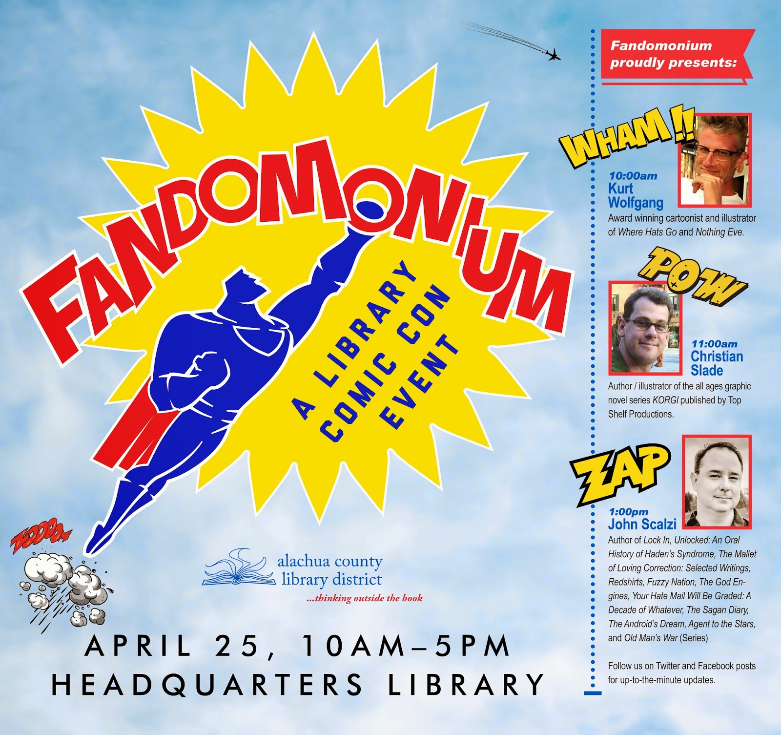
Marketing Design for Fandomonium, A Library Comic Con Event

Above: event identity utilizes a bold comic-styled iconography to catch viewer attention.

Above: identity variation without 
descriptive language for 
use in smaller applications.
Project: Alachua County Library District Fandomonium event visual identity and promotional collaterals.

Design brief: Establish a visual identity mark and develop integrated print and digital media marketing collaterals to promote the library's newly created annual event. 

Required collaterals (and printed quantities):
Series logo, with element variations and formats in both 
    colour and black/white (1+)
Newspaper Save the Date print ad (1) 
Public Service Announcement broadcast media ad (1)
67x63 inch library poster (1) 
Handbills four per 8.5x11 page.
45x45 inch library poster (1)
21x28 inch library poster (7)
21x28 inch library book sale announcement poster (1)
21x28 inch library event floor plan poster (3)
14x8.5 inch (open) / 7x8.5 inch (closed) 
    8-page program guide booklet (300+)
8.5x11 inch flyer (45)
8.5x11 inch newsletter (2,500) cover 
    and interior page layout design (1+1) 
8.5x5.5 inch Contributor Thank You Card (50)
8x2.5 inch bookmark (1,000)
Quarter page Save the Date handbill (2,000)   
Quarter page handbill (1,000)
Library website blog icon (1)
Library website banner ad (1)
Library website newsletter cover 140x188px image (1)
Library website newsletter cover 100x100px 
   blog icon (1) 


Spring newsletter cover and inside page provided event coverage.

Top: Library website blog icon; Middle: bookmark front, back. Bottom: library website banner ad.
TV broadcast PSA.
Black/white newspaper ad.
67x63 Youth Services display poster.
78x66 Teen Services display poster.
Design for both 8.5x11 inch sign and 21x28 inch poster.

8-page program guide booklet.

10 October 2014

Integrated Marketing Design Collaterals for Library Literacy Learning Conference

PowerPoint welcome image.


Event promotional 8.5x11 sign

The Alachua County Library District Literacy Office will host a conference event in Gainesville, Florida. It will be preceded by a breakfast for tutors and students, then open to the public for the rest of the conference.

To help promote the conference to both invited guests as well as the public, a set of promotional collaterals was needed to be designed and printed. A few months earlier, I redesigned an new integrated identity and set of marketing collaterals for the office

( http://librarygraphicdesign.blogspot.com/2014/08/integrated-library-literacy-collateral.html ), so I used these as the basis for designing the conference event collaterals too. Maintaining a consistent use of the design sensibilities created earlier during the redesign helped to further reinforce brand recognition of the ACLD Literacy Office.


Design collaterals (and quantities delivered) for this conference event included:

Breakfast Invitation to learners & tutors in English language (42)
Breakfast Invitation to learners & tutors in Spanish language (10)
Conference Invitation to general public (20+)
E-mail announcement invitation image (1)
4.5x3.5 inch folding invitation schedule insert (62)
4.25x8.5 inch two-sided event program (100)
8.5x11 inch PowerPoint Welcome image (1)
8.5x11 inch PowerPoint Thank You image (1)
8.5x11 inch award certificate (1)
8.5x11 inch promotional sign (520)
22x28 inch promotional poster (10)
Library website banner advertisement (1)

Folding invitation exteriors (printed two-up on 8.5x11 inch card stock then folded and trimmed to size).
Folding invitation interiors (two versions: one for learning teams and one for public.
Invitation insert page.
Program front / back.
Certificate award concept (to be used later in conjunction at year-end event).

PowerPoint thank you image for closing the event.


06 August 2014

Integrated Library Literacy Collateral Re-Design

A variety of new and redesigned integrated marketing collateral materials for the Literacy
 office include 8.5x11 signs, quarter page handbills, recruitment cards and utility bill insert,
 a tri-fold brochure, a six-page tutor handbook, and a 24-page PowerPoint presentation.

In 2013 the Alachua County Library District hired a new literacy coordinator. I felt this was an opportune time to tackle the job of updating the literacy office's array of materials with a redesign so all collaterals were better integrated with one another. 

Previously designed items borrowed from each other but lost a sense of continuity when seen as a whole. This redesign would take the opportunity to maximize use of its primary visual image of a globe, simplify the colour palette from red, white and blue to shades of green with white, refine the typographical fonts and treatments, and to broaden the use of a simplified corporate brandmark.

I started with the most pressing of items needed, quarter page handbills that advertised the service to patrons in need, then additional ones used to recruit potential tutors. While the both the fronts and backs of these two-sided card stock items would look very similar, both would utilize different headlines geared toward their appropriate audience. Similarly, contact information on the backs of each would be adjusted to suit the appropriate reader. The response was so tremendous that I had to order second and third printings of the cards to keep up with demand as they disappeared from where they were distributed in libraries and around the county.

Next up was a redesign of the existing Literacy Office brochure. Both updated and new information were provided, so a new layout was created to arrange and display sections of text into shorter blocks for easy reading. About the same time that the brochure was being developed, a website blog icon was created based on the cover of the brochure which used a green band of colour with white text reversing out of it overlaid the green globe.

The same design solution for the Literacy Office brochure and blog icon was then employed in development of aTutor Handbook design. A fresh re-write of the six-page document text was matched with an equally refreshed new look and that would maintain the same typographical treatment from the brochure for strengthening brand continuity.

For tutor training, a 24-page PowerPoint presentation was created utilizing the same design elements and sensibilities. 

While tutor training was underway, agreements with existing and new tutoring sites required advertising of their locations and dates. One quarter-page handbill design was used both as a handbill as well as a utility bill insert. Other single and two-sided handbills and associated 8.5x11 inch signs for posting were produced in both English and Spanish language to better serve both speaking populations. 

Lastly (for the time-being), a point of purchase sign was created for fundraising during one of the local Friends of the Library book sales. Placement of the sign at a location outside of the library where book lovers and supporters of the library mission congregated was a great idea and hopefully produced measurable results for the library's literacy program.


Projects included:
200 internally printed tutor recruitment cards 
+ a revised printing of 200
400 internally printed reading help cards 
+ additional reprints of 400, 600, & 5000
55 internally printed literacy office brochures 
2500 vendor printed literacy office brochures
150 internally printed six-page tutor handbooks
One local utility bill insert advert .pdf
One library Website Blog Icon .jpg
24-page tutor training PowerPoint presentation
40 Two-sided English / Spanish quarter-page handbills
11 New classes 8.5x11 inch Spanish version sign
11 New classes 8.5x11 inch English version sign
One "Help Promote Literacy" 8.5x11 inch sign .pdf

Stay tuned, because more marketing opportunities are continually being explored, and along with them, additional design projects.


25 May 2014

Marketing Designs for a New Library Grand Opening Event


Roadside sign announces opening of new library after opening day.
Invitation (folded) was printed on card stock, two invites per 8.5x11 inch page.
Event program (lower right) was also printed in the same manner, but not folded.

Grand opening public service 
announcement ad.
In 2011 the Alachua County Library District received permission from the city of Gainesville, Florida to build a new branch library. After that agreement and until they could build a permanent building, a mobile trailer was used as a functioning library. Finally, in 2013, work on the permanent structure began and leading up to its opening, the library wanted to get word out that a grand opening celebration would take place.

I looked back at previously designed marketing collaterals for the mobile unit's grand opening as a basis for continuing the theme of "building the future." That series of collaterals made use of a blue print background, a rainbow, and a few architectural tools such as a t-square. An announcement for ground breaking on the new permanent location site used a shovel silhouette along with the rainbow as part of the handle. You can see samples of those materials in my earlier blog posts here http://librarygraphicdesign.blogspot.com/2011/12/cone-park-library-branch-grand-opening.html and here http://librarygraphicdesign.blogspot.com/2013/04/library-groundbreaking-ceremony.html .


Post grand opening public service
 announcement ad.
Now that the permanent building had architectural renderings, I decided to use the architect's elevation drawing as line art for the basis of the new permanent building's grand opening design collaterals. I combined the elevation drawing with a sepia-toned wood grain image to add colour to it and to become the central art element on all collaterals. For purposes of continuity from piece-to-piece of the new collaterals, I made use of the same wood grain texture as a border treatment and within outlined text of the words "Grand Opening."


Website home page banner ad.
The first marketing piece to be distributed was an invitation, printed two up on a full page, then trimmed and folded down to be a quarter-paged sized card that could be opened. The 300 physical copies would be conventionally mailed out to recipients. A second invitation version saved as a .jpg would be embedded as an image into emails invitations sent out to additional recipients.


8.5 x 11 inch sign to post
in existing branch before
transfer of materials into
 the new library branch.
Two television broadcast public service announcement ads were created. One for announcing the grand opening event, and a second one for long term use after the grand opening. A 23x34 inch poster was also created for use in a free-standing frame to be displayed in the Headquarters Library lobby.

Closer to the grand opening day, a website banner ad and a secondary blog icon image would also appear on the library website to announce the grand opening and link to a blog post for details.

Because the mobile library unit would still be in operation during construction of the new permanent building, a time would come when materials from the mobile unit would need to move to the permanent site. A sign was created to provide advance notice for that disruption of service on the days that transfer of materials would happen. 


Library lobby poster.
Roadside yard signs were also created to be used along the stretch of road that passed in front of the new library location. One designed set appeared to announce the grand opening event, a second designed set appeared the day of the grand opening, and a final set appeared after the grand opening day to announce that the permanent library building was now open for business. The 24x29 inch signs were printed on large format paper and laminated for protection from inclement weather.

For the day of the grand opening, an event program was created, printed front and back on card stock, two programs to an 8.5x11 inch page. A diagram of the building's floorplan was also created to help visitors navigate the new space. And lastly, a pair of certificates were designed to present to the Library Foundation and Friends of the Library organizations for their generous support in helping to make the new library possible look and function to the highest of expectations.
Email invitation image.


Photos of the grand opening event can be viewed here:

https://www.flickr.com/photos/acld/sets/72157638731665456/


Event poster showed floorplan 
sections of new library.
Items created for publicizing the new library: 

300 copies: Grand Opening Event Invitation

1 copy: Grand Opening Event Email Invitation

1 copy: Grand Opening PSA #1

1 copy: New Library Open PSA #2

1 copy: Grand Opening Event Website Banner

Donor certificate.
1 copy: New Library Open Blog Icon


4 copies: Library Closed (during collection shift) 8x11 inch Signs

1 copy: 20x30 inch Grand Opening Announcement Lobby Poster


3 versions / 6 prints each: 24x19 inch Yard Signs for Pre-Grand Opening, Day-Of Grand Opening; and Now Open Post Grand Opening
Donor certificate.

100 copies: Grand Opening Event Program
Floorplan


1 copy: Grand Opening Event Colour Coded 
24x19 inch Poster

1 copy: Cake Decoration Image


1 copy: Grand Opening Event 11x8.5 inch Appreciation Certificate for Friends of the LIbrary donor

1 copy: Grand Opening Event 11x8.5 inch Appreciation Certificate for Foundation donor

Event program front and back.