04 May 2012

Library (Signage) Helps You Find Your Way

Can't find your way? Let the Library show you!
As a point of fact, our library is a fantastic resource for information and a wellspring of knowledge. There are some things it does well, and others that, shall we say, does a little "too well." Case in point, showing visitors the way out of our downtown Headquarters Library. 

Since my arrival at the library a couple of years ago, I've always marveled at how many EXIT signs (and derivatives thereof) keep popping up to point visitors out through the appropriate front door exit. Every few months, I go back to our lobby in part simply for my amusement as well as to more specifically count those signs:

One...two...ten...eighteen...more...are you kidding me? For four doors?

I, probably like a couple others (I'm sure we're an endangered species), will actually camp out to watch the traffic flow, paying careful attention to what visitors look at as they enter and exit the building. I want to see where their eyes are going, what catches their attention first, second, last. The interaction between visitor and the environment varies, of course, but by and large most people have been successfully "trained" to pass through a "metal detector" looking structure that scans for RFID stickers in front of one of the doors. Other visitors, however, probably consider the device an obstruction of some kind and decide to avoid it in favour of two other doors that appear to be more accessible--until they read the sign(s) on them.

Our lobby has four sliding glass doorways, two of which are identified as fire exits only, one as an entrance as indicated on both sides, and one as an exit, also indicated on both sides. In addition to that, library staff have printed numerous 8.5x11 pages to mount on windows, walls, and pedestals with ropes attaching them together that act as a funnel to guide visitors through to the RFID tag detector and the only door specified for exiting. The mass result looks like the photo above, compiling an impressive 20 or so signs that say "EXIT."

Why so many? Is it that difficult for visitors to find the exit? The obvious answer must be "yes!" otherwise some of those signs wouldn't be there. But the resulting visual clutter is an unsightly environmental chaos that looks tacky too. 

The challenge is how to fulfill city code requirements for emergency door access signage, yet reduce the overall number of signs it takes for the lowest common denominator of visitors to successfully navigate their way to the appropriate door. Just like "conduct code" signage, a balance needs to be struck between what is "reasonably sufficient," and what is "overkill."

Trust me, we have our crack team of experts working on it.

Library Garden Display Poster

Large format poster background etching, plus additional vegetable images for decoration.
Spring has sprung and if you're like my wife, you've already planted your home garden and are probably already eating from it too. At the library, we're promoting gardening awareness in May—whether it be for vegetables or flowers.

Background etching image prior to use.
I sourced for garden images—both photos and illustrations. Because of the display's enormous size, 116w x 83v inches, there are few very high quality photographic images that will scale up to that size. Instead, I sourced primarily for free public domain scalable vector illustrations. Once I had a few I thought had potential, I submitted them to the librarian requesting the display poster. Included in my submission were a variety of vegetables and a very nice, graphic line art etching style of leaves and flowers.

The librarian asked for a quote with a nice frame around it to be included on the poster. I set the quote in a nice, handwritten typeface (Jane Austen—freely available online) and made the box I placed it in semi transparent so the background etching image could be slightly visible through it. With the background etching image being so busy, I opted for a simple double ruled border around the quote. A design proof was created and emailed to the librarian for review, and upon reply approval I set up the file for printing.

Using our Hewlett-Packard DesignJet 800 large format printer, I printed background etching image in two long strips, then trimmed and spliced them together using double-sided tape. I printed the vegetables as large as I could on 11x17 inch paper and employed the help of a couple of volunteers to trim them out. My plan was to tape the vegetables up over top the etching background during installation.

Installation was easy; it took two people to place and pin to the bulletin board wall, and a third person to finish up with placement of the vegetables. I came back later to review it and was disappointed to find that all the vegetables had been placed in a very structured, angular fashion, rather than more organic, randomly placed one. But ok...what the heck; everyone's vision of a garden can be different!

All-in-all, the solution and execution was a simple and refined--and good timing too because two days after printing, the DesignJet printer broke and was out of commission for a week.
Background image printed in two strips, then taped together to create one large poster.

13 April 2012

Library Inspiration: The Library of Congress


Library of Congress Reading Room
I recently had the pleasure to visit the Library of Congress in Washington, DC. Due to time constraints, I could only take time to visit one of its three buildings—the Jefferson Building—which sits directly across from the capital building and is more of a museum and shrine than a practical library.

While I was at the Jefferson Building I toured the grand lobby, viewed a couple of exhibits, and visited the impressive circular Reading Room which can only be accessed on the ground level floor by approved researchers and staff. From an upper floor balcony, visiting tourists are ushered in roughly ten at a time so as not to overcrowd the glassed in balcony overlooking the domed room. It was quite an impressive sight. Unfortunately, no photography is allowed in that room, so I can offer you the above scanned image from the small note card I purchased in the gift shop.


A wonderful feature that the LoC offers visitors, teachers, and students is a pretty nifty "Passport to Knowledge" card that on-site visitors can insert into kiosks strategically placed throughout the Jefferson Building. These kiosks have large, angled, interactive touch screens visitors can use to view to learn about the particular room they are standing in. While doing so, the kiosk allows the viewer to save visual items of interest into a personalized collection of their Passport to Knowledge card for future viewing online after leaving the building. I took time to select a few items to build a starter collection, then returned home to continue the exploration and discovery.

Passport to Knowledge does more than building a personal collection of interesting items, however. It also links to other internal LoC and external websites to help facilitate an even greater learning experience about physical items, historical events, literature, people, and a myriad of other interesting topics. And as a value-added teaching tool, it even offers a "Knowledge Quest" online interactive game to test your knowledge on 20 themes, then suggests discussion questions and additional sources for gaining further insights into the topics. I found it to be an engaging, entertaining, and educational tool that keeps me coming back to explore more of its diverse and extensive range of topics.

If you're not familiar with the Library of Congress, I've found a really terrific overview of the most impressive and fascinating aspects of what the Library of Congress is and does. The link below will take you to a Library of Congress web page, and about half way down the page on the right side is a video "About the Library of Congress" which I highly recommend if you want to feel the power of what a library can do, be, and aspire to as an organization that serves the greater public. Unfortunately, as of June 2014 the link changed and I'm unable to locate where it might have moved to, but offer a new link which does a fairly good job of providing an overview of part of the LoC endeavours:
http://www.loc.gov/about/more-than-a-library/presentation/

28 March 2012

Library Volunteer Appreciation Luncheon Invitation & Program 2012 Marketing Designs


Volunteer Appreciation Luncheon invitation front / back resembled a seed packet.

Event program front/ back continued the design theme.
The theme for the Alachua County Library District's 2012 volunteer appreciation luncheon centered on growing, and with an environmental horticulture agent as its featured guest speaker, I worked on the concept of promotional collaterals related to seed packet design. 


I submitted about 15 designs for consideration, and from that, developed a final design that would become the basis for applying to 300 invitations, 200 programs, 21 table marker signs, and 21 florist appreciation table tents. 


The design incorporated use of a public domain flower photo, self generated and vector clip art banners and seal, and a detail portion of a commonly used watercolour image of the Headquarters Library. A brand logo finished off two of the design elements. And...Clever Alert! ...in an effort to further resemble a seed packet, I also included a little faux seed packet language of my own, such as my "Latin" version of "volunteerus appreciatus luncheonata" and a small descriptive paragraph on the back of the invitation about this particular "variety" of volunteer. 


Triangular vertical standing table markers
indicated seating arrangements.
I would have liked the invitation to be an actual seed packet, but unfortunately the costing was prohibitive. Instead, the quarter page invitation was placed into an envelope along with a small seed packet that contained a variety of seeds.


Each promotional item was printed on 8.5x11 inch 110lb white card stock, then hand trimmed to size. Table tents and markers were folded for display.


Since real estate on the dining tables is always a premium, I created table markers that folded to form vertical standing triangle columns. The markers indicated which branch or organizational members sat at the various tables, attended by over 160 people.


Table tent front / back acknowledged the florist arrangements.
Small table tents a little larger than business cards were used to acknowledge the florist that donated the table floral arrangements.

27 March 2012

Spring 2012 Library Newsletter Design: THINK...(ing) BIG

Cover of the Spring 2012 issue of the
library newsletter and program guide.
The spring issue of the Alachua County Library District's newsletter and program guide, THINK... is due to arrive 1 April at each of its 12 branch locations as well as select non-library locations throughout Gainesville, Florida. 


The design theme emphasizes all the big things that are happening within the district...big news, big events, big contributions, big deals...you get the big picture! It is a big, bright edition that will take you through spring and into early summer. 


If you are not able to get a printed copy, .pdf versions are conveniently available online here: www.aclib.us/your-library/blog/think-celebrates-big-read-and-big-reasons-visit-your-library . You might also be interested to read about the Library's recent national award honour at: www.aclib.us/your-library/blog/thinkdetails-national-medal-honor which highlights the library district's big achievement of being one of only 10 libraries or museums around the nation to receive the prestigious National Medal for Museum and Library Service from the Institute of Museum and Library Services (IMLS).


Associated television Public Service Announcement image.


19 March 2012

Marketing Designs for Author Kevin Moffett Library Event

45x45 inch large format display poster
In March, the Headquarters Library will host author Kevin Moffitt. Despite receiving a prolific amount of accompanying review text, I felt it was important to include as much of it as possible on the promotional material in order to educate about who Moffett was and what his book might be about in order to generate public interest in the event. Believe it or not, I cut even more than what finally made it onto the collaterals.


Trimming and piecing together two print-outs to
make one 45x45 inch poster.
For the 45x45 inch large format poster, I had to print it out in two sections, then trim out one section and strip it to the other section. To do this, I cut along a straight area along the top of the author's photo to help conceal the cut, then continued my cut line along a round graphic element to also aid in concealing the cut. After cutting was completed, I placed the trimmed section over the other background printed section and double stick taped them together.
Likewise, on the quarter page handbills, I placed the circular dot into my trim area so that when I cut the 8.5x11 inch pages down into quarter pages, a portion of the red dot I didn't want would be trimmed off with the unwanted portion of the edge.


Marketing collaterals included:
1x 45x45 inch large format display poster
1x 8.5x14 inch author bio page
200x Quarter page handbills
1x Newspaper print ad

Left: 8x14 inch sign. Middle: Print ad. Right:quarter page handbills, 4-up to an 8.5x11 inch page.


Marketing Designs for Author Javaka Steptoe Library Event

Left: 8.5x11 inch sign. Right (t-b): web banner ad, bookmark, print ad.

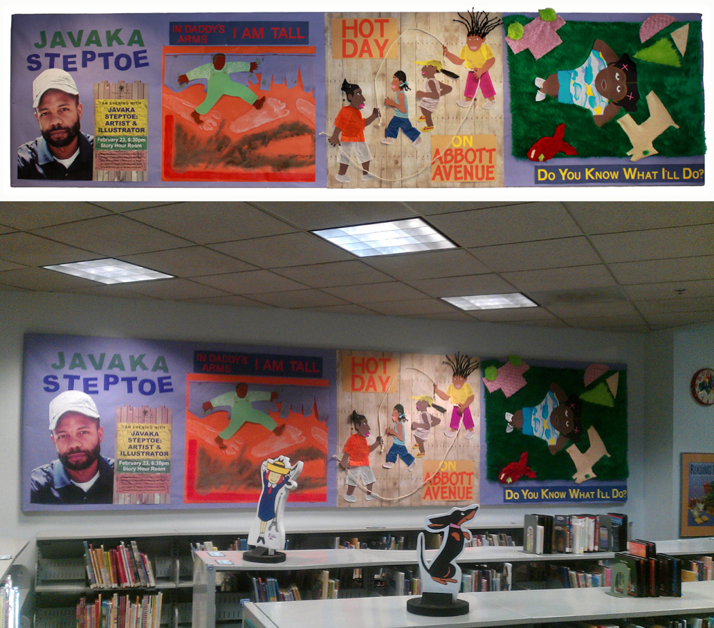
In February, the Headquarters Library hosted an event with children's book author/illustrator, Javaka Steptoe. Steptoe's uses mixed media for his illustration style. It has a terrific tactile, handmade quality to it, so I wanted to reflect that sensibility in with the promotional collaterals announcing his visit. 


I sourced for images of his books his portrait, then combined them with public domain photos of textured surfaces, layering them together for an irregularly shaped presentation. A bold, roughened display typeface was also used to add to the feel of hand generated elements.


Going above and beyond the call of duty, three of our youth services librarians wanted to create a wall display for the event as well. The idea to re-create three of Steptoe's illustrations on a larger scale. Each librarian chose an illustration they liked from his books and worked for a few weeks to piece together own handmade mixed media illustrations. Once all finished, we hung them on a wall together and I added a fourth panel to include an enlarged image of Steptoe and information about the event. It all came together very nicely and everyone was very pleased with the results.


Top & Bottom: staff re-created enlarged versions of Steptoe's work.
Marketing items created through the design department to promote the event included:
40x 8.5x11 inch signs
1x Newspaper print ad
1x Magazine print ad
1x Website banner ad
1x Online press release image
1x 20x30 inch poster
200x Quarter page handbills
1x 37x41 inch display poster
250x Bookmarks